 Rebranding is not for the faint of heart.
Recently Airbnb has revised a lot of their marketing, the website and introduced a new icon.
You can see from this short video that they designed it for anyone to make easily. Not sure I qualify!
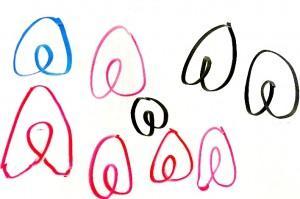
I tried to recreate the Belo icon that they’ve developed as a symbol to represent belonging. It’s integral to their new branding or – should I say – re-branding campaign.
They use this video to explain their rebranding and how they developed this simple icon.
It took me several attempts… and even then, I don’t think I’ve captured it.
While trying to recreate their Belo, I decided that I wouldn’t have selected this logo for all their new branding and marketing program.
Not sure that the design is getting the type of reviews they were hoping. Awkward! I thought it was just me.
Rebranding Demands Research
I wonder if they used any market research before they launched it. Maybe they were given some feedback but chose to ignore it? A lot of other sites are weighing in on the topic, including the social media sites. A look on today’s Twitter feed using the #belo hashtag includes some praise for the new icon but too many (in my opinion) snide body part comments. I wonder what the other graphic icons they considered looked like?
The official story from Airbnb
What do you think? Leave a comment below, but remember, please keep it “G” rated! Thanks, Chris

