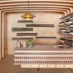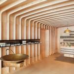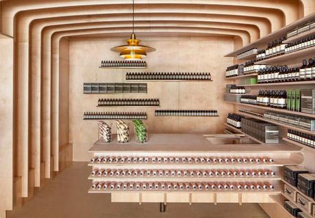
check @ knstrct | Aesop New York by March Studio
The space is quite small, so March wanted to create a way to make the store feel and appear more spacious. The team took bleached wood and created a “rib-cage” like interior where wood slats repeat themselves to add visual depth to the store. No need to add color to the design, at Aesop, the products become design elements as they saturate the space!
Related Projects

Cotta Cafe by MIM Design

Estruch by studio Arola

Public Cinema Center
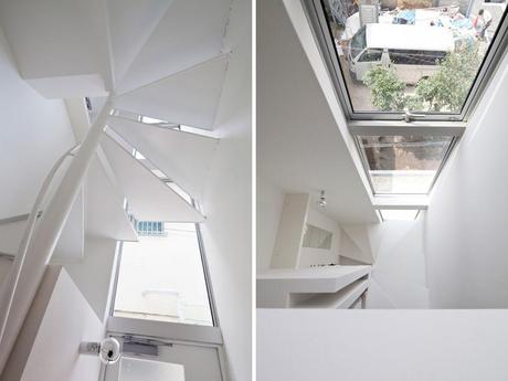
Attic House by Be-fun design prev nextRelated Posts Slider
