A couple years ago I did a series of abstract paintings with the same compositional direction, and when I do that, I find that not all in the group turn out equally interesting. I try to make each one work on its own terms, but sometimes looking back, I find myself disappointed.
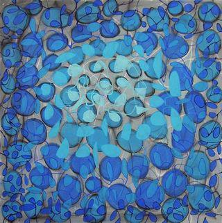
While working on Canvas #125 recently, I realized that I could use one of the techniques from that painting to improve an older one. Here's what Splash Three originally looked like:

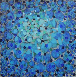
Using prussian blue, cobalt green, turquoise, and light blue, I drew small circles throughout the canvas, beginning with the darker colors near the edges and the lightest in the top center focal point. I filled in the circles with a small brush as I went. I also added variation by putting some of the darker circles closer to the focal point. Here's the final result.


