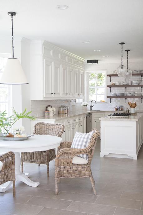
 First, just a little teaser of the "after" So pretty...white cabinets, subway tile backsplash...
Okay...here it was before.
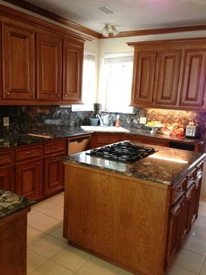
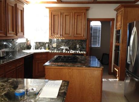 Sorry, that had to be done. All that dark granite and honey wood is too much in this space. Let's go back to where we can breath..
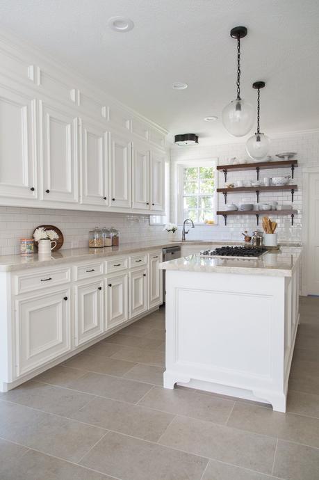 Ahhhh, that's so much better. Wouldn't this be a lovely kitchen to walk into each morning?
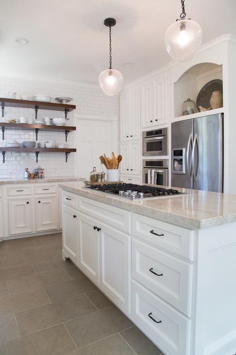 A love that the backsplash tile goes all the way to the ceiling.
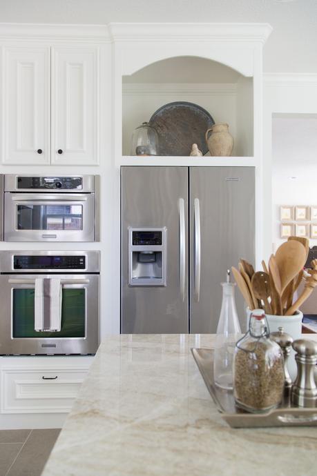 There used to be a doorway on either side of the fridge but Carla cleverly reclaimed some of that space for cabinets.
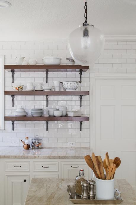 The sandy hue of the counters add some warmth to the space.
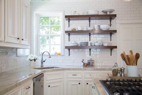 The open shelves break up the white wall and allow the owner to show off decorative items.
What do you think?
Go to Carla's Aston Designed to read more about this project.

