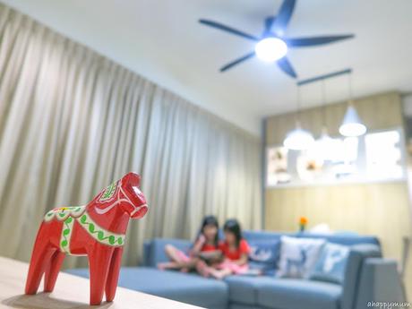
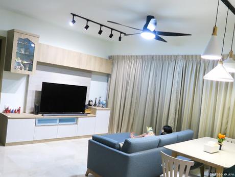
 The living area in our new nest is combined with the dining area (I'll share more about this in the next tour) and together, they make up a squarish, sizeable room. Since there is no storeroom or maid's yard in this house, we had to come up with ways to store our stuff and so we did storage cupboards and also included cabinets in our TV feature wall, which I'll talk more about later on.
Now, I wanted to show you the lights for the living area because this was what I had been dreaming about for a long time and it finally came true - track lights! Yes, you'll be seeing a few of these in the new house and I'm just very glad that we managed to solve some hiccups during the installation process and everything turned out well. Take for instance this living room, there were only two electrical points on the ceiling initially and I almost thought that I had to give up my track lights because the ceiling fan and dining pendant lights seemed to have more reason to stay. Due to the rush to move in, which was done in less than a month after we got the keys, we didn't want to do a false ceiling either.
We considered doing a external trunking so as to add an electrical point that joined to the switch but the switch was located too far away and it would turn out hideous. Eventually, the electrician helped us to drill through the ceiling so as to create one more electrical point for the fan and that day, we fought a war in the house as the loud drilling took place while the kids were camping in the master bedroom and the whole living area, balcony and even kitchen were covered in white powder. Nonetheless, I was just very relieved that we managed to install and fix everything in place at that point in time. Our track lights are kindly sponsored by Lights & Co while our ceiling fans by KDK, and I'll be sharing our reviews of them very soon too.
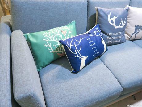
 Our sofa set is from My Nest, an online furniture retailer that is rooted in the Scandinavian design which has an emphasis on simplicity, functionality and elegance. Just perfect for our "nest" right? I'm so, so thankful that we got to know and collaborate with so many brands which have all helped to make our dream house come true. Anyway, our sofa set is the Ceni 3-seater sofa coupled with the Ceni Ottoman, which were all chosen by me, and I'll be sharing more about our thoughts on it soon!
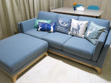
Now, if you take a closer look, you will realize that our cushions are Scandinavian themed too! Yup, those reindeer designs just give you the feel, don't they? Three of the cushions have dual functions and can either be used as cushions or they can also open up to become comforters too, how awesome right? The kids and I now have what we call Friday Movie Night and this is the place where we will just lay down, snuggle against each other, cover ourselves with the comforter and just bond over a show and some snacks. Love it, love it, love it. Oh, in case you wanna know, all these pillows were bought from Taobao and they are really not expensive (Exc. shipping fees, S$4 each for the normal cushions, S$14 each for the cushion-cum-comforter). I was actually pleasantly surprised by the quality and very pleased with our buys!
Moving onto the highlight of the living room, it will be the customised TV feature wall that we designed ourselves. I still receive queries from some of you asking about which interior designer we engaged but no, we don't have one and we didn't use a contractor too. Here's the first draft that I drew out when I first briefed the carpenter about the feature wall.
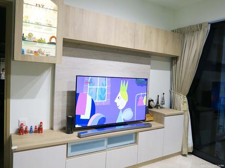
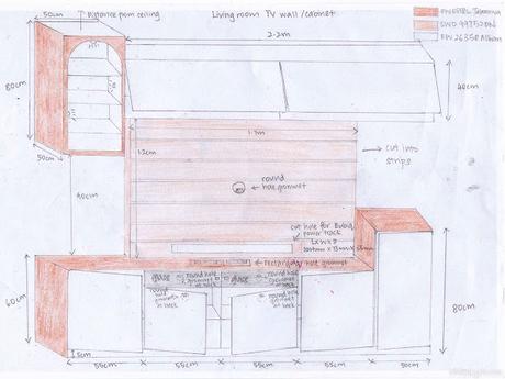 We eventually made changes to the choice of laminates because those we picked were not in production already. We also changed the shape of the display door to resemble a house instead of an inverted U. This was a suggestion by my father-in-law who said that the latter was a tad old-fashioned and asked if I wanted to modify it to something more modern, and so I did. Other than that, everything turned out the way we wanted and even better. Take a look below.
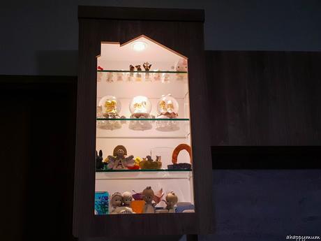
 Just look at how cute the 'glass house' looks! We added an electrical point so that we could place an LED spotlight at the top of the house and light it up when we want to. It adds a homely feel and warm ambience to the living room, don't you think so?
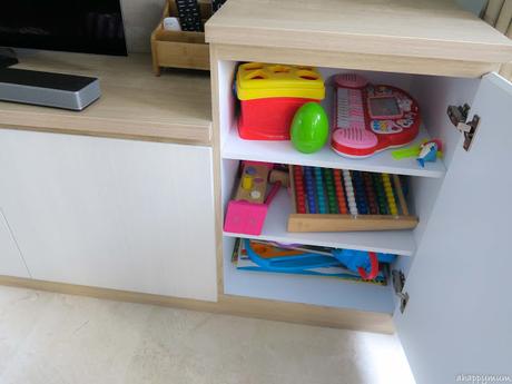
Now, let's take a peek inside the cabinets. For the bottom right cabinet below, I put in some baby toys so that it is easier to grab a couple for the baby to play whenever we are in the living room or when I task the sisters to look after him.
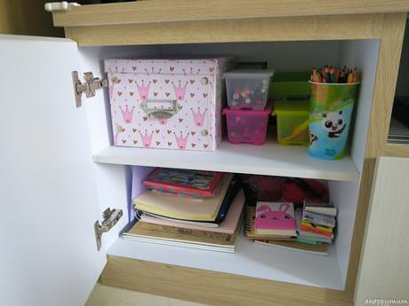
 As for the bottom left, this is where I keep our stationery and also some drawing supplies for the girls. They really like to write, doodle or color when they are free so this makes it easy for them to reach for the materials without my help.
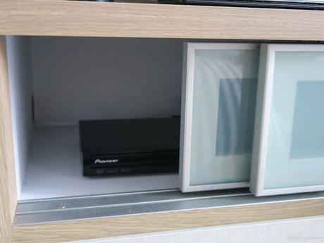
In the middle, we have two sliding glass doors which house our cable TV box, DVD player, game consoles and more. The reason for using glass is to ensure that the remote controls can work without the need to have to open up any door.
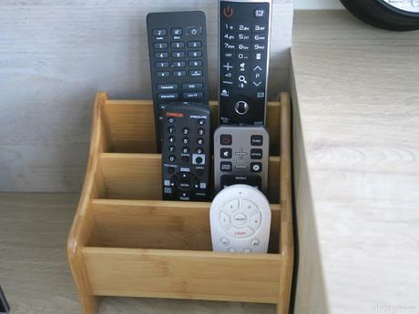
Talking about remote controls, I got this wooden remote control holder from Taobao which I thought was a perfect fit for our Scandinavian theme. I can't even describe to you how the baby loves to press all the buttons on any remote control he sees so I prefer to keep them all together and out of his reach for now.
As for the overhead cabinets, instead of the normal swing doors, I wanted them to have flip doors instead. These flip up and make use of hydraulic hinges to assist with the movement and stay in place. I thought they make a good contrast with the swing doors at the bottom and using flip ones also meant we had less doors to deal with on top. This is the storage cabinet for all our photo albums, mementos, keepsakes and anything that has a sentimental value.
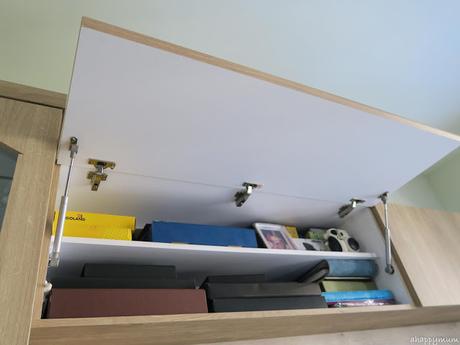
In line with the Scandinavian theme which focus on simplicity, I've kept our ornaments and decorations to a minimum this time round. We used to have a messy TV wall cabinet in our old house, I do mean really messy. There were books, paper, toys, coins, stationery and craft materials scattered all over and so, I've become resolute about being neater and more presentable this time round.
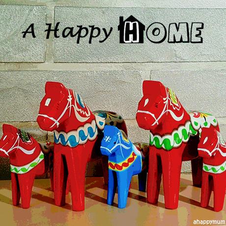
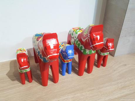
One of the key displays in the living room is our family of Dalecarlian horses which were brought over all the way from Sweden! I initially only wanted one but the hubby surprised me by getting five in total, one to represent each of us. I really find them meaningful and looking at them makes me reminisce the good old days we had living in Sweden, how it brought me into the motherhood journey and changed my life forever.
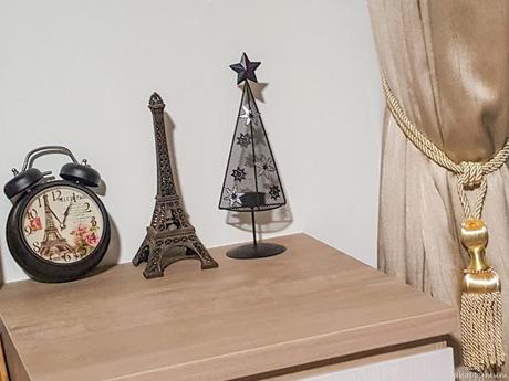
 On the other side of the wall cabinet, you can see an Eiffel Tower metal statue, an Eiffel Tower vintage alarm clock (you all know that it holds a special meaning for us because it was where we got engaged, right?) and a Christmas tree tealight holder. There, very simple, very minimal. Let's just hope I can keep it this way. To read more about our day and night curtains done by Meridian Curtains & Furnishings, go here.
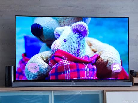
The highlight of the wall is, of course, the television itself. Since we don't intend to have any TV in the bedrooms, we wanted a nice, big one for the living area. Yes, so here's our new 55" LG Oled TV (yes, it's considered big to me already because our previous TV which lasted us many years was a 40" one) and a sleek curved sound bar.
I always believe that things happen for a reason. We initially wanted to hang our TV onto the feature wall using a bracket, which was given to us in the package, but alas we were told by the Courts people that the bracket was out of stock - and it still hasn't arrived up to this day. So after some discussion, the hubby and I decided that we will leave it on a TV stand instead and see, I think it looks really clean and neat and we will likely keep it the way it is.
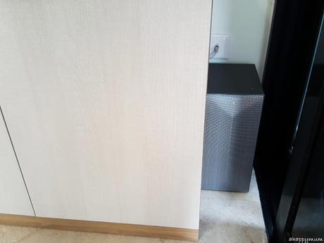
 Our woofer is placed on the floor at where the curtain is and I must say we are very lucky because the woofer fits perfectly into the small space. See? We bought the TV and sound system only after we had sent in our order to the carpenter, so it was totally a coincidence that the woofer fitted so well. Any bigger and we would have been unable to find a nice spot for it. Phew.
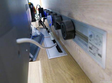
One thing about our new nest that I wanted to do was to get rid of.... messy wires! I'll show you how the wires looked like in our old house in another post next time and you'll be shocked at the difference then and now. Thanks to Eubiq, we now have power tracks in the house and one of the main ones is this 80cm track on the feature wall. I'll do a review on it soon but you bet I'm very glad to finally be able to conceal all, or at least most, of the wires in the living room. Woohoo!
Without a contractor or ID, it was quite a challenge for me to coordinate this with the carpenter (who needed to help us cut a hole in the wall to embed the power track), the electrician (who had to help us do the trunking and pull the wires to the track) and Eubiq installation guys (who came to fix the track when the wall and power point were done). Yup, in my drawing above, you can see that I even had to include the dimensions of the hole to be cut in the wall. BUT, it was all totally worth it!
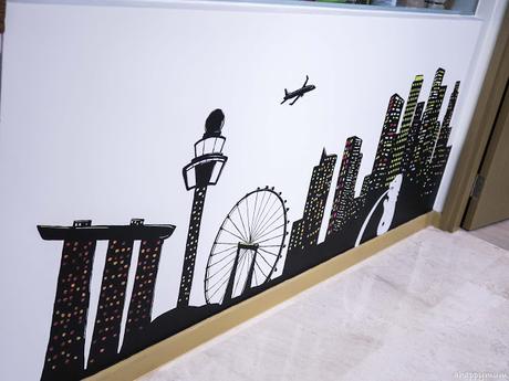
 I guess you have already read about this but if you have not, here is how Angel and her art teacher helped to paint a silhouette of the Singapore skyline for our wall mural in the living room. Yes, I can look at this all day long and not get tired of it. Plus, it makes for a great photo backdrop which you can already see from my social media posts nowadays, right?
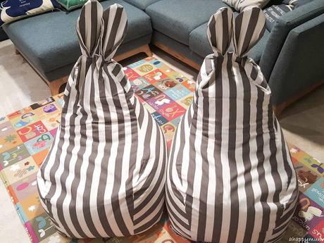
 Lastly, just to make the living area more baby and kid-friendly now that our kids are still young, we decided to add a bumper playmat and two kid-sized bean bags. The Parklon playmat was bought at a baby fair in Expo while the kawaii bean bags with the rabbit ears are from Taobao. This makes it much easier for us to play with the baby and also save him from a few knocks if he falls over too. Yup, this is definitely the most colourful part of the living room!
 So, that's all for our living room for now. Do you like it as much as I do? I still have so much more of the house to share with you, so stay tuned next week!
******
This post is part of the "A Happy Home" series where I share all about our new Scandinavian-themed house, the renovation process and some tips and thoughts. Moving is never easy but it comes with an indescribable sense of joy in building up the house of your dreams. Remember, home is where the heart is and nothing is more important than being able to build memories with the people you love.
