So, continuing with our tour, I'm going to show you our Dining Room today! Okay, strictly speaking, it's just a dining area because it shares the same space as the living room. What we did was to place a dining table behind the sofa and also install a customised storage cupboard which I will show you later on.
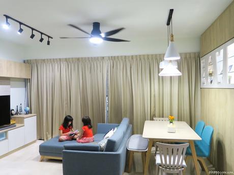 To be frank, this arrangement makes the sofa a little too close to the TV, so what I usually do is shift the bench under the dining table and push the sofa as far back as possible, in the hope that this will do less harm to the kids' eyesight. Yes yes, I'm hoping they can be like me and don't need to wear spectacles but I know it's going to be a tough challenge in this high tech age we live in today.
The hubby initially suggested that we should do away with the dining table but I objected because that, to me, meant less motivation to cook and less opportunity to eat with the family. So, a dining table was a must and thanks to My Nest, we now have Scandinavian styled dining table, chairs and bench. This did not come as a set and in fact, it was a mix and match and every piece of furniture was picked by ourselves. I loved all the wood and earnestly thought that the colours and the combination of different styles worked together quite well in the end, do you think so too? Will be sharing more in our review!
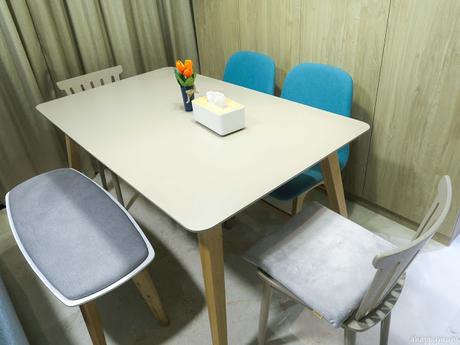
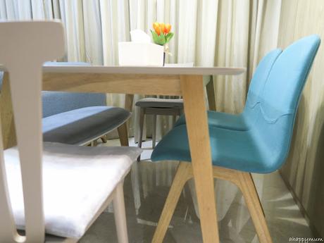
So far, we've already hosted a few rounds of gatherings with friends and family in our house and the dining table has served us well.It makes for a nice corner to sit around, catch up and bond while we tuck into food at the same time. So yes, having a cosy dining area is really essential to us for now.
Moving on to the highlight of our dining room, it will be the personalised LOVE cupboard that many of you have been asking me about and the unique Travertino wall done by the Nippon Momento team. Here's showing the draft of the design that I drew.
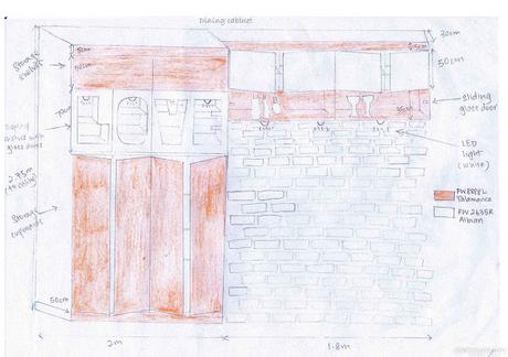
Basically, we needed huge storage cupboard space because there is no storeroom in the house, we wanted a glass display for all the booze, and I wanted to have a brick wall as a photo backdrop - these three factors led to this peculiar design which you've probably not seen anywhere else. Yup, that's how special it is. Haha.
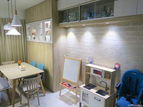
See how it eventually turned out? It definitely exceeded all our expectations and I am loving all the earthy tones and wooden feel.
 The LOVE display cabinet idea came about when we saw this photo frame we bought in Sweden. You can see it in my foyer tour here. The hubby, who can be more creative than me at times, was the one who tried to draw a mockup design and said that it would be nice to have a cabinet with the letters cut-out on the doors and LED spotlights to light up the displays.
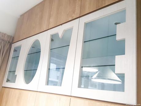 So, we thought about it for some time and also had a discussion with the carpenter. He was intrigued with our concept and said that he had never done anything like this before, which explained why it took him weeks to cut out the doors despite the fact that the cupboards were completed much earlier. But see? He did a really awesome job eventually, right? We are so in LOVE!
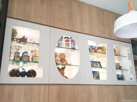 Yup, so this is the reason why we are calling our new abode the House of Love (see our cabinet cut out in the shape of a house in the living room display here). A tad cheesy, I know, but we still like it. Nowadays, whenever guests come over to our place, the girls will write welcome messages on the whiteboard and it always says "Welcome to the House of Love" along with drawings of our whole family. How cute, right?
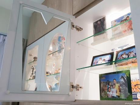 Here's a look at the door from the inside. As you can see, the display glass shelves are just the usual shelves and what makes it special is the cut-out of the door in the corresponding letter. This means you can basically spell anything you want, right?
For the displays, I've put up some photos, souvenirs, medals, trophies, memorable keepsakes (such as two pebbles from Iceland, a walnut cracker from Sweden), two disco lights and so on. I love the LEGOLAND photo souvenirs where they printed our photos onto real LEGO which can even be dismantled.
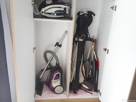 Now, a quick look inside the storage cupboard. Since we don't have a storeroom, we had to devise ways to store bulky items like the vacuum cleaner, the hubby's golf set, our Christmas tree etc. I actually came up with a list of bulky items before we even did the furniture design so that we can have a rough idea of what is to be stored where and then allocate the space for the items. Yes, a lot of planning prior to this!
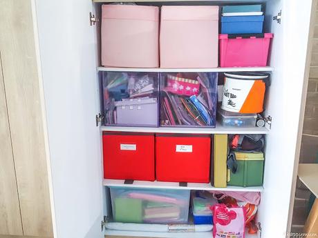 The storage cupboard is also where the hubby keeps his fishing gear and where I keep all my art and craft materials (which is quite a lot of stuff!). I have a box dedicated to storing the kids' past artwork and even though I've tried to be selective, it's already almost full and I'm wondering what I should do in future.
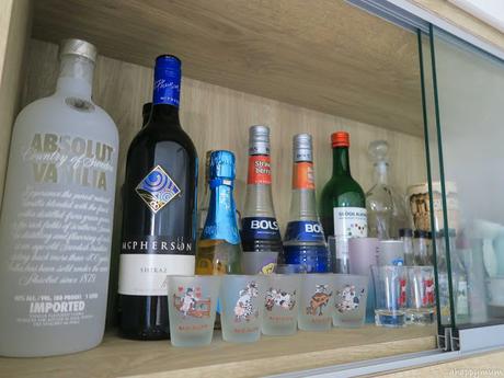
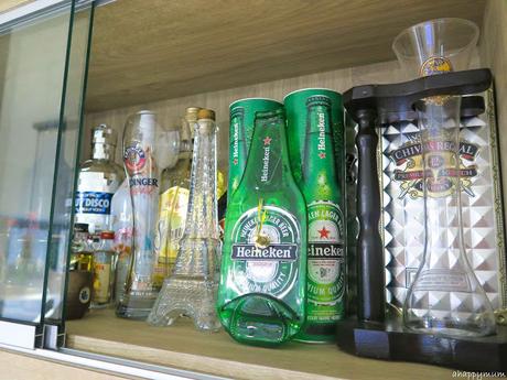
On the other side of the cupboard, we have these display shelves with sliding glass doors that keep all our booze as well as shot glasses, champagne glasses, alcohol related souvenirs (such as this Heineken clock from Amsterdam) etc.. Yup, you can say this is our mini bar and I'm still looking forward to the day when I can have a glass of Baileys or cup of sake without feeling the guilt. But for now, I shall cherish all the breastfeeding days I have left!
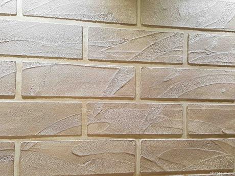
Lastly, this is one of my favorite parts of the house - the gold-coloured brick wall. Right, it's not really made of bricks, not even craftstone, but is in fact done using special effect paint. I was amazed by firstly, how the wall fitted perfectly with the cupboard and didn't even leave a gap. Yippie, this meant that our measurements were spot on. Secondly, I was blown away by how the gold color of the wall matched the wooden laminates of the cupboard perfectly and this was purely by a stroke of luck.
The more I look at the wall, the more in love I am with it. Some of our friends who came over have also asked us about it and many commented that it looked very nice! I'll share more on this in a separate post soon but you bet you'll be seeing this wall pretty often in my posts.
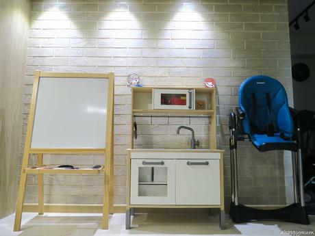
I initially wanted this area to be a photo taking backdrop cum stroller parking area. However, plans changed and it became more practical to put the kids' Ikea play kitchen (I fixed everything up myself for this, woohoo!), the baby's high chair and the whiteboard easel stand. This is good for me in the sense that since it is right next to the kitchen, I get to whip up our meals while the kids also whip up theirs in their kitchen or do some drawing and writing too.
So, this concludes our tour of the Dining Room and in my next tour of A Happy Home, I'll be showing you the bedrooms so stay tuned!
******
This post is part of the "A Happy Home" series where I share all about our new Scandinavian-themed house, the renovation process and some tips and thoughts. Moving is never easy but it comes with an indescribable sense of joy in building up the house of your dreams. Remember, home is where the heart is and nothing is more important than being able to build memories with the people you love.
