- The homepage is the first impression your visitors receive when they arrive at your website. This is why the homepage design will be the deciding factor in whether or not you can retain your visitors.

On the average, you have about 7 seconds to convey the purpose of your website before visitors click on the Back button. This means the design of your homepage plays a critical role in attracting and retaining your target audience. In this article, you will be provided with key points you should know that will get you started on your way to creating a homepage that gets results.
What should be included in a homepage?
In order to determine what should be included in a homepage, you must first understand the purpose behind your website. The homepage serves as the portal to the rest of the site and provides the visitor with exactly what they are looking for as soon as they arrive. By defining the purpose of your site, you are providing the visitor with the information they need to take a specific action.
For example, if the topic of your website is to sell a specific product, the majority of your visitors will not make a purchase on their first visit to your site. Therefore, you must identify a purpose that leads the visitor to the intended action which is to buy a product.
In this instance, your purpose might be to help visitors learn more about topic of your product so they will be more inclined to eventually make a purchase. This means your homepage is the gateway to establishing trust with the visitor as well as demonstrating your skills and knowledge related to the product you sell. If you try to make the sale on the homepage, it is highly likely you will discourage your visitors since it sends the message that you may be just out to make a quick buck.
It is also important to keep in mind that you will have new visitors as well as returning visitors. The homepage should provide a balance of components that get the new visitor interested in the content enough to want to return and content that reminds repeat visitors to return.
New Visitors
New visitors to your site are looking for information not only on the topic of your product but also information that will help them gauge your expertise and trustworthiness. Your content should be organized in a way that demonstrates these traits such as a video that establishes an immediate relationship by providing face-to-face contact. You could also give away free high quality information in exchange for an email address. This helps the person to get to know you and your expertise by receiving valuable information in an email.
Returning Visitors
For repeat visitors, you should provide resources that consistently remind them to return to your site. This could be something as simple as a news feed or forum community where they feel a part of something.You may be able to go as far as setting up a membership portion of the site with a free trial or a subscription-based newsletter.

High quality content geared toward new and returning visitors, a clear statement of purpose, and a design that makes it easy to find your way around, is the key to catching the attention of new visitors. It is also an effective way to increase the number of returning visitors who will eventually make a purchase.
Additionally, your homepage should be capable of loading quickly to avoid visitor frustration. This means a simple design with small graphics will help your page to load faster and prevent your visitors from leaving. You can also opt to use CSS image sprites which help to group the page images together. This reduces the number of requests the page requires to effectively render your homepage.
Where should the navigation feature be placed on the homepage and how should it be structured?
The navigation for your website is the foundation that will determine whether or not your visitors will be able to easily find their way around. The navigation should be designed in a way that clearly organizes and displays the hierarchy of web pages to the visitor. It should also be consistent throughout the pages of your site so as to avoid confusion, yet visually appealing to provide a pleasant browsing experience.
In terms of where the navigation should be placed on the homepage can be the preference of the website owner. Typically the navigation bar is across the top of the page or on the left or right hand sides. However, newer trends in website design add an air of creativity to navigation design. The main thing to remember is to maintain consistency on each page of the site regardless of where you place the navigation. Your visitors just want to be able to easily navigate your site and expect it to be user-friendly.
Current trends in navigation design involve 3-D navigation with JavaScript which provides an interactive experience without being too over the top. Other designs provide the navigation icon with an explanation of the content written out in a summary paragraph under the icon. The paragraph typically contains keywords that your visitors use to find your website.
How should a website be structured in order to capture your target audience, increase conversions and encourage returning visitors?
To capture your target audience, you must identify and prioritize the content and elements that are the most important for communicating the purpose of your site. Once identification is complete, prioritize each one in order and in the form of a list. Some of the elements might include featured content, RSS feed, or opt-in list.
The priority list in order of importance will depend upon what you plan to achieve with your site. However, with this information visually in front of you, you can come up with a design that draws the visitor’s attention to the most important aspects of the site. You can accomplish this by organizing the content so it is viewed by the visitor in the correct sequence.
Use a Heat Map to Enhance the Purpose
Heat maps are a useful tool for discovering what parts of your homepage are performing and which portions are in need of improvement. A heat map is a colored diagram that displays the process your website visitors use to view the content on your web page. The concept comes from pupil tracking devices used during market research to reveal consumer eye movement when they are viewing a promotion. Heat maps display the areas of your homepage that are viewed the most by your visitors.
Heat maps display different colors to show the most frequently visited parts of a homepage. For example, if you are using the color red and yellow, the heat map will indicate where 85 to 100 percent of the activity is by outlining it in red so you can decide how to maximize conversion rates. The color yellow may show you where 65 to 70 percent of visitor activity is located.
There is a tool in Google Analytics known as Site Overlay that offers similar functions to a heat map. Or, you can opt to use an open source heat map generator such as ClickHeat. ClickHeat provides you with an entire heat map package that can be uploaded to the host server for your website.
Additional Ways to Draw Attention to Content
In addition to the general layout you choose for the homepage design, there are a few ways you can draw the visitor’s attention to important elements and content.
- Implement more white space around the content or the element to isolate it and make it stand out.
- Highlight various features in order of importance.
- Increase the contrast of important elements so they stand out from surrounding components.
- Increase the size and change the color of important features such as a Subscribe button or other feature where you want to visitor to take a specific action.
- Use graphics that have a purpose and lead the visitor’s eyes to an important element, piece of content.
Graphics can also allude to the location of an organization; this should be intentional if your service is regional. The Our IT Dept. Services homepage is a great example of regional optimisation well executed. Note the slider images and the header tags.
Remember to Include the Basic Components Visitors Expect
As you browse the Internet, you have probably noticed that most websites contain basic but important elements which visitors expect to find. Since these are common elements, creative positioning will make your site stand out from the others in the eyes of the visitor. Some of the common elements of a homepage include:
- A feature for searching your site.
- Your company logo.
- Social media widgets.
- RSS Feed.
- Navigation Menu.
- About your company.
- Contact information.
Additionally, the homepage layout should be simple and each element should have a purpose in mind. If the page is cluttered with elements that do not seem to have a purpose, this will only confuse the visitor and cause them to feel overwhelmed enough to click the Back button and move on.
What colors should be used and what ones should be avoided on your homepage?
The colors on your website should be presented in the form of a theme such as those used on your logo or other type of company representation. You should avoid using too many colors at all costs since it results in visitor distraction and makes your site look disorganized.

As a rule of thumb, the homepage should use no more than two primary colors with a third color used sparingly in the design. The color theme you choose should remain consistent throughout the site and be simple to make viewing the pages easier on the eye.
The color theme should also connect with your visitors and relate well to the purpose of the site. For example, you typically would not use loud colors such as fluorescent orange for a site where you are trying to communicate a business-like image. Although contrast is important, it should not be too over the top. Additionally, the text should either be dark with a light background or light with a darker background. However, you want to avoid excessive contrast such as yellow text on a black background since it is very hard on the eyes. This brings us to the subject of text and font styles.
What about text and font styles?
About ten years ago, small fonts were considered to be trendy however, it wasn’t very practical and rather difficult to read. As a general rule, you should never go below 11pt with 14pt being the ideal font size for paragraphs and other text.
It is also important to keep in mind that some browsers do not support specific font types. So if you are thinking of using a fancy font type, it is more important to think in terms of practicality and readability. The primary font styles that are supported across many different browsers include but are not limited to Verdana, Serif, Times New Roman, and Comic Sans.
Also, consider accessibility and health in addition to health and safety. The height of the paragraph lines is also important to prevent eyestrain and make your content easier to read. This is the spacing between each line in a paragraph. If the lines are too close together, this provides an unpleasant reading experience. When the lines are spaced further apart, this makes the content more reader-friendly.
Positioning. Where should your headers appear? What should be above the fold? How long should your website be?
The website header is a critical part of making a good impression on the visitor so it is important to get it right the first time. There are a variety of different types of header designs which help you achieve different purposes. The type of header you choose will depend upon your site’s purpose.
In general, a very large header placed at the top of the page could waste valuable space above the fold unless you use the header space wisely. For example, if you simply include your company name and logo, you are wasting valuable real estate where you could be placing the most important content above the fold. On the other hand, if the header includes the navigation bar, valuable content, and perhaps an opt-in section, then you are making better use of the space. The whole idea is to create a purpose for every element you place on the page and this includes the header at the top.
In terms of page length, your page should typically be no less than 500-600 words. In order for the content to be valuable to your visitors and the search engine bots that visit your page for indexing, this is a good rule of thumb to follow. The content should be filled with valuable information and totally void of “fluff” or unnecessary content just to fill the page.
What is currently trending online?
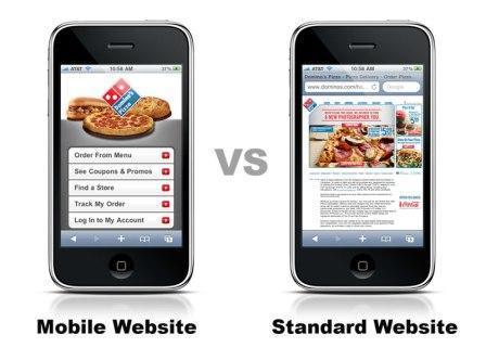
There are varieties of different approaches that are currently trending online. A lot of them are due to the increased use of mobile and tablet devices.
Videos
Videos have been gradually been replacing text to the point where the search engines recognize them for indexing on the search engine results pages (SERP). Most people would rather watch something than read about it. Plus, videos provide an easier way to explain or demonstrate a concept related to the topic of your business. They are also easy to share with others which makes getting your message out a lot easier.
Simple and Straightforward Content
You have heard the old adage, “Less is more.” This rings true when it comes to providing content. Most people that browse the Internet are scanners which means they scan the content to find the parts that interest them. For this reason, the content should be kept simple with lots of subtitles and bullet points that allow the reader to easily find the content they want to read.
Mobile Designs

Flat Design is current.
When Apple released the iOS 7 operating system, this launched the popularity of flat web design. This type of design is simple and typographical and is expected to be in the forefront during 2014. It is also a very user-friendly design that is preferred by many web surfers as well.
Hopefully, this information will provide you with a solid foundation to start designing your own homepage. And, remember that designing an effective homepage requires attention to detail and consistency when taking into account your site’s purpose and long term goals.
How is your homepage looking today? Do you think you need to make any changes to your homepage?
Top Image Image courtesy of arztsamui / FreeDigitalPhotos.net

