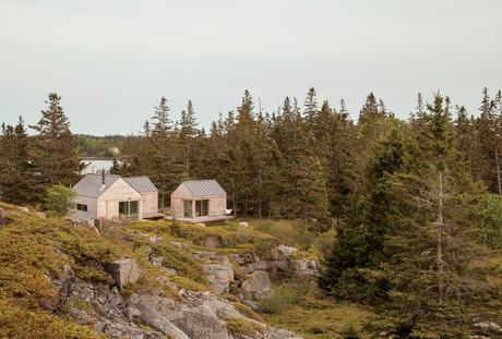
On a sloping site near a defunct rock quarry on the remote lobster-fishing island of Vinalhaven, Maine, a three-part summer home overlooks a framed view of Penobscot Bay. Working around the site’s unique topography, design-build firm GO Logic created each structure at varying elevations.
Project Little House on the Ferry Architect GO LogicIt’s perhaps misleading to call three structures a summer house. But measuring 890 square feet altogether, referring to them as a set of summer houses would imply something grander than three cabins tucked into a defunct granite quarry. From a distance, the buildings look like a cluster of bait shacks you might see on the harbor side of the Vinalhaven, the island where they sit.
Fifteen miles offshore from the town of Rockland, Maine, the island is its own world, its very separateness a part of its magic: It can win people over in one visit, which is all it took for Nick and Nadja van Praag. Both expats—he from England, she from Austria—they’d only just arrived when a photo in a Realtor’s window caught Nick’s eye.
At the time, Nick’s work with the World Bank had brought the couple to Washington, D.C., where they had a classic Georgetown house, yet felt a persistent sense of unrest. It drove Nadja crazy to be in America, where, as she says, “the inside/outside thing was invented!” Living like center-city Europeans in a four-floor building, the van Praags daydreamed about an open, single-story home, while Nadja kept close watch on a Richard Neutra house nearby, hoping a For Sale sign would go up.
“Then we came to Maine, and didn’t expect anything like that,” says Nadja. But there it was, for sale, a “little box” on Vinalhaven. “Nobody else wanted this house,” she recalls. “They were all looking for the perfect New England shingled-whatever.”
However, their tiny square overlooked a tiny rectangle: a 700-square-foot mobile home. The van Praags realized that if another family purchased the trailer to build a larger home facing the channel, the quiet setting of the disused quarry would significantly change character.
A few years passed, the van Praags made interior renovations to the home with local builder, caretaker, and lifelong resident Mont Conway, then—when it became available—they bought the plot of land where the mobile home once sat, less than 100 yards down the path. Around the same time, they met Riley Pratt, an architectural designer who summers up the road. Pratt, of the Belfast, Maine–based firm GO Logic, knew Conway from pickup soccer games on Vinalhaven but also by way of his reputation.
When the van Praags expressed interest in building a new structure on the extended property, Pratt mentioned Alvar Aalto sketches he had seen for a deconstructed summer cottage in Finland, where the rooms (and, of course, a sauna) were broken out as separate buildings focused around a courtyard. Nadja took to the idea of a peeled-apart, three-volume structure immediately: The design was an exploded version of their house, also a three-part structure, and building it would mean their three grown children could have a place to stay when they visited.
The town of Vinalhaven considered the lot, with its jumble of rejected granite scraps, “substandard” and therefore granted the Van Praags up to 30 percent more square footage and volume over the previous structure. While the site posed challenges, it also inspired. GO Logic paid special care to the topography and geometry of the quarry. Every angle—of both the structure and the interior lines of sight—is in purposeful alignment with the surrounding stone, trees, and water views.
The three pavilions, each with wall-height sliding glass doors, collectively make up a living-dining space and two bedrooms with attached bathrooms.
The town approved the plan for multiple structures because a single deck connected them, and the van Praags were thrilled because the design maximizes both privacy for overnight visitors and a connection with the outdoors.
The spare aesthetic—inside and out—at once suits the austere island and reflects a judicious building process that was as much about choreography as construction. GO Logic used an emerging technology—cross-laminated timber (CLT)—to reduce waste and on-site labor. The design-build firm, working with Conway and his crew, carefully sequenced the packing, transport, and assembly of the black spruce panels shipped from Quebec. The panels form the entire enclosure—floors, walls, and roof—a practical and sustainable solution that provides both structure and finish. Conway’s crew sided the buildings with mitered white pine that will turn hoary with time, matching both the granite landscape and the local cottage vernacular. They also used white pine to create sliding barn doors that offer shade and privacy as needed in the summer, and protection in the off-season.
Although they’re just a short walk from each other, the van Praags’ two homes—the “little box” and the new trio of cabins—feel worlds apart. “The old house looks over Old Harbor Bay, protected and speckled with boats. It’s sort of domesticated, in as much as the islands of Maine do domesticated,” Nick says. “The new house is out there. It feels wild and remote, with the old quarry rising gently behind the house and the ocean stretching away in front.”
By day, the three connected pavilions sit lightly on the land. At night, they float above their concrete piers, a U-shaped harbor that beckons guests with its warm light, the platform at once a dock and a deck.
“For me, the most amazing thing is the way Riley sited the place,” Nick says. “It was always a beautiful spot, but by raising and angling the buildings, it embraces the landscape and the ocean in a way that I could not have imagined.” When guests ascend the stairs to the deck, popping up into a framed view of Penobscot Bay, they all stop in the same place. “I realize now that siting a building is a very special talent,” he adds.
