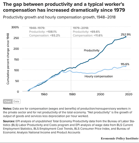
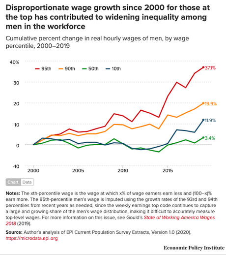
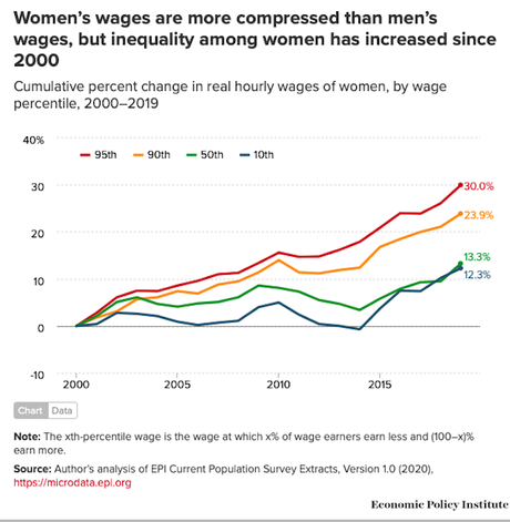
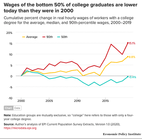
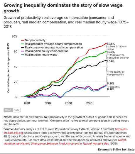
Prior to 1980, most segments of the American population shared in the nation's rising productivity. But when the Republicans assumed enough power in 1980, they changed the nation's economic policies. Their policies tilted the economic playing field to favor the rich.
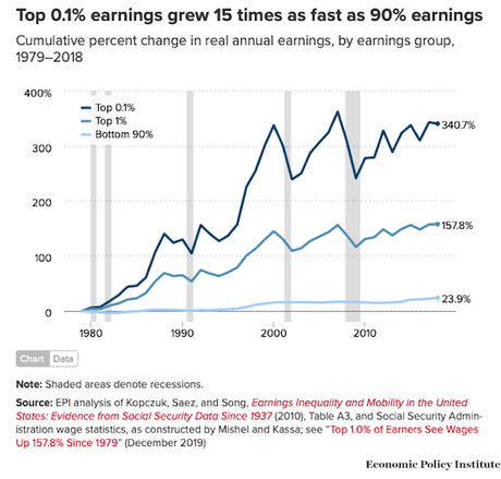
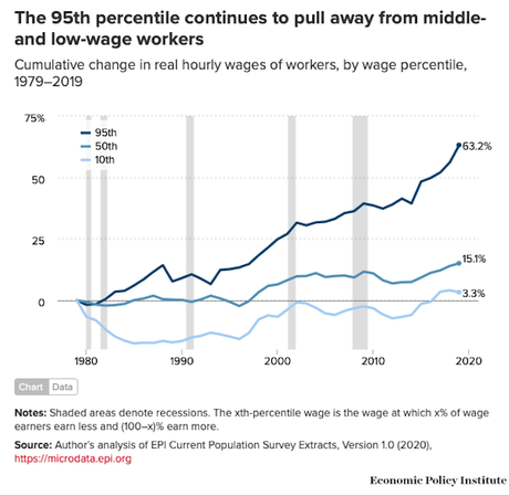
The Republicans told us that everyone would benefit from their economic policies, because the money given to the rich would trickle-down to everyone else. That did not happen. The bank accounts and wallets of the rich grew much fatter, but wages did not grow nearly as fast for everyone else -- and for many Americans did not grow at all.
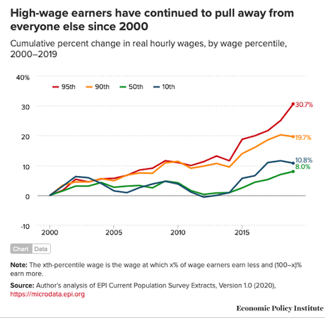
The result was a huge growth of inequality between the richest Americans and the rest of America -- a gap that is now as large as the gap right before the Great Depression -- and that gap continues to grow (and was sped up by the Trump/GOP tax cuts for the rich and corporations). This growing inequality has shrunk the middle class, and is turning America into a nation of "haves" and "have-nots".
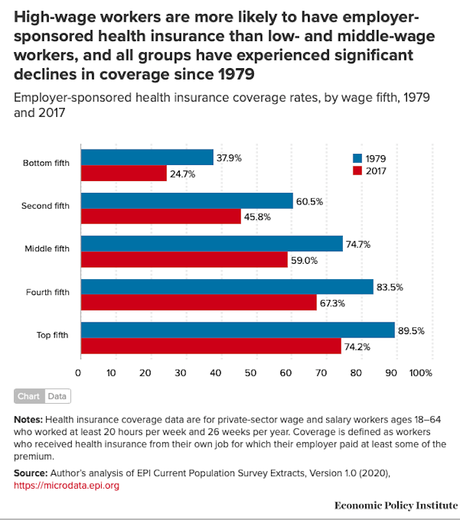
This is clearly shown in the nine charts above (from the Economic Policy Institute).
It doesn't have to be this way. We had a fair economy in the past, and we could have one in the future. But it won't happen as long as the Republicans remain in power.

