Not a lot of people are good at creating presentations at work, virtually we all need some sort of insights. Making a presentation engaging enough can only generate your audience’s interest. Also, the same can be your pick to bloom your business goals. In this article, we’ll talk about the eight best ways to make unparalleled presentations:
1. Keeping it simple
PowerPoint, in general, was required to project the analytical information to your viewers while you can support the same as the prime speaker. The ordinary PowerPoint presentation slides were never meant to be the star of the show. The thing is, people are there to hear what you have to say. The slides in the background are just for supporting the facts that you speak. Further, if one creates an appealing PowerPoint presentation, that can be a win-win. But, if your presentation is boring or ordinary & contains ‘N’ number of slides, it can surely destroy the charism of your content. Hence, rather than including chart junk in your presentations, you must strive to keep a lesser cluster in your slides, hence a powerful visual message can be delivered.
2. Limiting the text & bullet point
When it comes to the audience, it can be said that the PowerPoint presentations are created for the benefit of the same. What could be worse than boring your audience with an array of bullet points as well as the never-ending text? Now, you’d say that including no text is the key? Well, that’s not entirely true! Making use of PowerPoint templates from the providers like SlideModel.com can be a great choice if you wish to include lesser material and appeal more. Without the narration, PowerPoint endeavours for schooling students as well as corporate enthusiasts would be meaningless. Rather than making the speaker superfluous, the content in the slides must support the user in a splendid way.
3. Limit the animations
Making use of slide transitions as well as object builds are subjected to a judicious use. From object builds, we are referring to bullet points, images, gifs and other animations. It can be said that an array of graphical designs are awesome, though the excess of everything is cumbersome.

Including few but quality transition effects is necessary when it comes to alluring your audience. Users are advised to make use of 3-4 transitions and subtle animations in PowerPoint presentations. Your listeners might get bored quickly if they’re subjected to just not so appealing data.
4. Inculcating high-quality graphics support
It would be evident to say that the more are the senses, the more is the interaction. In other words, when you make use of images in your presentation, it acts as a word cutter, which is great. Not only it reduces the cumbersome content in your presentation, it also increases the engagement level of the same.
SlideModel.com is a leading provider of PowerPoint ready-made templates as well as high-quality royalty-free graphics that can be added to the presentations. Templates are 100% editable and built with PowerPoint shapes, making possible for the end user to edit the shape properties and adjust the presentation styles like colors and effects.

Thus, rather than degrading the resolution of pics, you can register as a premium user of SlideModel to get your hands on the pixel-perfect image designs. Always remember that the graphics that you’re projecting through your presentation have already been done by somebody. Taking up the services of a template and graphics provider for your presentation can be your out of the box pick.
5. Prefer PowerPoint templates rather than ordinary visual themes
You clearly require a consistent template throughout your presentation. Most of the visual themes are changing as your presentation progress. Just imagine as a viewer, you’re subjected to an ever-changing array of graphics, templates and themes. That would be not so appealing, plus it will kill your interest.

Always remember that a majority of the audience tends to expect an innovative presentation, hence ignoring the ubiquitous PowerPoint designs at all stakes is vital. Hence, a professional comes in to picture, SlideModel is a dedicated provider of state of the art PowerPoint templates which are robust in nature and offers a consistent appeal throughout the presentation.
6. Making use of Charts and Tables
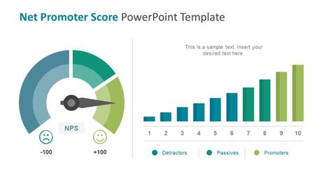
When it comes to depicting analytical data with added ease, it can be said that Pie Charts, as well as Tables, are the best pick. It is pretty obvious that a viewer doesn’t engage with algorithmic data like company statistics, log reports etc. However, you can inculcate some customizable pie charts, waveforms, tables, bar charts, flow charts and more to increase the viability of your content as well as make your presentation endeavor booming. SlideModel can be your savior, the site is offering a lush array of charts, diagrams, graphics, images, map add-ins etc.

What comes as a fascinating fact is that all of the above-mentioned amenities offered by the site are customizable in nature. Hence, a great deal of personalized input can be achieved.
7. Find the perfect color combination
When it comes to colors, we can say that they can invoke feelings as well as emotions. It would be wise to say that, when it comes to a better retention as well as comprehension, colors play a significant role. While making a PowerPoint presentation, you’re not required to be a professional, even a novice user can make awesome presentations with the help of the right presentation templates. The company can be your pick if you look forward to impressing your C-Level audience. For all the students out there, SlideModel can also equip you with much crucial insights, which are necessary for making out of the box PowerPoint presentations.
8. Choosing the right Fonts
What comes as a splendid fact is that Fonts are the soul of any presentation. They convey a hidden message which is subtle in nature. One must strive to choose fonts deliberately, the same not only improve your audience’s interest but also improves the integrity of your presentation. Google Fonts is definitely a good resource to browse fonts for your presentations. Fonts like Serif are best suited for on-screen presentations. Also, regardless of the font that you’re using, one should make sure that it’s big enough to be visible to the people sitting at the back of the room.

