Responsive design is an approach to design websites such that it responds well on all screen sizes, platforms, and orientations. with the user’s devices depending upon their screen dimensions and orientation.
This approach eliminates the need to design a new set of code for each new device. The primary focus is to deliver a consistent browsing experience to the users no matter what device is being used.
While the number of devices at our disposal have grown tremendously, this becomes a nightmare for web designers and testers. The web application should be able to render each page correctly on all devices with multiple dimensions. But the question is, how to perform such exhaustive testing?
Some of the most common responsive checks that you need to perform includes :
- Does the website load properly on all the major devices?
- Are all the tappable areas responsive?
- Does the text remain properly aligned on all device dimensions?
- Are the image placements and sizes intact?
- Are there any JavaScript errors?
Nowadays, to perform responsive checks, there are amazing testing tools, which ensures that your web applications are optimized for all the devices. There are several browser-based and standalone tools that help you to check the responsiveness of your websites. In this article, we will run you through a curated selection of 7 premium tools for performing responsiveness testing.
1. Testsigma: Testsigma, an automated cross browser and responsiveness testing tool, provides you with more than 1000+ Browser-OS and 2000+ iOS and Android devices on-demand to perform extensive automated responsiveness testing of your websites and applications. With features such as scriptless automation testing, parallel testing of test suites, drill-down test reports, and many more, Testsigma should be the go-to tool for all your testing needs.
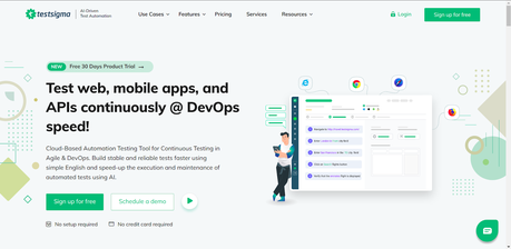
Top reasons why Testsigma sits right on top of the deck includes –
- You can automate your tests as easily as you write them in English
- A plethora of browsers, OS, and device combinations to perform extensive automated responsiveness testing and cross browser testing.
- Parallel automated testing for large test suites.
- Integration with popular CI/CD and bug reporting tools.
- Quick actionable feedback through comprehensive test reports.
- Excellent customer support with 24×7 availability.
It allows you to create automated test cases for UI testing which becomes very useful while performing testing on large test suites with complex functionalities.
Signup for a free trial and see it for yourself.
2. Responsinator: Responsinator is the simplest tool used widely for testing the responsiveness of websites. With a simple and sleek interface, you just need to enter the URL of your website. Without any hassles, you can easily see how the pages are rendered on some generic screens.
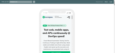
Reasons, why you can choose Responsinator for your responsiveness testing are –
- Cost-free but with ads.
- Simple and sleek UI with allowing you to interact with websites.
- Devices are available in both portrait and landscape modes.
- Great for quick checks but limited if you want to check breakpoints extensively.
With Responsinator, you need to perform cross-browser testing manually. It simply displays your websites in emulators where you can get an idea of what your website will look like on an actual device.
3. Screenfly: Screenfly is a free, in-browser tool that allows you to perform responsiveness testing on different screen sizes and devices. It allows you to add any custom screen size you want. Its featured devices include laptops, tablets, smartphones, desktops, and televisions. It allows you to rotate, scroll, and perform more such actions using simple click buttons at the top.
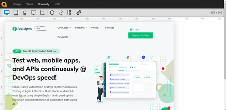
Some popular features of Screenfly that make it popular among developers include –
- Allows you to add custom screen size along with pixel-based screen sizing.
- Allows you to perform rotation, screen scrolling using simple click buttons.
- Provides support for devices such as tablets, smartphones, televisions, desktops, etc.
- In-browser, easy to use, and cost-free tool.
It only allows you to perform cross-browser testing by manually setting the screen sizes and orientations.
4. LambdaTest: The LTBrowser application by LambdaTest provides all the sets of tools needed to perform responsive testing and make the website mobile-friendly. It contains around 27+ devices and it also allows you to create custom devices. It also allows you to perform complete website auditing and share bug reports with your team.
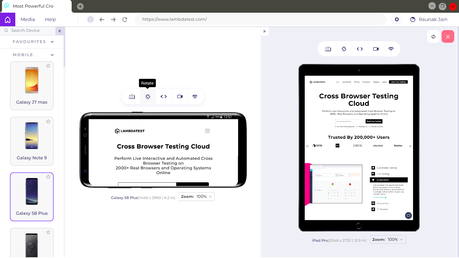
Some of the widely used features of LTBrowser tool are –
- Network throttling features allowing you to perform responsiveness testing on different network profiles.
- Scroll syncing and device rotation features.
- Compare on multiple devices and screen dimensions simultaneously.
- Screenshot and video recording of a full page.
- Complete website auditing and bug sharing.
It’s one of the most popular manual testing tools with a wide range of devices and its ability to create custom-sized devices is very useful.
5. Am I Responsive?: It provides its users with 4 different apple devices with resolutions – desktop (1600 x 992 Pixel), laptop (1280 x 802 Pixel), tablet (768 x 1024 Pixel), and mobile (320 x 480 Pixel). It allows all these different sizes to be compared directly. It is quick, simple, and easy to use.

Some of the features of “Am I Responsive?” that might come in handy for you are:
- It allows different sizes to be compared directly.
- You can drag the “Am I Responsive?” bookmarklet to your bookmarks toolbar to test the responsiveness of any site directly in the browser.
- You can perform scrolling of websites inside the devices.
- You can test websites served on localhosts as well.
- You can screenshot the results and use them in your portfolio.
It’s the simplest manual cross-browser testing tool that you will find and it might come in handy for quick testing purposes.
6. CrossBrowserTesting: It offers 2050+ real desktop and mobile browsers to perform responsiveness testing of your websites. You can easily validate public or locally hosted pages across multiple mobile browsers for complete compatibility. Similar to Testsigma, it is a one-stop solution to perform parallel automated tests, compare screenshots visually, remote debug the code, and interact with the website on real-world devices.
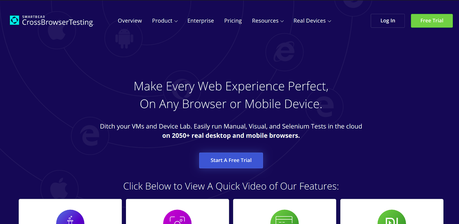
Some of the top-notch features of the CrossBrowserTesting tool includes –
- Spin up a custom browser-OS combination with a single click.
- Leverage native browser tools for debugging and consoles.
- Track and record network logs for performance.
- Debugging behind the firewall or proxy using secure tunnel technology.
- Perform scrolling and swiping on real mobile devices.
7. Browserstack: It gives your users a seamless experience by allowing you to perform responsiveness testing on 2000+ real browsers and iOS and Android devices. It provides large testing coverage and the breadth of testing options is invaluable. Its ease-of-use tools allow you to perform responsiveness testing quickly and efficiently.
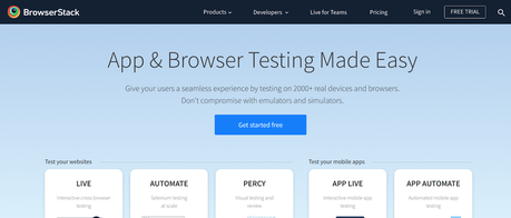
Some of the features provided by Browserstack that you can leverage for your own use includes –
- Selenium-based automated and live responsiveness testing for websites.
- 2000+ real iOS and Android devices and browser-OS combinations.
- Uncompromised security with pristine browsers and devices available on demand.
- Allows you to integrate with CI/CD tools and get test results directly in Jenkins and Slack.
- Visual testing and review.
All the tools listed above only simulate how a website is displayed. However, some content cannot be displayed using responsive design tools. For example, it cannot simulate the way a website performs on high-performance devices, how a multi-touch screen control affects a site’s UI, scroll bars may appear on the simulators which do not exist on real touch screen devices.
Despite this, online responsive tools prove to be a valuable responsiveness testing tool for performing comprehensive tests. Developers benefit from the uncomplicated, quick modification of the resolution which immensely accelerates the testing process.
It’s always a good idea to play with a couple of options before you settle for a single tool. All of these tools workly slightly differently and have their own levels of user control. It’s best to try out each one of them and then decide your favorite ones.

