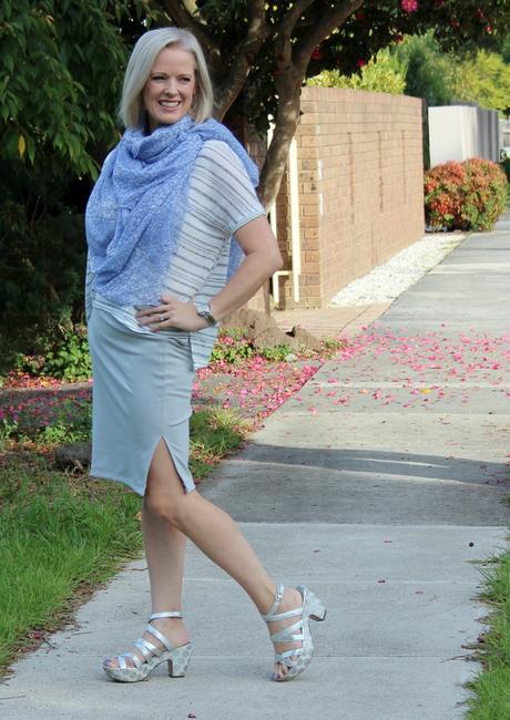
So many people tell me they don't know how to mix colours, and really it's not hard. There are a few key tips to consider.
- Mix colours of similar intensity
- Mix colours of similar value
- Mix colours with the same undertone (warm or cool)
- Add your value contrast with a neutral
- Use colour schemes to create pleasing colour combinations
Neutral Plus 1 Colour
This is the easiest scheme and can be worn by all. It can seem dull if you have triadic or complementary colour contrast though (and then I'd think about adding an alternate coloured necklace to bring in the pop of extra colour you need).
2 Neutrals plus 1 Colour

Monochromatic
Monochromatic means shades of the same colour (mono meaning 1 and chromatic meaning the presence of a rainbow colour, not black, white or grey). Here there is a dominant colour (cobalt) which is about 2/3 of my outfit and then the secondary colour (turquoise) is around 1/3 of my total outfit.
Achromatic
Even though black and white is a high value contrast (and I'm medium value) I can get away with wearing black and white when I do it like this.
- Keep the vast majority of the outfit light (as I'm dominantly light in value)
- The contrast with black is only in small proportions - fine lines not too heavy
- Wear darker eye makeup to up the contrast of my face
- Wear a bold lipstick colour - again to help increase the contrast on my face
Analogous
Analogous means 2-3 colours that sit next to each other on the colour wheel. Here I'm working with blues through teals to greens
Triadic
Here pink and blue (remember that pink is just "light red") work as 2 parts of a triad.
When wearing 2 colours think about the proportions of each colour, keeping them uneven rather than even.
Or go back to the traditional red, white and blue - which is again 2 parts of a triad along with a neutral.
Split Complementary
Complementary schemes can seem too bold sometimes (red and green scream Christmas), but the split complementary, which is one off the opposite is an easier way to create a colour scheme. Here I'm doing blue-green (teal) and pink (remember, almost red) which creates a really bright and exciting colour scheme.
It can help to have a larger proportion of a base neutral such as these white culottes and then the colours in smaller percentages of the outfit so that you are not overwhelmed by too many colours, particularly if you don't have high colour contrast.
Read more on how to mix and match colours here.
Linking this post to: Top of the World, My Refined Style, iwillwearwhatilike, Visible Monday, Let It Shine, Monday Mingle, Style Sessions, Turning Heads Tuesday, Trend Spin Link-Up, What I Wore Wednesday, Brilliant Blog Posts, Throwback Thursday, Passion for Fashion Friday, Friday's Fab Favourites, Style Stories, FlatbumMum, The FABulous Journey, Mummy's Got Style, Sydney Fashion Hunter

