Whether you offer photography services, franking machines, second hand office furniture or otherwise - here are 10 features to make you stand out from the crowd.
Each and every business envisions themselves differently from the next, even two branches of the same business want to be different. But in terms of website characteristics there are a number of things which can help any website from any industry stand out and implementing these can really help your chances of success in gaining more clients and web traffic.
Remember the below are valid regardless of your industry or website type. Unless you are just blogging and then maybe number 4 isn’t for you.

1. Simplicity is Key
Successful websites have a simple design, they focus on the essential and eliminate the frivolous.
This isn’t about removing content from your website, it’s about organising it in a simple manner which aids readability, click-ability and helps keep users on your website.
Simplicity is about you taking on the mindset of your visitor and potential customer. Simplicity is about ensuring that you get the visitor in front of the information they need and want. Simplicity is about removing “waste” choices and simplifying the route to conversion.
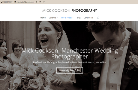
This idea is something Manchester Wedding Photographer, Mick Cookson has really understood with his latest website. A reduction in clutter, simplification of his navigation and simple calls to action make his website much more user and search friendly.
2. Responsive Design
Responsive Web Design has become very important in recent years, with many websites seeing anywhere from 20% to 70% mobile traffic. SEO Andy for example has 48% mobile traffic from smartphones and tablet devices. Ensuring a great user-experience, regardless of device, should be a priority for any business wanting to get the most from their online presence.
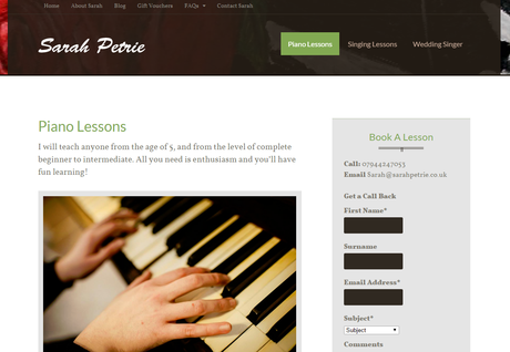
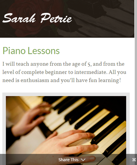
Couple this with Google’s recent loving towards mobile-friendly sites, and its easy to see just why you should be focusing on Responsive Web Design. As you can see below, Piano Teacher, Sarah Petrie’s website is responsive in design – including the sharing functionality to social media (see “share this” in gray at the bottom of the mobile version), the contact form also moves to the bottom below the important content.
Ultimately, like with “simple design” (above), having a responsive site is about ensuring you are always putting your best and most relevant content in front of your visitors. Think about how annoying it can be to ‘pinch and zoom’ constantly, or to have the little magnify screen show when you tap a link. Put your users first, embrace responsive web design.
Mobile Search Ranking
Google’s recent update ensures “users [can] find it easier to get relevant, high quality search results that are optimized for their devices.”
3. A Clear Navigation
Navigation bars are often an “after thought” of the design process, all to often they become the down fall of what is otherwise a brilliantly designed website.
A great navigation bar or an OK navigation bar could mean the difference between a conversion or a bounce. There is little more frustrating than wanting to find a piece of information but not having the tools or links to get there.
Here are 3 examples of simple and effective main menus: Kopi is about direct information quickly, Sarah Petrie’s is the same and Mick Cookson’s is about user direction & searchability.
Remember: Very few people will take your website address and search for a term on your site using Google – think like a user and make life easy for them, put things where they want them.


4. Awesome Forms for Helping Conversions
Contact Forms, Checkout Forms & Search Forms
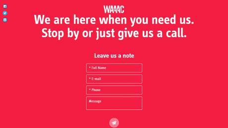
Whether you are selling £1000 pieces of photography equipment, £150 pieces of jewellery, customer services such as wedding photography or indeed offering free resources – the secret to more conversions is an easy conversion system, starting with navigation and search and ending in contact!.
The form to the left is by Brand Designers, WAAAC who have a contact form that even my gran could use! The form is so simple and elegant that it would be near impossible to not know what to do once you see it.
Below are some more examples of simple to use conversion forms, from ecommerce to subscription forms.
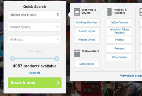
AO Search Function from Homepage.
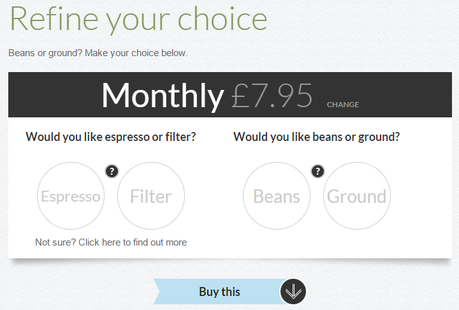
Kopi Coffee, simple coffee buying selection system
5. A Great About Me/Us Page
For many the “about” page isn’t viewed as important, apparently no-one ever reads them and even if they do they don’t take much notice of them. Well I am afraid to say those people are wrong (at least in my opinion).
Normally the most boring page on the site, for me an about page can make the difference between someone contacting you or your competitors. A great about page is pretty hard to find, but hopefully the examples below are useful for inspiration.
About pages need to be more than just a boring blurb, you need to get to the point, give only the information you need to, give some social proof (testimonials) and have a nice design – do all that and you’ll be the first one to get an email, not your competitors.
Most Visited Page
About pages are usually among the most visited pages of any website. Don’t let your about page drag you down.
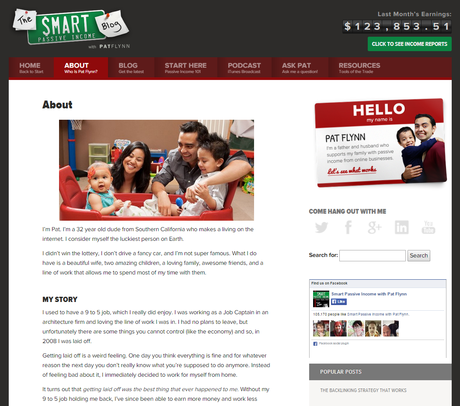
Pat Flynn / SPI – uses a family portrait to engage visitor emotions.
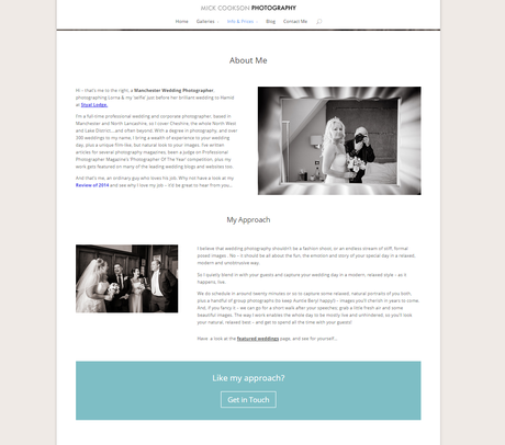
Mick Cookson – explains his approach clearly and has a definitive call to action.
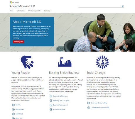
Microsoft – use their about page to set out key biz objectives.
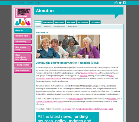
CVAT – use the about page to link to vital sections of their website.
6. Fast Loading

We are all on a time budget, we only have so long to do certain tasks, we want to find the information we want easily & without waiting around. A while back Google made clear that it wanted to support faster websites, it even released the Google Page Speed test (way back in 2011) which constantly gets updated.
Speed goes along with your site being mobile friendly. The faster it loads in general the better the user experience will be. There’s a ton of things you can do to help improve your website speed (using the Page Speed test is one way) others include:
- Use a CDN, SEOAndy uses MaxCDN
- Implement Caching systems (wordpress has plugins for this)
- Upgrade your web hosting
- Don’t use image files bigger than you need too.
- Test your site on different devices to find any issues.
7. Have Awesome SEO
Great SEO is about putting your website and users first, and then Search Engines. It’s also about a holistic view of digital marketing, everything together rather than focusing on a single aspect (such as search ranking).
Major On-Site SEO Challenges:
- Meta Titles & Meta Descriptions
- Great Textual Content
- Simple Navigation
- Clean Code
- Implementation of Sitemap
- Use of Image Alt Text
Major Off-Site SEO Challenges:
- Brand / Website Reputation
- Social Presence
- Awesome Links
- Email Marketing
- Offline Reputation
SEO is a Journey, Not a Destination
Make Your Website Stand Out
Looking for SEO or conversion assistance, get in touch with SEO Andy today.
Contact SEOAndyOriginal SEO Content by SEOAndy @ 7 Features to Make Your Website Successful

