In this blog, I am going to share with you Awesome Ecommerce Store Designs
For many consumers, browsing online stores is a hobby. It's a way to pass the time and have an enjoyable experience, even if we don't buy anything.
It's become a much more pleasurable experience to use many eCommerce websites as a result. More companies have realized the importance of the shopping experience and are investing heavily into creating that little sense of joy.
We all know how frustrating it can be to deal with some businesses online, and life's too short to use a site that doesn't put the consumer first.
An astonishing 47% of visits to ecommerce websites involve only one page, because people are put off so easily, and they leave right away. On the other side of the spectrum, you have companies like Amazon and Walmart that have massively increased their growth largely because consumers enjoy using their sites.
There are many smaller businesses that also have great experiences which you might not have seen yet.
What makes them so appealing is how they tell a story through their site, which makes them memorable and keeps their customers coming back for more, clear prerequisites to experiencing ecommerce growth .
You can learn more about what great eCommerce website designs here , but below are some stand-out gems.
1. Bohemian Traders
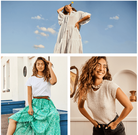
Source: Bohemian Traders
With "Bohemian" in its brand name, this website has a lot of pressure on it, but the design delivers. It has a crisp white background with soft images, usually featuring water in "golden hour" situations . The similarity between the images creates a lasting impression of relaxation - the sun and a vacation vibe.
This common thread of images continues onto the product list page and notably, the models are almost always smiling in the photos. This is a website which feels friendly and inviting for the visitor.
The product pages themselves feature images of multiple models of different sizes wearing the clothing to create a sense of inclusivity rather than snobbery. It's a simple and easy touch to add which not enough brands make use of.
This aspect is further enhanced, because they clearly display the range of sizes they offer, from XXS to 4XL. No matter who you are, you're part of this tribe.
When you add a product to your cart, a popup appears with a large image of the product you've bought and asking you what's next.
You can proceed to checkout or continue shopping. It's actually a very important step to highlight this, because over 84% of us abandon carts without checking out.
By prompting the user to click "continue shopping" to continue, the Bohemians help people to not accidentally forget to buy something they wanted.
LARQ has been featured on Shark Tank and offers the innovative product of a self-cleaning water bottle. Their website captures the essence of what they are - through expert use of color, font and styling to take you on a journey.
The banner image on the homepage features a man with a surfboard holding one of their bottles. It creates a sense of who their market is, and the text is "Dip into pure water," which makes it feel like you're starting an adventure.
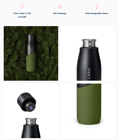
When you reach the shop, the key text tells you to "Sip smart" and tells you exactly what the product does. The selling point of eliminating germs appeals to the health-conscious shopper.
The products are laid out in block colors, and when you hover over a bottle, the animation shows the lid coming off, which invites you to take a peek inside.
From within the product page, you can change colors easily with a beautiful bold palette.
There's another subtle element when you add an item to the shopping cart. A progress bar at the top shows you how far you are from free shipping and earning store credit. By gamifying the upsell, part of you wants to see if there's anything else you can buy to get these perks.
The whole process is seamless, with everything on each page adding value which makes it a pleasure to use at each step.
3. Urban Originals USA
Urban Originals creates cruelty-free bags and has a simple website that never loses sight of its brand positioning.
The homepage is dominated by a pastel pink banner image featuring a model without any text. It lets the consumer take in the style and the bag with a pause before scrolling to find what they are looking for.
The product list page is simple and has all the color blocks the same shade of grey, to make the bag pop out in comparison.
The product page itself doesn't overwhelm you with detail. It has a simple description and a few pictures and that's it. Notably, the layout mentions the ethical aspects prominently here, rather than burying them in minor product details.
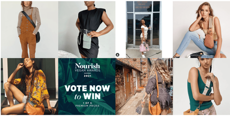
The banner menu is where the design here truly tells a story. It contains only four options, and two of these are "The Brand" and " Choose Kindness. " For first-time visitors, it makes this easy to find out more about the company and what it stands for without the information being lost in submenu oblivion.
Their entire "About" page focuses on their work against animal cruelty rather than their product specifications. You learn that Urban Originals donates 10% of their profits to human rights causes. You might be here to buy a bag, but you're part of something much larger, too.
To really hammer that point home, the " Choose Kindness " page has only three sentences. The slogan "Choose us, choose kindness" is powerful and memorable. Having an entire page in the permanent menu dedicated to this is a masterstroke.
This website is a great example of a company that keeps things simple so you don't lose sight of their cause and how you can be part of it.
4. Sabon USA
Sabon's website oozes opulence. The use of gold and silver products with subtly blurred backgrounds creates a pop effect on the page. This is clearly a high-end personal hygiene brand with a focus on natural ingredients.
Their main action on the homepage isn't "buy" or "shop now" - it's "Discover the benefits." This use of words encourages you to explore and learn rather than be pressured into making a purchase.
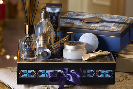
The product page is simple and clean. A nice touch is the use of bullet points in the product description for the key benefits to make it easy for people to skim along.
Once you add to the cart, they have a cool feature where the site recommends additional products under a "You'll also love" heading. It shows three suggestions in an unobtrusive way next to your shopping bag. This is a feature from AI company , which is growing in popularity across eCommerce.
It bases these suggestions on what each shopper is most likely to be interested in, based strictly on that individual's browsing sessions.
The language choice here is great. Amazon shows you what other people bought after you purchase, which feels like a naked attempt at a sale. "You'll also love" feels far more natural and inviting rather than coercive.
Sabon has created an experience where you are encouraged to browse and learn rather than funnelling you into a sale. You could easily spend hours looking at all their different products.
5. Skullcandy
Skullcandy's website is a lesson in how to use black with bright colors to give an edgy yet luxurious feel. It's sleek at every stage of the process, with heavy use of animation, which makes sense for the industry they are in.
They use stories throughout the website experience. The featured product is Hesh Evo Wireless Headphones, and the website background reflects the vibe of the product itself.
Instead of talking about how great the headphones are, the product page talks about designer Desiree Melancon, who is a world-class street snowboarder.
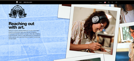
You learn the story of what she stands for, which is acceptance of mental health conditions and inclusivity.
You then learn if you buy this product, part of the profits will go towards helping her campaigns. It's a fantastic way to make the consumer feel like they are part of something bigger than just buying headphones.
Another standout on their storytelling aspects is the "Inside SkullCandy" section. It makes you feel like this is a tribe, not just an online store. The use of the bold white font on high-quality photography of adrenaline-pumping events adds to the sense of adventure.
Here's a snippet from their "About" page: We're for music you can feel. For front rows. And first chairs. Demo tapes. And dropping in. Deep cuts. And dawn patrol. Because we don't believe in tuning out. We believe in tuning in.The short sentences create a dramatic atmosphere which is exactly what they want. The visitor feels part of the journey. There's so much to explore, including videos on the different products and their backstories.
Quick LinksConclusion- Awesome Ecommerce Store Designs 2022
To create an eCommerce shopping experience that's truly customer-centric, independent retailers need to take design to the next level.
When smart design effectively turns product discovery into a storytelling-driven journey, customers can feel like they're not just with you for a cold transaction - they're investing in better versions of themselves.
As a result, eCommerce companies that do this well are likely to see significant lifts in sales conversions, order size, and loyalty over time.
