A major part of having a strong online presence for a website is its ability to provide seamless and responsive user-experience on any internet access device, including mobile devices such as smartphones and tablets. Same applies to your practice’s website which is an online window for your patients to take a look at what’s inside of your brick-and-mortar practice.
With the high popularity of smartphones – for their ability to provide internet services on the go – your practice’s website needs to be completely mobile-optimized and responsive so that patients landing on your site can get a seamless user experience while navigating through it.
According to Google, 60% of all healthcare related searches are now happening on mobile devices such as smartphones and tablets. This means that even if your website already has a strong presence on the web, but not mobile-responsive or mobile-optimized, it will lose on a huge portion of total internet traffic looking for information and services on the web.
In this second part of the blog on the 3rd pillar of healthcare marketing success, i.e., a robust online presence, we’ll discuss the role of mobile optimization in boosting your online presence.
Read the first part of the 3rd pillar blogs to know more about the essential components of a strong online presence for your practice.
Why Patients Love Using Mobile Devices for Searches
Mobile devices such as smartphones and tablets come handy as they are more personally used, and can be carried along while on the go. Modern patients are highly observing about their health conditions and possible treatment options. They like to check the facts before selecting a provider or a treatment. And they want to know the details as and when the need arrives. Their search for quality care keeps going on even after they have received the treatment; for ensuring proper after care.
So, it all comes down to the idea of being aware about everything. The need to be aware can arrive at any point of time and in the middle of anything. It’s the mobile devices, and not the desktops that offer such flexibility of use.
Here are some mobile-exclusive features (that a desktop doesn’t offer) that come handy during search activities on the web:
- Allows for finding nearby treatment centers from any location
- The map feature helps in locating a treatment center or a medicine shop, and the GPS system helps in navigating a patient to the treatment center
- Tap to call feature allows to make a phone call at a clinic with a single click
- Providers are looking for newer opportunities to engage with patients on social media which is field of mobile-based social media apps
- Patients like to share useful information with relatives, friends, and even with their providers on social media which is possible with smartphones and tablets, and not with desktop (at least not easily)
Boosting Online Presence with a Mobile-Optimized Site
Search engines have started giving importance to websites that load on mobile devices pretty quickly and adaptively. Google made some updates in 2015 to start giving preferential treatment to sites that are mobile-friendly. Not just that, the search engine giant is already checking the scopes of the full scale implementation of its mobile-first index.
The mobile-first index means Google will use mobile version of the content for indexing and ranking, to better help our – primarily mobile – users find what they’re looking for. With that, the mobile versions of the websites will be treated as the primary page to index, with desktop versions being secondary.
Here’s what Google has to say on its mobile-first indexing:
To make our results more useful, we’ve begun experiments to make our index mobile-first. Although our search index will continue to be a single index of websites and apps, our algorithms will eventually primarily use the mobile version of a site’s content to rank pages from that site, to understand structured data, and to show snippets from those pages in our results. Of course, while our index will be built from mobile documents, we’re going to continue to build a great search experience for all users, whether they come from mobile or desktop devices.
What this means is if your website is optimized for mobile, it will rank on both mobile and desktop. And if it isn’t, the ranking will tank on both mobile as well as desktop.
That’s why mobile optimization is essential for a robust online presence.
Mobile-Optimization Factors That Increase Search Ranking (And So Your Online Presence)
There are some factors that ensure your site is well-optimized for mobile devices, such as page loading speed, ease of navigation, proper visibility of the web page content, clear and large icons, etc. You can check for these on your own. All you have to do is take out your smartphone, type in your site’s address in the browser’s address bar, and see how your site performs on those factors. Or, simply enter your website’s URL in Google’s Mobile Friendly Test Tool to see how your site is performing.
Let’s check out in detail about the most important factors for a perfect mobile-optimized site:
- Mobile Responsive Design
Design of your website should be such that it can almost speak out to your users about what to look at, where to go, and how to take actions. Here are the most important elements of a highly mobile-responsive website:- Large CTA buttons: Call-to-action buttons (for phone calls, appointment scheduling, or free sign up, etc.) should be clearly visible, and should clearly express its purpose. Your patients landing on a wrong page because of a confusing CTA button irritates users and which can cause them to immediately leave your website.
- Clear navigation menu: Make sure your website ensures an easy and quick navigation. A vertical navigation is preferred. An ease of navigation on your site means your patients should be able to find what they’re looking for easily, and in as little steps as possible.
- Map and GPS navigation facility: Map facility on your site will help your patient locate your practice, without hassle, with just one click. Also, by incorporating a simple navigation button, you can relocate patients to their GPS application that will help them in showing directions to reach your practice.
- Include a search bar: A search bar on top of the home page of your website helps your patients find what they’re looking for more directly. It reduces wandering for your patients, which is not so good for you from the SEO (search engine optimization) perspective. However, it’s very good from a user’s perspective as they can directly access the desired content more quickly.
- Less graphics: A mobile-optimized site shouldn’t be excessively loaded with graphics as it will not only interrupt the user’s path to the critical information they are seeking, but will also lower the site’s page loading speed.
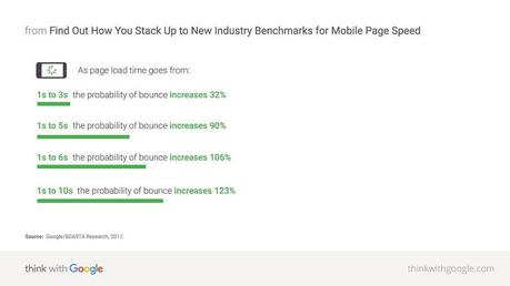
- Page loading speed: A responsive website will not benefit much if it cannot be accessed quickly. A slow page loading speed causes an increase in the bounce rate that as a consequence lowers your website’s search ranking.
See what Google has to say about the page loading speed and the bounce rate:

Note: When checking your site’s page loading speed, use your cellular network data, not the Wifi data. Patients outside their home or office will be more likely using the cellular data on their mobile for internet access.
- Mobile-Optimized Content
Optimizing your website is a great thing, but that doesn’t guarantee user engagement on your site until its content is also mobile-optimized. After all, your patients will stay on your site not because of your site’s design alone, but also because of the engaging content on it. The term ‘engaging’ doesn’t just count for quality, but also for quick loading and proper visibility on a mobile screen.If your content isn’t optimized for a proper visibility on the mobile screen, how can you suppose that your patients will go through it, and more favorably, take any converting action?
Let’s have a look at the screenshot below to understand how people consume data on mobile devices:

(Source: Neilpatel.com)As the image above shows, 68% of a user’s attention is on the top half of the mobile screen, and 86% of their attention is to the upper two-thirds. Content lying below that area are rarely viewed. However, you should still optimize all your content.
Here are the important qualities of a mobile-optimized content:
- Optimizing text content: The attention span of mobile users is very low compared to that of the desktop users. This means that you should keep the title or headline of your content short and simple. Researches in this field shows that headlines with 55 characters or 7 words (on an average) perform the best.
The body of the content should also contain shorter paragraphs. Each paragraph should focus just one point, and they should be under 5-8 lines as seen on a mobile screen. Using bullet points to list down data, or for explaining data in steps is a good way to make your content short, concise, and engaging.
Also, consider using short words, such as ‘get’ in place of ‘obtain/acquire’, and ‘next’ in place of ‘subsequent’. Using one-word substitutes like ‘to’ in place of ‘in order to’, and ‘now’ in place of ‘at this point in time’ is also a good idea.
- Optimizing images and video content: Doctors can make great use of images and videos to explain difficult treatment processes, or detailing a complex topic. Using images and videos for explaining makes the content engaging, and thus increases your search rankings. But they need to be optimized according to the mobile screen.
Images
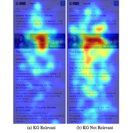
Eye tracking studies for images show that mobile users look at images more than they look at text.
(Note: KG stands for Knowledge Graph – the entity results, panels and carousel summary are provided by Google.)
The screenshot shows that images over text catch more user attention. To achieve the best results, offer your most valuable information directly after an image.
In terms of image size, keep them less space consuming. There are many tools out there that let you compress your image’s size without compromising on its appearance.
Video
Online videos are the fastest growing gateways for healthcare information. According to Google, 70-80% of all the content that consumers are engaging with online will be through video by mid 2018. What’s more – most of that traffic would come from mobile devices. That’s why, focusing on video content is necessary to boost your online presence.Tips for mobile-optimization of video content:
- Make sure the text you incorporate in your video is clearly visible
- Make sure your video makes sense even without the help of audio; 85% of videos on Facebook is played without sound
- Embed third-party video hosting services like YouTube, Vimeo, etc., to ensure bitrates, compression, and other such issues on an automatic basis
- Optimizing text content: The attention span of mobile users is very low compared to that of the desktop users. This means that you should keep the title or headline of your content short and simple. Researches in this field shows that headlines with 55 characters or 7 words (on an average) perform the best.
Think like a user (your patient) when analyzing your site for mobile optimization. In fact, become a patient for a while and go through the whole process of finding a provider through search engine, check out your website, and go through the hassle of booking an appointment too. Do everything on your smartphone. This whole process will give you a clear understanding of what on your website needs to be optimized for mobile devices.
This is the 2nd part of the 3rd pillar of healthcare marketing blogs. Read previous blogs here. Wait till next time, when we come with our next blog in this “3 pillars of healthcare marketing success” series.

