BUY NOW! Atharintiki Daredi Official Merchandise@CelebOutfit
Enjoy reading cinecorn.com on your Smartphones. Download the FREE App right now. Android App / iOS App

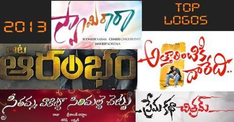
This year has been rather poor on this count unlike last year which had few really good one’s to put in a list. Still we try our best to make a list. Here are the top 5 first look/logos from movies released last year.
Swamy Ra Ra
The film did everything that could be done right to gain the attention of the viewer. It was especially important because it was a small film. The first look of the film was a beginning which gained audience attention and the unit did well to hold on that attention till it was out of theaters.
Aata Arrambam
Most of the Telugu titles come in a very generic and predictable font. Its courtesy of some dubbed flicks like these we get to see the something new being and creative done using Telugu font. If last year Vishwaroopam and Thuppaki made the logo design look creative and cool, this year Aata Arrambam does it.
Prema Katha Chithram
Yet another small film finds itself on the list. The title logo with its cloudy ghost like quality was very neatly done and went superbly well with the theme of the film.
Atharintiki Daredi
Among the big films Atharintiki Daredi easily finds a place among the list because of its well designed and intended logo that makes clear the theme of the film. A confused Pawan Kalyan and the two pointers in the title pointing towards the two opposite ends make the logo interesting and gives us a feeling that little bit of thought was put up while designing it.
Seethamma Vakitlo Sirimalle Chettu
For the kind of hype the film had being the first true multistarrer, the logo of the film was fairly simple and set the tone perfectly for the film. Different colors with plain and simple Telugu font hinted at what the film was going to be all about in a very subtle manner.
