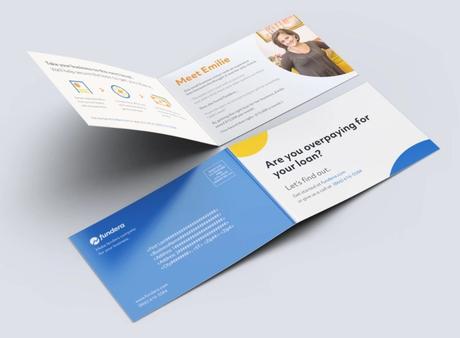
Are you designing mortgage marketing materials? What is your process? Rushing through the design phase of marketing materials can lead to poorly crafted and executed documents with limited success. When designing sales materials of any kind, it is crucial to focus on at least the following ten areas.
1. Know Your Target Audience
First, you must define and know your audience. In terms of mortgages, what type of clients do you want to attract? For example, high-income individuals will typically expect different design elements and phrasing than middle-class or lower-income clients. You need to know the difference.
2. Use Relevant Images
Next, use relevant images. For example, when offering mortgage assistance, you don’t want a picture of your office building or a sales rep. You would likely be better served by using images of homes or families, depending on the types of mortgages your company offers.
3. Show Don’t Tell
Also, don’t tell people to buy or apply to your service immediately. Ease into it. Start by showing the prospective client why they need your service. For example, using the mortgage example again, consider low-interest rates or creditworthiness.
4. Use Headlines and Graphics to Guide Customers
Images and headlines should be used with purpose. Don’t just break up text because you think the brochure or ad needs a page break. Graphics should highlight the service and headlines should explore benefits or organisation.
5. Use Benefit-Oriented Headlines
While headings can be used to organise the information, a better use of headlines is to express benefits. For example, quick approval times, low-interest rates are just a few things that could work as headlines for mortgage marketing.

6. Use Bullet Points to Highlight Features
Next, bullet points are useful for highlighting features. People’s eyes are drawn to list and bullet points. If they are enticed by the information in these lists, they are more likely to read the material.
7. Focus On Readability
It can be easy to overdo it with graphics and headings and fonts. Companies can become to engrossed in design and style rather than the delivery of information. Make sure that graphic and stylistic choices don’t take away from the information.
8. Motivate Consumers to Take Action
Next, be sure to include a call to action and to encourage consumers to take action. It is all too common for marketing materials to focus so much on the service that it neglects the purpose of the information: to drive sales and business.
9. Make Ordering or Response Easy
Next, make sure that the ordering or response process is easy. For example, sending an email or making a phone call. If the process is too complicated, then you may lose the sale.
10. Remove Doubts and Risk
Last, the materials should try to eliminate any doubts or risks for the consumer. For example, offer a no-obligation consultation or a free sample, anything to reduce the stress or indecisiveness of the client.
The above ten tips are only a beginning to designing and creating effective marketing materials. Contact a marketing or strategy firm to discuss your specific needs and business.

