One of the things I have always loved about True Blood are the sets. The designers have every last detail included down to the junk in the waste paper baskets. The photos on the wall in Sookie’s house are real childhood photos, and remember Gran’s room when Sookie was cleaning it out, and we got to see her private possessions. The True Blood set design spearheaded by Suzuki Ingerslev has done it again with not only Eric’s renovation of Sookies house, but also the changes that have been made to the Comption home now that Bill is made King of Louisiana. I have to admit I kind of miss the battered and scared home that Bill first moved into, but this new look sure is mighty grand and fits Bill’s new status as King. She also did a nice renovation of Sookie’s house, now owned by Eric.
Below is part of an interivew from the LA Times with Suzuki about the renovations that have taken place in Season 4 of True Blood:

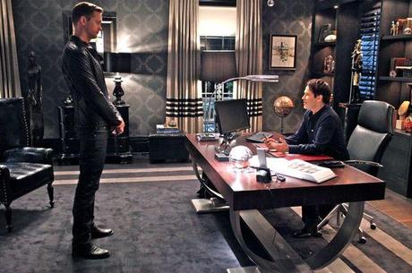
In painstaking detail, “True Blood” production designer Suzuki Ingerslev answered questions about the inspirations and resources used to create striking residences for the show’s characters including Bill Compton (played by Stephen Moyer, above right), Vampire King of Louisiana, and Eric Northman (Alexander Skarsgard, above left), now landlord with a swanky bachelor crypt in Sookie Stackhouse’s family home. Chief among the topics in our email exchange with Ingerslev: the formerly mud-encrusted home of Sookie.
Question: Sookie’s house looks new. How did it get that way?
Answer: Eric repainted the façade a warm yellow color (Dunn Edwards DE5373, Clay Dust) with Navajo White (DEC772) trim and touched up the landscaping. Eric kept her house the way he knew she liked it best, which is how her Gran originally decorated. We updated a few electronic appliances, such as a microwave and big screen TV, which are actually gifts for Sookie from Eric.
Bill Compton’s house really got the extreme makeover, from shabby to unbelievably chic. Why does it look so contemporary?
When we first meet Bill in Season 1 he inhabits a worn-down antebellum home that was inherited by ancestors who, over the years, had performed various remodels but had left it in ruin. It did have a Victorian feel, but that style wasn’t necessarily an indication of Bill’s taste. We chose a modern style for him because we felt he had been around for a long time and had traveled the world. There are antiques and treasures from other countries and time periods he might have accrued through his adventures.
What reference materials did you use?
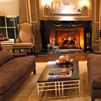
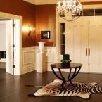
Books on plantation interiors, traditional homes and modern furnishings, as well as Object Magazine. The more modern feel creates an interesting juxtaposition between the traditional plantation architecture and the furnishings. The set does have an elegant Regency feel, and I really wanted it to be sophisticated and sexy.
His office has a Hollywood Regency vibe, normally a somewhat frilly style. But it reeks of sex and power, doesn’t it?
It is meant to be his lair. We wanted the room to be extremely masculine and authoritative and could be a place from which King Bill could stage his power plays.
Are we to believe that Bill had a decorator?
We are to believe Bill employed an interior designer to decorate the place, but it was ultimately his vision. As a king, obviously, he wouldn’t tend to the myriad mundane tasks but would oversee and exercise control over the finished product.
He’s got a lot of interesting objects on his shelves. What are those about?
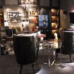
We wanted the room to be indicative of his secret inner life, to illustrate his true personality and reflect Bill’s experience of having seen the world throughout the ages. The layers of collectibles indicate a well-traveled and timeless life. We had fun playing around trying to guess which items may have been received as gifts from various fellow vampire dignitaries.
How did you set the tone for the office?
A good part of the room’s inspiration came from the wallpaper selection (Astek Wallcovering). The monochromatic scheme prevented the room from becoming busy or competing with the numerous collectibles. We worked to bridge a gap between old and new by finding traditional plantation elements that were done in a fresh way. The light fixture over Bill’s desk, for example, is a traditional crystal chandelier encased in a not so traditional black silk lampshade. The desk itself is also very modern with its high chrome finish. That piece was very important to the overall design because it provided an anchor for the entire room to spin off.
To read the rest of this interview go to: latimesblogs.latimes.com
See more photos here:


