Sweet mother of goat milk. Don’t feel bad. I did it too. I was once a doofus.
It’s okay to be a doofus.
Be weird. Normal is the new boring.
You + Me = doofus squared.

I have a wee surprise for you today. A guest blog post by Lisa Smith from Decor Girl.
Lisa is a blogging pal of mine. And she’s nice. And smart. And an interior designer. And she freakin’ races cars !! And I know she doesn’t start sentences with and. She actually formulates real sentences. Imagine that? And I have a few things to learn from her. And so do you.
Starting with : how to hang your pictures so you won’t look like a doofus.
Maybe we can even convince her to teach us how to race a car.
Note : I would only want to race cars if I could wear a racing jersey with jazzy lettering and sexy race car gloves. With super model hair. The kind of hair that looks good even when the helmet comes off. I dream. I get helmet head just thinking of wearing a helmet.
I’d also want one of those big racing stripes right smack dab down the centre of my race car.
So mature. Vroom vroom.
A race car driver and interior designer all wrapped up in one package is an epic combo for a blogger, don’tcha think?!! She is all that and a bag of chips. It’s times like this where I wish I was a lesbian. She’d make a great partner. She can drive fast and she can blog.
Explosive combo.
Do you wish you were a lesbian now too? Too bad. She’s married. To a guy. Me too. But who’s splitting hairs with mundane facts like that?
I’d actually consider lesbianism for one other reason. Ellen.
A guest blog post from Lisa Smith at Decor Girl :
Artwork is as personal and emotionally charged as our choices in clothing, music and food. Displaying artwork in our home is much less subjective and it is easy to stray off course. While I was interviewing BB, a professional framer and art installer, for an earlier post our conversation took a turn towards the mistakes she encounters with regard to artwork in people’s homes. I’d like to share those with you.
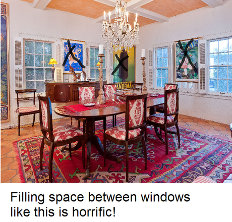
The Common Mistakes People Make When Hanging Artwork
- Don’t use too small of piece for the scale of room or furniture. BB reiterated more than once, “I don’t know why but people have this thing about buying artwork too small and then hanging it over mammoth pieces of furniture.”
2. Mix it up a bit. Don’t hang everything in a row around the room. Use two-dimensional (flat) pieces and three-dimensional (sculpture) in the same room.
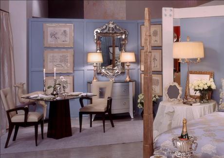
3. Allow for negative space, not every wall needs artwork.
4. Don’t be afraid to hang a picture or mirror by a lamp. Layering is fine. This enhances the textural experience of a room.
5. Hang artwork using two hooks or hanging points so nothing shifts. “I often go into homes where the cleaning crew has dusted the picture frames and left the artwork askew.”
Who wants to look at crooked pictures?

Two level hooks guarantee perfect picture hanging.
6. Don’t hang pictures over doorways or “up in the sky” where they can’t be appreciated.
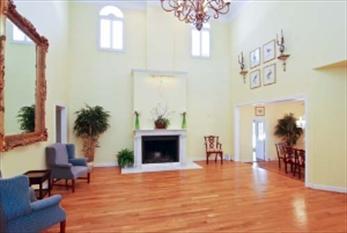
Who can see these tiny pictures up over a doorway?
7. Too many family photos. Designate a location on a wall for an impressive grouping and switch out photos, rather than bunching more in.
Let’s talk height :
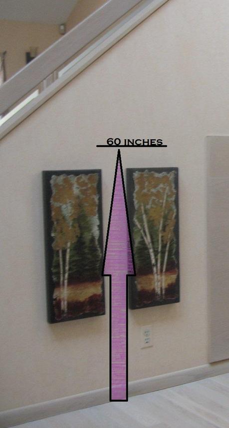
A great rule of thumb to remember : 60 inches.
Height is the area people have the most trouble with. Solution : remember the number 60. The phrase eye-level can be too subjective. What you want to be concerned with is sight-line. This is the area 60″ off the floor to the center of the piece or grouping where most people’s eyes rest comfortably. It’s the same number used by professionals and museums. It will work perfect for you too!
Wrong height and wrong piece for area.
The purpose of hanging or placing works of art is to showcase them to their best advantage. We’ve all seen artwork hung too high or too low. We’ve seen items hung which just look wrong, and we aren’t certain why. The girls from Decorating Hotline also have a few other Tips for Hanging Art you might enjoy. If you avoid the 7 mistakes outlined above, your artwork should look fabulous.
Want more on art placement ? Stop over at Decor Girl for more design tips !

From Lynne :
Hey Lisa ! Thanks for the guest post. I was tempted to add things like ‘size matters’ in inches… but thought I would behave myself on this post. My bad.
Have an epic day ! Cheers !
Lynne

