I was watching some cool advertisements of an online portal (OLX.in) and was wondering that why the public health messages that went out were so boring and hackneyed, poorly designed and “turn off”-ish! In an era where advertising is a buzzword and online or offline marketing is bringing the consumer and provider closer together, it is a sad affair that public health affairs have stayed out of the dictum.
More often than not, these advertisements are really poorly designed or conceived in such a manner that it is not relatable for a massive number of people. Here is an example:

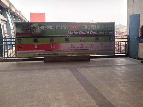
Dengue Public Service Message
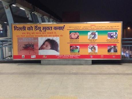
Like each of the past few years, there seems to have been a profusion of cases of dengue in Delhi and the Government has gone all out, once again, in a bid to spread information about the do’s and don’ts in order to prevent Dengue cases from rising. Here is a billboard showing that very same information, in a prime spot in a metro station. This very prominent advertising space is right in front of the staircase which one has to use in order to enter or leave the platform. However, the message is so poorly designed, all one can grasp at a glance is the rather obvious tag line. None of the do’s and don’ts are visible. Imagine running up the stairs while in the morning rush to catch your conveyance to work, would you have the time or the luxury to stroll about trying to decipher the small and squiggly writings on the bill board? I doubt it! Taking another example of Dengue information system, here is a board:

One may say that this board at least portrays the important facets of the do’s and don’ts in a more prominent manner, but given the fact that the target audience is rushing to work and has barely a couple of seconds for the board to register, it kind of loses importance. There is too much information for the kind of audience that this board targets.
One may argue that this is probably the case for the dengue related IEC. Unfortunately, the same disarray characterises the IEC campaigns of almost all other diseases. Another example: the same lameness of design holds true for another board on another prime location; this one about Thalassemia:

Once again, too much information, squeezed in too tight, too squiggly small to attract attention of the rushing passengers. In short, no appeal to anyone. Bland. Plain, Boring.
In contrast, try out the advertising campaign of a web based company who, in a bid to stay connected to their target demograhy, has started advertising on the popular media as well as the online methods.
A few days ago, I was gifted the Steve Jobs biography by Walter Isaacson and I have been lapping it up since. One of the aspects of Jobs that has captivated me is his attention to design and the details. One may say that his fanaticism with design could be an extreme form of OCD, but it also makes an Apple device a dream to work with. As someone who resisted the shift to the Apple lot for a while, I have been totally proselytised since I made the first dabble with an Apple device.
Jobs believed that even the parts tat could not be seen should be designed with care. Unfortunately, in our public health advertising, even the parts that are seen out in the open by everyone is seldom well designed. I just took a random couple of diseases from one of the metro stations I use the most often, so, this is a rather flawed attempt at generalization; but the truth remains, that even if there is ONE poorly designed billboard, it is one poorly designed billboard too many.
What is the evidence that this works? What is the way out?
Last year, I conducted a small questionnaire-based study on the knowledge about Dengue in freshmen medical students. One of the aspects I intended to explore was whether the knowledge levels of students who traveled using metro (and who noticed such public health messages there) was higher. Although the results were not too encouraging, one can apply their common sense that public transportation hubs are good places to talk about public health issues.
But in order to make that happen, in order to maximize the impact of advertising public health issues in public transportation hubs, one has to keep in mind the following facts:
- People are always rushing at these places: the messages should be short, pithy and sexy. It has to attract the attention of the hurtling masses.
- The messages have to have appropriate images and not more than two messages per board. Cramming more stuff into one board may seem financially more attractive, but, eventually, all of it gets diluted and no one bothers to look at anything.
- The boards should be at some height above the ground level. Only then shall it attract the attention of the rushing daily commuters.
- Introducing celebrity faces has been a popular ruse; and in India, it seems to work quite well. Maybe rope in the cricketers and rockstars and moviestars to not just pose for the placards, but also use their larger than life image to create a message that stays in the mind.
- DESIGN. The posters and boards need to be built up in such a manner that they do not seem repulsive and boring at the first go.
Once the public health advertising can inject the oomph that fuels the private enterprise, only then shall we achieve the full extent of benefit of the money poured down the drain of advertising health.
28.684000 77.309000