Ideas for Wedding Colours
The chances are if you’re reading this post you’ve not got a clear idea that you are committed to. If you have a strong affinity for a color or colours there’s nothing wrong with going with that. Personally I don’t have a clue what my favorite color is. So where to find inspiration?
Seasons
Seasons are an easy one. Your wedding will obviously have a date and that date will be at a time of year. If it’s on the cusp, then just go with whichever you prefer;)
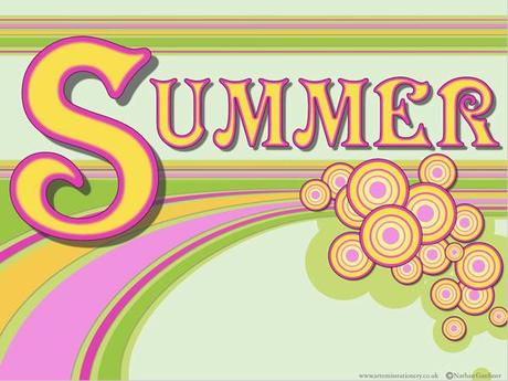
Summer Wedding color inspiration
Summer
If your wedding’s in the summer you could go for bright colours: think flowers and the colours you see. Bright pinks, blues, greens and yellows. These will all do very well. When you think summer you think sunshine (or at least hope for it!) and beautiful blue skies.
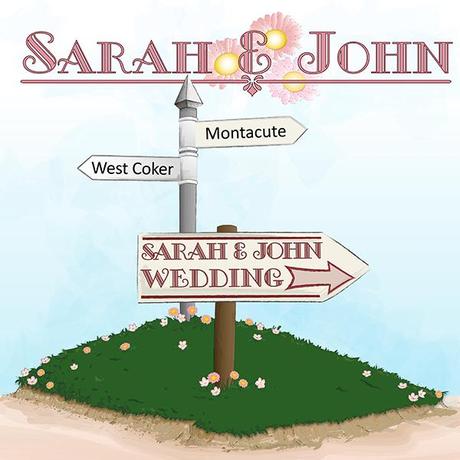
Nothing says summer like the english country side, or signs in a country lane…
Autumn Colours for Weddings
Autumn
Autumn is most obviously associated with the fall so think rich reds, yellow, oranges and browns of the falling leaves, think New England in the fall. You can also go for desaturated versions of natural colours like green and blue. Think what these colours look like in the mist.
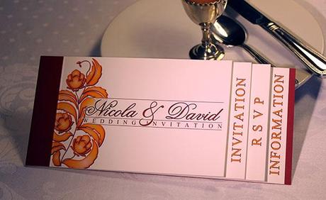
Tuscany booklet invitation — impress your guests, though probably not over breakfast. Does anyone get morning post any more?

Winter Wedding color inspiration
Winter
Winter can go at least two ways. You can either reflect the (sometimes) plunging temperatures choosing cool tones like blue and white. Or you can go with the warmth of the fires inside people’s homes (at least historically) and the opulence of Christmas, dark reds, golds, purples etc.
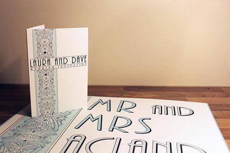
A fresh light blue great for winter (and spring to)
Spring Wedding Colour Inspiration
Spring
Spring is very like summer but fresher or pastel versions of these colours. Life is coming and on the up but it’s new and more delicate at this time of year.
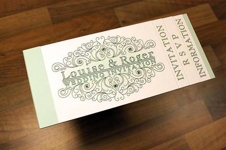
Booklet invitation in mint green, great for a spring wedding
Other Sources of Colour Inspiration
If not the seasons you might want to look at what you like: this could be a favorite brand. If you think of Tiffany it is very obviously associated with a specific shade of blue. Look at signs or packaging. Designers have found colours that work together and you can take advantage of these. Here are some examples of color schemes taken from company and organisation websites including the well-known and the not quite so well known.
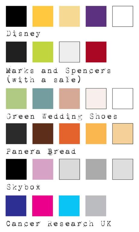
Examples of a color schemes from websites
Photos that you’ve taken can also be way to look for color ideas. You may want to go for inspiration from travels in exotic countries or use inspiration from your favorite spot in this country.
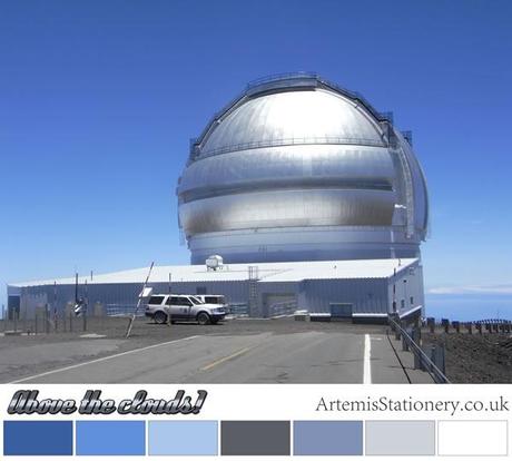
An observatory in Hawaii
Here’s an example from my own blog. If you’ve ever used an art program of any type it’s the color sample tool. It looks like a pipette in a most programs! Some tip top websites (not sure why I’m using tip top – don’t say that phrase!)
- Pure color inspiration https://kuler.adobe.com
- Wedding color inspiration http://www.theperfectpalette.com/
- Seeds – for plants, floral and not plant colour inspiration http://design-seeds.com/ (very glad Sabine at g lily told me about this site)
- Take colours from images in a less fun but more easy manner http://www.colorhunter.com/
Ways to use colours
Keep it simple and choose one colour, many suppliers can work with a specified color. You will know all your colours match as they’re all the same. Things rarely look bad when this option is taken as things look uniform and orderly. The dead simple approach is to use similar colours. You could use lighter and darker versions of a color to compliment it or colours either side of it on a colour wheel. E.g. for green you could use a more yellow green and a more blue green. Choose a color and then find the opposite colouron the color wheel This handy website is great for that. The Smorgasboard — Not a well-known term for color collections but I like using it when there is lots of colours in play! If you look at the website in the previous link you could classify the triad, tetrad and accented analogic as those.

How to use colours
You may be interested in my attempt at explaining ombre if you click ombre and say olé as you do so.
Bringing it all together…
So you’ve got some color ideas. Here some final thoughts for tying it together.
- Pastel colours generally work well together and make for an easy way to use colours that match
- Bright colours can be a lot of fun. Just because weddings feature lots of white they are also a celebration and remember white can be the brightest color of all*
- Lots of bright colours can be hard to balance so using some pastel colours with them can make it easier to match.
- Colours that are seen together in the world around you normally make sense when drawn together in other circumstances.
So have fun and let your guests have a visual treat!
*to see a surface as white a surface must reflect all the colours of the spectrum into your eye. Therefore being bright as in more light!
Interested in the Designs or bespoke invitations and stationery seen here? Here’s the where to find more on these:
- The Summer title was made from our Modeno design — click to see this very fun and funky design.
- The summer stationery example was from our ‘Way to Go’ design - click to see more of this slice of the English Countryside. Also looks quite some bits of Wales just over the border from Gloucestershire ;)
- The Autumn Title uses our Ombre design — not on the main site yet but read more about it and Ombre here
- The autumn example is a booklet invitation from our Tuscany range. Again click to see!
- The Winter title is made from our Natale design. Natale means Christmas in Italian I believe.
- The Winter example is Capri, a sophisticated design. Probably no need but click to see more of it.
- The Spring title was from our Spring table name blog piece. Read about wedding table names for spring here. It’s also very like our Campania range.
- The spring example is Trieste in Mint green.
Thanks for taking the time to read this piece. Would love to hear about any ways you might have found color inspiration or if you have any questions ask below and if you’re looking for great wedding stationery please check out the main Artemis Stationery website. There’s also plenty of advice on the blog AS Invites. All images in this post (but only this post and not the titles or sidebars etc) are the copyright of Artemis Stationery.

