CO2 – August 5, 2017
GR: Good news is beginning to overwhelm the bad. Countries, cities, and U. S. states are accelerating their efforts to cut CO2 emissions. Unlike the mouse who just wants a little milk to go with our cookie, however, we need much much more. The problem is that emission cuts haven’t begun. This is why atmospheric CO2 is still increasing. If emissions had slowed, the line in the chart at left would have leveled off.
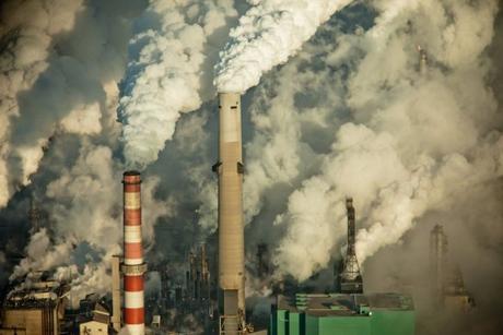
I’m repeating portions of Barry Saxifrage’s article here to point out what’s really happening. We need to call on everyone to keep their commitments and make the cuts in emissions. If we can’t, we will be forcing our children and grandchildren to live in the dark future depicted here.
Final thought: For all those Trump supporters who accepted the idea that we had to leave the Paris Accord because we couldn’t trust other nations to keep their promises: You were right. But being right won’t save us. The world needs a leader, not a loaner off in the corner somewhere.
There are more charts in the original article. They reveal more details about the growth in fossil fuel use.

“But so far, humanity keeps burning ever more. Last year we did it again, burning an all-time record amount.
“That’s according to data compiled from the latest “BP Statistical Review of World Energy.” This annual report is one of the most widely used and referenced around the world. It’s big and comprehensive with fifty pages, thirty-three spreadsheets and forty charts. The report highlights most of the important trends in global energy. Most. But one critical trend was nowhere to be found….
“Conspicuously absent was the basic statistic on fossil fuels that I, as a climate reporter, was looking for: how much fuel is the world burning each year? Such a simple question, and the answer tells one of the most important stories in the world: are we finally turning the corner on our fossil fuel dependency?
“To find that missing story, I needed to download and combine multiple BP data sheets, do the math, and then build my own charts to reveal the trends. Here (drumroll, please) are the “missing charts” and what they have to say to us…
The missing charts: how much carbon-polluting fuel is humanity burning?
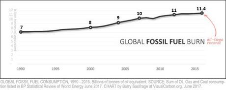
“I built three charts using the compiled BP fossil fuel data. This first chart shows the total energy consumed from burning fossil fuels each year.

“There is certainly no sign in this chart of a turning point in our relationship to fossil fuels.
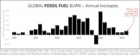
“My next chart uses the same BP data, but this time shows the annual increase from year to year:

“The only year in the last quarter century with a decrease was 2009. That was caused by a sharp global recession. And within a year, that rare respite was wiped out by a massive surge that followed.
“Sadly, there is no sign of a turning point in this chart either.
“Take last year for example. The increase wasn’t particularly large, but it wasn’t particularly small either. In fact, it was right in line with the 1990s average. And the nineties certainly weren’t anyone’s idea of a retreat from burning fossil fuels. Nor were they a turning point in our fight against climate change or ocean acidification. The 1990s were business-as-usual.
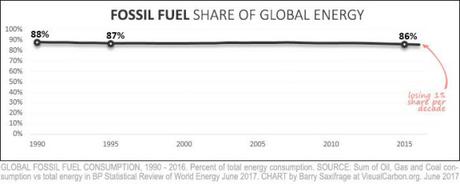
“Finally, here’s a third view of the same BP data. This one illustrates fossil fuels’ share of all global energy. Turning point?

“Together, these three “missing” charts of BP’s fossil fuel data — ever rising amounts; increasing every year; and maintaining uncontested dominance — paint a sobering picture of humanity’s lackluster response to the growing threat.
“As California Governor Jerry Brown lamented in a recent New York Times interview: “No nation or state is doing what they should be doing. This is damn serious, and most people are taking it far too lightly than the reality of the threat. You can’t do too much to sound the alarm because so far the response is not adequate to the challenge.” –Barry Saxifrage (Continue reading: These ‘missing charts’ may change the way you think about fossil fuel addiction | National Observer).
Go to the article for several more revealing charts and explanations.

