The tree of life shows how all living things are related. This makes it one of the most important scientific diagrams ever. It's also one of the best ways to teach people about evolution; with a simple structure that's instantly recognisable. It should help clear up a lot of misunderstandings about the theory.
Except it's often done wrong.
A group of psychologists examined the evolutionary displays in many museums and found pretty problems with all of them. Whilst they might look pretty in a display, these issues could lead to some major misunderstandings about the theory of evolution.
Here's how the museums get it wrong, and how to fix them. Hopefully this advice is useful for a more general audience, helping you pick out the best diagrams to illustrate your point next time you're tying to teach someone about evolution.
Squares stop misunderstandings
When drawing a tree of life there are two major designs. A diagonal splitting "tree" like Darwin drew, or the more classic "square" shape. Which should museums pick? Well it turns out Darwin got it wrong.
In a diagonal design the "trunk" remains unbroken for most of the tree. So it looks like one species surviving the whole time. In reality speciation happens most times something split off the trunk. A fact obscured by the diagonal design.
As a result of this people looking at the diagonal design tend to be left with the impression that evolution happened via one species just turning into another (a process known as anagenesis). In reality, species splitting into multiple populations ( cladogenesis) was much more common.
A simple misunderstanding a few right angles can fix.
Include the evidence for evolution
Most of these trees just show the tree of life. Which you wouldn't think would be a problem. After all, that's what they're supposed to do. However, studies have shown that by throwing in some of the evidence for evolution people understand these trees (and the scientific basis for evolution) much better.
The nature of evolution makes this really easy to do. These trees are created by looking for traits unique to a group of species. Those that have these traits get to go in a branch of the tree together. For example, all the upright apes with big brains get to join the club Homo with us; Homo sapiens.
As such, it wouldn't take too much work to include the traits which define the branch on the tree.
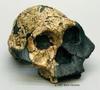
Humans aren't special
As a species, we can be pretty full of ourselves. When we draw evolutionary trees is no exception and humans are often placed in the most privileged spot: top right.
You would think that this prominent placement would help highlight how humans are part of the tree of life. That we evolved just like every other species. In fact, it has the exact opposite effect. Making humans the main attraction causes people to think of us as the "goal" of evolution. Putting humans in the top right of a family tree makes people more likely to say there was some sort of intentionality behind our evolution.
In reality, evolution has no goal. Not even the development of filthy monkey men. To fix this misunderstanding the psychologists suggest putting humans in the middle. That way we're have species either side of us; which helps people realise that we aren't the end-result of evolution.
Put it in context
The final major problem with most trees is that there's very little context associated with them. Where does this snippet of the tree of life fit in the overall picture of evolution? And how much time did it take to happen?
These shortcomings are very easy to fix. Mixing it in with a timelime is an easy way to give these trees a bit of context; yet only one reviewed by this study did that. It's also relatively easy to add a few other parts of the tree to help show where this segment fits in. For example, on a tree of the human family you might include the chimps and other apes next door.
These changes, like the rest of the ones suggested by this research, are very minor. Yet they have the potential to significantly improve public understanding of evolution. Which we really need.
tl;dr
Diagrams of evolution often do more harm than good. Researchers have identified a few simple changes that can clear up these misunderstandings.
References
Novick, L.R., Pickering, J., MacDonald, T., Diamond, J., Ainsworth, S., Aquino, A.E., Catley, K.M., Dodick, J., Evans, E.M., Matuk, C. and Sacco, J., 2014. Depicting the tree of life in museums: guiding principles from psychological research. Evolution: Education and Outreach, 7(1), p.25.