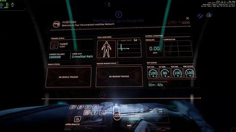
#wehatemobiglas
I suspect the original function of Star Citizen's MobiGlas was to 'give the player a one-stop solution to all the info he need;, his stats, his missions, his place in the verse...' non-quote. I'm sure that would have been the original aim. But (like the clunky ship-manifest screens) it's shit... Star Citizen isn't supposed to be a MobiGlas game, it's supposed to be about Star Citizen'ing.
And CIG don't tell me, "We can improve the glowing semi-transparent interface so that it works with all lighting conditions and backgrounds," I don't mean that. I mean, "Get a fucking game-specific interface," i.e. THINK about what Star Citizen's about. Make the interface WORK WITHIN THE THREE-DIMENSIONAL FRUSTRUM OF THE GAME CAMERA. There's nothing worse than a Spreadsheet game. Don't do that to the player in 2018. Don't make him fly a fucking spreadsheet.
This may refer back to my earlier gripe(s) about Doors and Hyperspace. I digress'd... We accept, from our two previous arguments that IT'S A GAME, not a RLE or Real-Life Emulator. Uncanny Valley will not be breached this century. Plus, one doesn't need to, to make fun interactive product. Set some game rules and apply them to the gaming experience.
Your ship has hard points for weapons, WHY ARE YOU USING MOBI GLAS all of a sudden?
Surely THE GAME knows what your inventory contains and can visually cycle through your load options for that weapons hard point for you. Visually, in front of you. It doesn't need to 'raises its arm, defocuses the background, plays plunkety sound fx, to present an overlaid spreadsheet.....' blah blah blah, you see how tedious this is to use for EVERY SINGLE THING the player does in the game. Time after time after time through the gaming hours. Or maybe you don't. Maybe CIG you REALLY NEED HELP to design something that's physically usable for the kind of game you're hoping to complete as 2020 looms.
Same with Star Map, just show the Verse as seen through the start-point of the current view screen. Whether that's a view of the universe or just a view of the local terrain/city. You're already there. Why send the player's mind elsewhere?
It's obvious from the duality in the player's interaction with the current iteration of the game e.g. you can Think a door open, or you can press a Door Open button, that serious design decisions have yet to be made. Are you really going to go down the path of clicking every single button in the game some time in the next two years? With all the extra coding or animations that'll need? When will the game start to understand that IT IS THERE TO SERVE THE PLAYER, not knee-cap or ham-string him through clunky-clicky game mechanics that CIG seem perversely fond of. Just cut to the gaming chase, and show him what he needs to Star Citizen (vb) his gaming session, on the screen that he's playing on.
What I saying is, "The current player interaction functionality needs GUTTING i.e. removing," from the game.
MobiGlas takes the player away from his beautiful game, it banishes him from the beauty of it so that he can comply with a database representation of fun. Come on, UP THE FUN and make this game as visually stimulating as it is (already) a shimmering QT-jewel in the gamer's eye.

