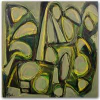
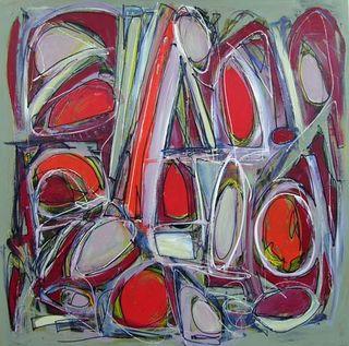
I had liked this painting when I first completed it, but after looking at it again, I decided it needed a revision. I began with one of my brightest colors, cadmium red light, filling in three shapes with a brush. Then I filled in a few more with cadmium red medium.
Ah, it looked brighter already! Then I kept at it, using a pale lavender, cadmium red deep, white, and a pale green-gray. I worked loosely, allowing small sections of the original painting to show through.
Then I drew sketchy lines in white for interest and highlights. My final step was to draw lines in Prussian blue, outlining some of the shapes. With a brush, I flattened those lines and blended then with the other colors.
Here's the original:

Here's the revision so far:


