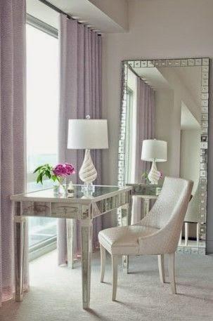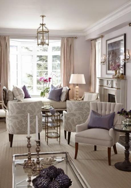
Anyone who knows me well, knows that I have a strong aversion to purple. It's a joke in my family that when there is a choice of colors someone invariably jokingly asks if I would like the purple one. No, I would not. Lavender gets a suspicious side-eye from me for associating so closely with the purple but I recently found a color that has me rethink the whole lavender thing.

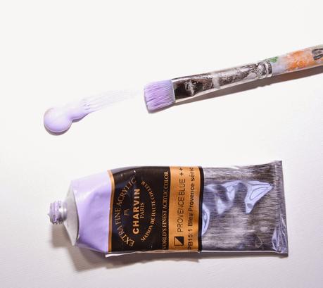
It's called Provence blue but it more closely resembles lavender. Not just any lavender but a divine grayish, pale blue lavender. Nevertheless it is very lavender and in possession of some kind of pixie magic that makes me like it and also hard to photograph. I tried to find a Ben Moore or Sherwin-Williams color that matched but nothing was close. If I had to choose SW 6815 Awesome Violet is the closest but its still far too muddy and gray. It was not big deal deal to me until I began to notice that it looked great no matter what I put it next to, in fact other colors improved it every time according to my eye at first. The more I used it the more I noticed that the adjacent color not only improved the lavender but the lavender improved all of the other colors. I tried it with a different lavender of my own creation and the effect was not the same.

This got me thinking that this particular shade could find a spot in my house after some deep breathing exercises and plenty of reassurance that it isn't purple. Purple is still right out (I am talking to you, Mom) so don't get any ideas.
