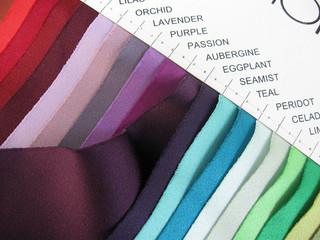
I've been gathering David's Bridal swatches for a while now... They come in handy
when discussing color with clients!
Welcome to the Potpourri Friday blog... I've been thinking a lot about color lately. I was contemplating how important color is to the event discussion. Everything starts here:
- A color palette is chosen (what a relief)
- Swatches are gathered and shared (or are they?)
- Elements for the event are pulled together based on this initial selection
Sounds easy, right? It should be... Here are a few tips that will help you to communicate and review color properly to ensure successful results.
Color varies from screen to screen

A large majority of the creative digital files CT-Designs sends out for client review are
looked at via iPhone, iPad or a home PC screen.
David's Bridal Swatches

David's Bridal swatches are still very popular among brides
Even though you will find brides that are going in the Vera Wang direction or a small boutique, David's Bridal is still HUGELY popular among brides. For years I only had a handful, and would only purchase swatches if I needed to when a bride would mention it. Then I thought to myself, I should be collecting all of these swatches (they have a total of 44 and are only $1.00 each), what the heck am I doing? Sure enough, I just went in a bought about 10 random colors and while working on a pewter and yellow Save the Date, the bride referenced "sunbeam" as the shade of yellow to match. I had it in stock!
PMS Color Matching System
Check out an earlier post that I did about understanding Pantone. There is a symbiotic relationship between the color swatches your client gives or indicates to you (you should be asking for them if they are not being freely shared) and the Pantone color system. This is the most reliable system that you can use to match your bride's invitation colors on press.
Managing Color Expecations
Let's face it, palettes have become more sophisticated and the pressure for colors to be consistent over various mediums (the linens, the cake, the paper, etc.) demands for industry suppliers to be honest about how these colors are being matched and evaluated through the process. This extra effort will lead to happier and more satisfied clients.
Have wonderful weekends and we'll be back on Monday!
--ct

