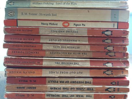
I’ve been enjoying looking through a few of my coffee table books lately; I’m very good at buying exhibition catalogues and art books, but as they’re not very portable and I rarely have much leisure to sit and peruse them at home, I’ve not cracked many of them open. Now I’m at home much more often than I used to be, it’s been a pleasure to while away an afternoon learning about something new and taking the time to look closely at the images they contain. One I have especially enjoyed is Penguin by Design by Phil Baines, which looks at the changing designs and typefaces of Penguin books since their inception in the 1930s. Most people know Penguin for their famous boldly coloured striped paperbacks, but as I discovered, there have been a huge range of imprints that have come and gone over the years, along with numerous attempts to rebrand and redesign under a changing leadership looking to move with the times. Some of these were more successful than others, and the 70s and 80s saw some particularly bad cover designs that moved away from the traditional simplicity of Penguin’s style in an attempt to keep up with the broadening competition in the paperback market. Baines’ selection of front cover illustrations shows some very cheesy 80s film tie-in covers as well as soft-focus photography that make some of their fiction aimed at women look like soft porn! It’s hard to tell from many of these later covers that they’re even Penguin books, and this dilution of the brand and corresponding drop in sales led to a return to its original roots in more recent years.
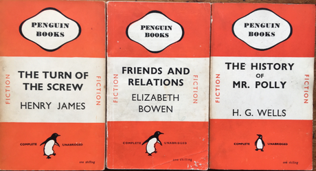
I’ve always loved Penguin covers, and I have a large collection of Penguin paperbacks that cover a wide range of eras. I love to collect the older, orange and white and green and white striped fiction and crime fiction editions, but I also very much like the 1960s Penguin Modern Classics, with their whimsical line drawings and soft duck egg blue color way. I hated the early 2000 change to shiny silver covers, and have replaced nearly all of mine with older editions where possible. More recently, they’ve returned to the softer palette and matte covers of the 1960s style Modern Classics, and they are beautiful; collector’s items of the future in the way their original predecessors have become. Even these recognisable covers, however, have had subtle changes over time, and I didn’t realize that in the early days of Penguin, the design and typeface wasn’t standardised and there could be many differences between editions. The Penguin symbol was neatened up over time, and experiments made with adding and taking away detail as new Design Directors came and went, eager to make their mark. After reading the section about the early days of Penguin, I went for a rummage amongst my shelves to see if I could find any examples of this more erratic approach, and I was surprised to find plenty. Take a look at these Penguins, pictured above, all published in 1946. The Penguin Books cartouche is the same on each one, but notice how the Penguin symbol changes shape, and how the one shilling price is italicised on two but not on the other. There is also inconsistent spacing between the letters in the titles and there is no standardisation of placement of the authors’ name and title within the central band; H.G.Wells’ name is far lower than Bowen’s and James’, for example.
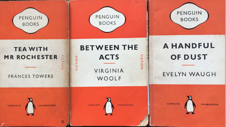
Now look at these three. Between the Acts and Tea with Mr Rochester both date from 1953; A Handful of Dust is dated to 1955. Can you spot the difference? Notice now that there’s a little orange line to separate the title and author, compared to the earlier editions above, but the size of the title and author’s name is still inconsistent. There is, however, a clear centrality to the author and title within the middle band compared to those earlier editions. But what changed between 1953 and 1955? Well, ‘Fiction’, in orange letters, is now gone from the sides of the white stripe, and the 2/- price has changed to 2/6. Subtle changes – and not ones I’d ever noticed before reading Penguin by Design!
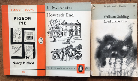
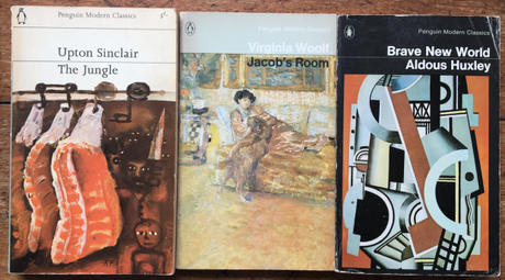
Moving on to the 1960s, look at these, arranged in publication order. The creation of the Penguin Modern Classics list led to a change in color and design – and between 1964 and 1965, when Howards End and then Lord of the Flies were published, you can see how the design of the Modern Classic was simplified, with the title, author, Penguin branding and price all being moved to the top quarter of the page, and an image being allowed to dominate the lower half. I love how, in just the space of a year, the rather old-fashioned looking design of Howards End subtly changes into the sleek and modern design of Lord of the Flies, which is one of my absolute favorite Penguin covers. However, someone was busy in 1965, because the first cover in the image below, Upton Sinclair’s The Jungle, was also published in that year, and the duck egg blue background has disappeared, and the image is now in full color rather than black and white. Maybe to fund the cost of all this change, the price has gone up rather steeply! Three years later, in 1968, someone’s been tinkering with the design again with Woolf’s Jacob’s Room – we’ve returned to the blue, but we’re sticking with the coloured image. The Penguin logo has been redrawn, and the price is now on the back. By 1975, a more striking black has been chosen as the background color for Huxley’s Brave New World, but the layout is broadly the same as in 1968. Decimalisation has also happened, and Penguin Modern Classics now cost just 55p. Those were the days!
Can you track the history of Penguin in your own book collection? Why not take a look and see what you’ve got buried on your shelves!
