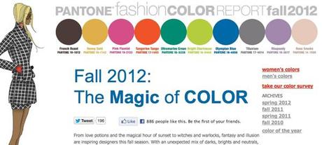
After shopping with a client recently, I noticed the Fall palette was … well, vividly bright. Rows upon rows of bright green, orange and dusty pink – and this definitely wasn’t Spring leftovers. A check on Pantone’s Fall color report confirmed my suspicion.

The color forecast for Fall 2012 left it’s heart in Summer – not that I mind. This palette is so groovy and mod, a total throwback to the 60s. I love vivid color, but mixing brights should be done with caution. If you’re not careful, you might end up looking like you were transported directly from an episode of “Laugh In.”
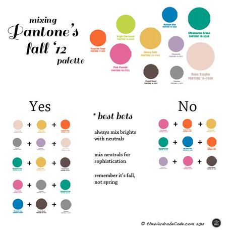
Here are my color combo recommendations, using Pantone’s colors for Fall 2012.


