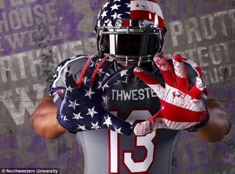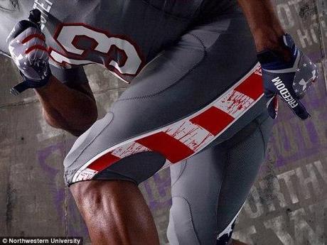
DailyMail: Northwestern University has sparked outrage after it unveiled special edition ‘blood splattered’ football uniforms, which the team will wear to raise funds for injured veterans.
The Illinois college released photos Monday of its Wounded Warrior uniforms, which the Wildcats will don instead of their usual purple for their upcoming home game against Michigan.
The gray jerseys feature accents of the American flag splattered with simulated blood on the helmet, gloves, pants and shoes, and have been labeled an ‘asymmetrical patriotic mishmash.’
Where players’ names usually are, one of seven core values is printed: Duty, Honor, Courage, Commitment, Integrity, Country and Service.
After the game, the Under Armour jerseys worn by players will be auctioned online, with 100 per cent of the proceeds going to the Wounded Warriors Project. Additionally, 10 per cent of proceeds from non-game jerseys sold will go to the foundation.
But the jerseys drew immediate reaction from online sports commentators and Twitter users. ‘Isn’t ‘flag covered in blood’ a little on-the-nose for something honoring a group that operates programs for injured veterans?’ Deadspin‘s Barry Petchesky asked on Monday. Meanwhile, Twitter user Jordan Pascale wrote: ’Oh no no no no no. These Northwestern uniforms are not OK.’

But others supported the uniforms, with Bleacher Report columnist Jesse Reed describing them as ‘classy’ and ‘sharp-looking.’
‘The men and women who sacrifice their freedom by serving in the military far too often go unheralded for their exploits. Those who return home after injuring themselves in the line of duty deserve even more gratitude and praise, and any chance we have to honor them, we should,’ Reed wrote.
On social media, the jerseys were dubbed everything from ‘beautiful’ to ‘the most patriotic uniforms in history.’
Northwestern spokesman Paul Kennedy defended the design on Monday and apologized for any ‘misinterpretation.’
‘It’s a distressed pattern on both the stars and stripes that was inspired by the appearance of a flag that has flown proudly over a long period of time,’ he said.
<a href="http://polldaddy.com/poll/7538168">Take Our Poll</a>DCG

