There has been a lot of shabby chic, a lot of vintage (both aged and pristine or replica) recently. Most people only have one wedding so it’s highly unlikely you had another vintage wedding last year. That said it may not be to your taste or if you have a close group of friends you may have seen more tea cups or bird cages at everyone’s weddings than you want to. So this article is to look at what I consider a polar opposite for those pondering not going vintage. This will be from a stationery perspective since that is what I do! See what bespoke stationery I can make here. So welcome to my post on modern stationery and other alternatives to vintage and shabby chic.
Modern, shapes and geometry
We get into shapes at an early age. From building blocks to fit the shape through the hole I find something reassuring about triangles and squares. They can also be very modern, free of all that classical or vintage fussiness.
I have to be honest, I’m not sure I’m one for much modern art. I do like the look of some of it but struggle to see the value justified. The name of the creator almost becomes more important than what has been created. It might also be because for art homework at school I had to do something in a modern style. I chose do something like the work of Piet Mondrian. It got marked an A and the teacher in giving it back to me asked me what the inspiration was behind it. When I said I arranged it so it looked pleasing to the eye she crossed the A out and put a C in its place.
A meaning if you need one
The designs you’re about to see were made with the intention of making stationery that could look great and be personalised in any number of ways (like all our stationery). Although if — like my art teacher — you do want a meaning behind your wedding invitation design, then this is reflective of the universe, in that geometry is very mathematical and maths is the language of the universe. And if you break the universe down to its smallest components it’s all digital, 1’s and 0’s. (I think they call it binary

Is vintage old hat?
I don’t dislike vintage at all and I think if you love it go with it. A lot of my work fits that category quite well including my best selling range Trieste. I’m also a big fan of art deco which is often seen as falling under the vintage banner. You can read up on Art Deco articles on this blog, background on Art Deco here and Art Deco wedding stationery ideas here.
So let’s go circular

Overlapping circles — fish scale design
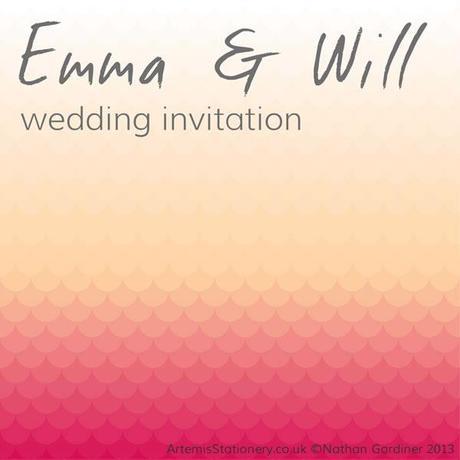
First I’ve gone with circles. This has been featured on my wedding stationery blog AS Invites in an article on Ombre stationery. This design I’ve overlapped in a fish scale style. The illustration above shows how the circles are arranged. This makes the invitation design work well with the Ombre style as it has a bit more complexity than a basic colour gradient.

Fish Scale Ombre Invitation design
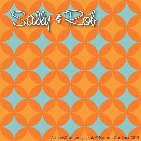
Circles don’t have to imitate fish scales though and the following design works by overlapping different layers of circles. I must admit that this one went a little retro, though for the sake of this article retro is definitely not vintage!

Retro Geometric Circles Wedding Invitation
This was created for this blog post though I expect there’s similar designs out there as it’s not the most complicated design in the world.
A square design
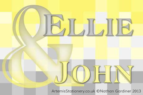
I like this square based idea, it reminds me of computer pixels which is kind of futuristic and retro all in one go. This style lets you go from one colour to another which is good if you have two colours in your wedding styling and especially good if one colour is representing each person. This design could also be used with more sporadic colours rather than moving from one to another.

square pixel wedding invite
This was based on a title I did for a yellow and grey inspired post on my own wedding stationery blog.
We’re going to take a break at this point from our look at modern stationery. If Claire the great and powerful ruler of English Wedding Blog land [haha Nathan — nice touch! — C x] allows me I’ll be back with some more ideas shortly. I know thousands of people will be on the edge of their seats in anticipation now! None of these designs are currently listed on the Artemis Stationery website. If you like what you see here and in the previous article they could easily be used with any of the types of bespoke stationery and invitations made by Artemis Stationery. I expect one or more will be up on the website once it’s been re-launched.
To contact me visit my contact page on Artemis Stationery or leave a message here. I’d love to know what other ideas people have in avoiding vintage or even how people are doing something new with vintage.

