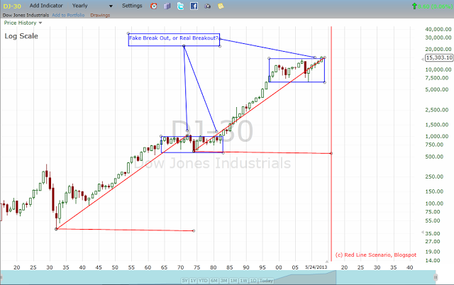
There is potential long term resistance in this area. Again, I am watching the November 2012 low before we really talk about the return of the bear market.
First, here is the Yearly Dow Chart:
Second, here is the Yearly S&P 500 chart:
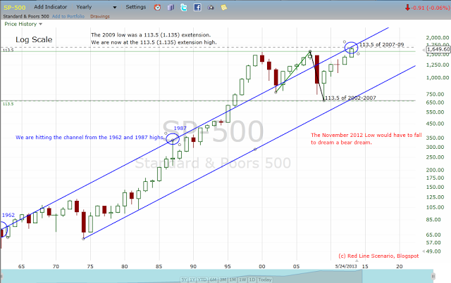
Now, even if this is a bullish breakout, those fib (the BC extensions) extensions on the S&P 500 can produce nice sell offs like they did this past week which gave me a nice multi-day short last week. If we continue to motor upwards, the 127.2 extension would be the next area of interest.
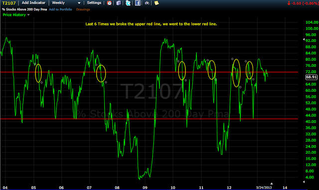
In the intermediate term, I continue to stalk a corrective back test of the November 2012 low, to see what is up on the big bull/bear debate. Here is one of the indicator charts upon which I am relying.
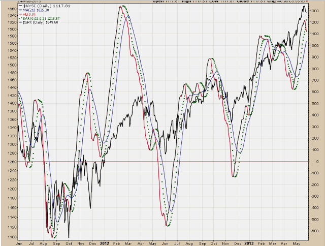
Also this week our NYSI Renko charts and NYSI SAR charts flipped to sell signals. Those charts are in the links on the right hand side of the blog. Here are the two charts.
NYSI Renko:
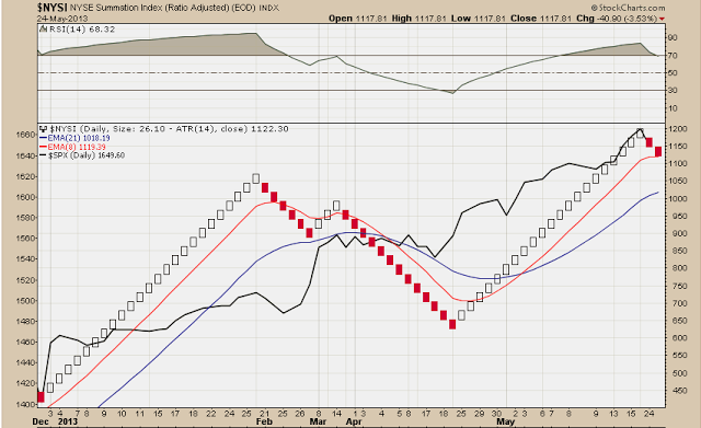
NYSI SAR:
Signal wise, I will be watching the BPSPX daily Renko chart, along with the Elder Impulse charts (also in the links on right side of blog) for further sell signal corroboration.
In addition, I also added a couple polls to the right side of the blog if anybody is interested in voting. I find the first topic about Fed Liquidity the most interesting poll topic currently.
As indicated, I will be out on Tuesday and probably will not have time to post. Have a great week.
Peace. Om.,
SoulJester
