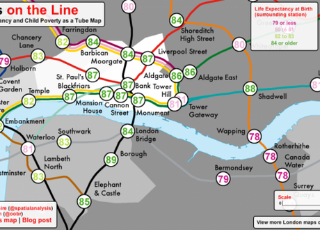
 Lives on the Line map.
Lives on the Line: Life Expectancy at Birth and Child Poverty as a Tube Map is the work of James Cheshire,a lecturer at the UCL Centre for Advanced Spatial Analysis and author of the excellent SpatialAnalysis.co.uk blog. On the eve of the London 2012 Olympic Games, Cheshire’s revealing map clearly highlights London’s (sometimes glaring) social inequalities and shows how the richest and poorest inhabitants of the city live cheek by jowl. It’s a fascinating read for Londoners and visitors to the city for the Games. The stations serving the Olympic Park fair badly and contrast with the Olympic volleyball venue at Earl’s Court whose spectators will be passing through areas with far higher life expectancies and lower child poverty.
Peruse the full map here.
“When designing this map it was my intention to create a memorable impression of the persistent inequalities along (and between) the routes traveled by millions of Londoners each day,” said Cheshire at his blog. “I also hope it provides another way of further communicating such inequalities in these uncertain economic times.”
Startling range
“Whilst the average life expectancy predictions show that today’s children are expected to live longer, the range is startling,” pointed out the blog. “For the stations mapped, it is over 20 years with those around Star Lane (on the DLR) predicted to live, on average, for 75.3 years in contrast to 96.38 years for those around Oxford Circus. The smaller disparities are no less striking.”

