After the bright color contrasts in my last impressionist painting on paper, I used a narrower range for this new one. I also worked more loosely, suggesting images with a brush-stroke or line. The basic colors are cadmium orange, cadmium yellow light, yellow oxide, and sap green.
I painted the backgound in unbleached titanium, but while it was wet, I blended the other colors into it, as well as parchment and a touch of white. Burnt umber lines help suggest the shapes and provide movement for the eye to follow.

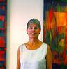
The opening reception for my exhibit at The Kitchen Theatre is tonight, and I'm looking forward to it. After working alone in my studio most of the time, it's gratifying to see my paintings hanging in a great space, not to mention the compliments. I always wear an "artist" name tag so no one will be confused.