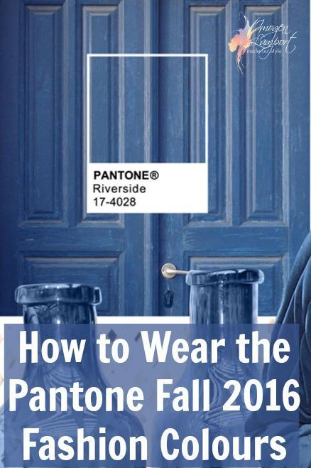
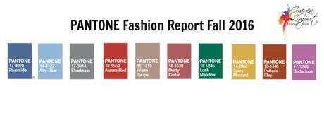
Those in the Northern Hemisphere are just coming into spring, whilst we in the Southern Hemisphere are in Autumn (or Fall as you North Americans call it). Pantone has just released its predictions for the fashion colours of Fall/Winter 2016 and interestingly, neither "colour of the year" Rose Quartz or Serenity are anywhere to be seen, though Airy Blue and Dusty Cedar are relatives of these colours.
How to Wear the Pantone Fall 2016 Fashion Colours
Firstly, let's look at who they suit.
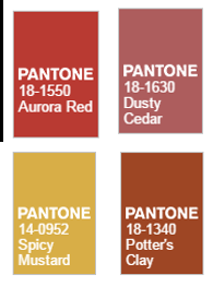
Warm Undertone Colours
Cool Undertone Colours
-
Airy Blue
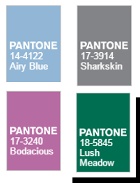
- Sharkskin
- Lush Meadow
- Bodacious
Universal Colours
-
Riverside
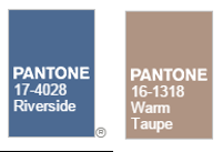
- Warm Taupe
As always there will be a variety of these colours, lighter and darker, brighter and more muted versions. There is always variation in the colours you see in stores. You need to get in close and check them out to see if they work with your palette and flatter your complexion. You will find that Warm Taupe will come in both more cool pinkish beige and warmer yellowish beige colourations.
Again with Riverside we have a lovely denim blue that will work with many palettes. The warmer versions will be slightly more marine navy in their appearance (so having a yellower undertone).
Secondly, let's see how easily they mix with other colours.


