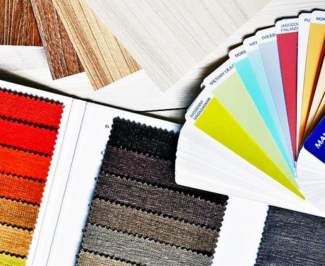
Art & Color psychology plays a major role in any Design’s Visual Impact, whether it’s Interior design or Fashion design or any other. These can set the mood, attract attention, spark emotions and even physical reactions. Hence, it’s important to get these done right. So, today I am going to talk about the Pantone Color Guide Fashion, Home & Interiors
The Role of Color Psychology in Design Process
Before we begin with the Pantone Color Guide let’s discuss a few things:
Bracing a non-so-happening & boring room with a little paint isn’t just about picking a pretty colour — you have to know exactly what your décor, furniture or paint colours represent.
Do these colours or art objects speak of your personality?
You must have heard about the Color psychology and how to use certain colours to inspire different moods, from happiness & relaxation to productivity. If you want to step in your bedroom after a long & hectic day at work, you have to make sure that your room’s visual impact is calming & relaxing as you step in. It will automatically calm you down before you even notice it.
Similarly, it’s important that every space you own whether it’s your home or office has —a visual impact the way you want it to have on you and your loved ones too. While designing something for a client, a designer’s choice of hue for furniture, fabrics, wall art, décor props etc. Which will massively determine how the design is perceived by the client and their family.
Keeping in mind the Color psychology, you’ll have to ensure you choose the right colour palette. That’s where Color Guides helpfully steps in. You have to know about – the colour guides, palettes, and the context in which colours are used and colour schemes etc.

Also, the designer has to keep in mind the latest & ongoing trends in the Interiors & Fashion etc. to ensure he/she is not recommending what is outdated. It’s when the Pantone Color Guides come handy which are released every year with the trendy colours & shades in the Interiors and Fashion events.
So, here is a colour guide which is a perfect option to choose those colours or shades that speak of your vision. I am talking about the Pantone Color Guide TPG Fashion, Home + Interior FHIP110N by DesignInfo
About DesignInfo
DesignInfo is excelled in supplying custom colour trend reports, Fashion trend analysis, styles & accessories concepts. By cross-checking groups of thoughts, aesthetic currents, social influences, artistic events, their intention is to offer a current vision of future synergies.
Fashion and trends for the next generation society. For them, the artists and designers are the creators who crystallise the trends with an overall view of the world. DesignInfo has an experience of 45 years. Hence, you can say it’s the largest supplier of Fashion forecast magazines in Asia.
They are connecting small publishers and media outlets to global customers. Hence, growing both the textile designers and the publishing units. They have over 2000 + different subscribing titles.
Pantone Color Guide TPG Fashion, Home + Interior FHIP110N
This guide is basically used for colour matching. The first print is available for true colours and completes accuracy. All colours in the guide are printed on paper and each page has 7 colours of size width 4.2cm and length 2cm. Each strip in the Pantone Color Guide Fan is of total length 23.2cm.
It has a fan format which can be opened and displayed easily. However, care must be taken to not use oily handy to prevent fading of colours. Pantone TPG is a subcategory of the Pantone Fashion, Home & Interiors, wherein TPG stands for textile paper- Green. It falls in the FHIP category of Pantone fashion Home Interiors colour guide.
This Pantone guide for textile is ideally used in textiles, apparels, fashion accessories, Cosmetics, Leather goods etc. Inspired by nature, the Pantone FHIP110N is in line with the Pantone Trends 2017 & comprises of colours which are bright & vivid exuding a sense of unmatched exuberance.
Know more about the product here… Pantone Color Guide Fashion, Home & Interiors
Make sure to have a look at their wide range of products, other colour palettes, and colour guides as well. Because they have never ending options to choose from 
Also, know more about their product range here… DesignInfo
I hope this article has been helpful.
How do the art and colours impact your vision and senses?
Let me know in the comments below.
Also, you might like to read:
6 Chic Ways to Incorporate Marble in Home Decor & Lifestyle
How to Get your Home Designed & Build {BILLED*} Right?
Is your Design Concept strong enough?
