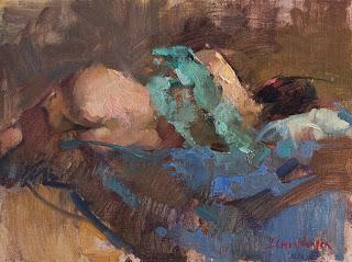
Infinity
12 x 16
The next thing I do is place pieces of local color throughout the painting, setting up the color scheme for that composition. That's when the turquoise, blue, flesh tones, and background color appear.
But the trickiest step is deciding on the color - if any - that will go over that initial dark. Part of the decision making is logical: warm light, cool shadows; or cool light, warm shadows. Which still leaves a lot of questions. Do I make the cool shadow green, blue or blue-purple based? Is the warm shadow red, orange, or red-purple? And if that's not enough to think about, I have to remember that temperature is relative: a green shadow can appear cool or warm depending on its context. It may look cool next to orange, but warm next to blue.
These questions are easily answered if I'm working from life: if I look hard, I'll see the color. But I have to simply make arbitrary decisions when working from a photo as I did here. No matter how hard I stare at the shadows in a photo, there's no information for me to find.
One strategy - the one I used in this painting - is to decide on the background color and then introduce it into the shadows on the subject. It's a method that I learned from reading painters like David Leffel and Gregg Kreutz, and it works beautifully to harmonize a painting and to integrate the subject with its environment. The warm greenish-ochre mixture near the figure's head appears in the shadow on her body as well as in the shadows of the drapery. It's modified with other warms to avoid monotony, but it is the foundation for the other mixtures. You can see how this allows the blue, turquoise and flesh colours to mingle rather than sitting separately as isolated individuals; the shadow is the common thread that unites them.
Like everything, though, it can become formulaic, so I don't use it as my default mode - unthinkingly. It's just another tool in the box.
Happy painting!

