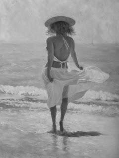
 Ahoy Maties
Original oil painting 24x18"
by Susan Roux
Color and Value. They're quite different.
Color, we all know. It's how we've been taught to refer to the pigment of everything we see. It's green, it's blue, it's yellow, it's red... Of course as artists we know there is a lot more to color than just identifying it's pigment. We train our eyes to see beyond mere childlike identifications. Is the color neutralized? Is it saturated? Has it been lightened or perhaps darkened? Is the color in sunlight or in shadow? This is where it can get tricky.
As soon as we start thinking in terms of how light or dark the color is, we switch to talking about it's value as opposed to it's pigment. Here lies a very confusing fine line for a lot of people. My students stumble on it a lot. Value becomes confused with color.
It's pretty easy to do since we are always using color to paint our paintings. Wether we're depicting value or color, it's with mixtures of color that we work with. Even trying to write it feels like a tongue twister.

The most important thing to capture in representational painting is the correct value. How light or dark a passage is. It's what identifies form. Three values, a light, a dark and a mid-tone placed between the two will create the illusion of 3-D form. As for color, the skies the limit!
Unlike needing the correct value, color can be as expressive as the artist chooses. So long as the value is right in a passage, any pigment can be used. The decision is up to the artist. Some will opt for a close representation of what they see while others will play with the emotional factor color possesses.
I experimented once and painted an entire painting with very wrong colors, but kept the values correct. It was pretty bizarre to look at, yet when you looked at it through a red-sheet value finder, it appeared to be totally correct. A friend said it would make a great exhibition. Paint all these crazy paintings and have value finder glasses for viewers to use. I could actually picture it in large cities, but never followed up with the idea from my rural area.
Do you have a red value finder? I like to pass some around during my first class with beginner students. It blocks out color and helps you focus on the actual values. As I try to have them look at things in terms of value, it's a great tool. Squinting does a similar thing and I'm sure a lot of you are accustomed to doing so as you paint.

Are you getting your values right? An easy way to check is to turn your image to black and white. Eliminate the color and what remains are the values. Does your work hold up to this test? If not, try focusing on it and you'll find your work will improve. Your images will become stronger. Getting the values right is primo in representational painting.
-----------------------
Ha ha. I have to laugh at myself. It's wasn't until I was sitting here looking at my image in black and white that I noticed the reflection doesn't line up with her right leg. I moved her leg to the left near the end as an adjustment, but never moved the reflection! I guess she needs to come sit on my easel a bit longer...
See. There's proof that turning your painting to black and white can help you improve your work!
