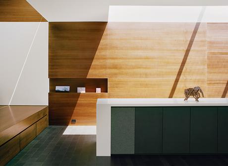
The residence architect Cary Bernstein designed for Scott Croyle and his family is an exercise in hide-and-seek. Clever storage keeps the space clutter-free and lets the structure shine. In the entryway, drawers tuck under the mezzanine, niches hold artwork, and speakers are built in line with the cabinets.
Project Hill House Architect Cary Bernstein ArchitectWhether he’s developing a stool whose crossbar doubles as a footrest or a cell phone made from one seamless piece of metal, product designer Scott Croyle helps create objects that reflect clever design thinking. For Croyle, who currently works for a start-up and formerly was head of design and user experience for the mobile device maker HTC, such an approach involves three criteria: “simplicity, craftsmanship, and something harder to pin down: beauty through emotion,” he says. Croyle kept these qualities in mind when he revamped the 1930s fixer-upper in San Francisco’s Glen Park neighborhood that he shares with his wife, Michele Godwin, a teacher who’s working on a master’s degree, and their nine-year-old son. Croyle found San Francisco–based architect Cary Bernstein through Dwell’s Design Source database and worked with her for three years, sharing ideas and refining concepts for the house. The two began by debating whether to move a wall, but grander conversations ensued, and the project became, in Croyle’s words, the ultimate example of scope creep as the parameters of the renovation became more ambitious. The result is an 1,800-square-foot residence that, through the ingenious use of natural materials and space-saving design, feels expansive. Croyle and Bernstein walk us through the design process and end product.

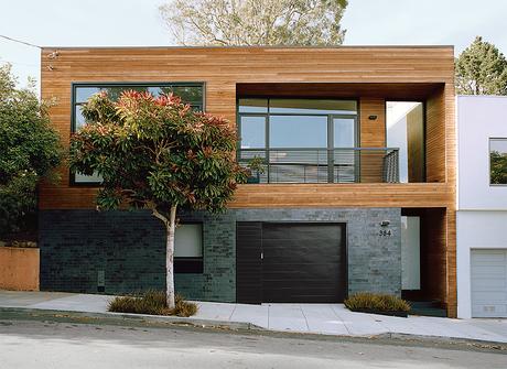
Bernstein reconfigured the entryway to the street level; guests ascend to the main living space. Ironspot clay tile and FSC-certified cedar clads the facade.
Scott Croyle, resident: In 2007, we bought the house with the idea of renovating it. It was 940 square feet, with two bedrooms and one bathroom. What was unique about the property was that the house had open space on both sides. It is a fairly wide lot—40 feet—compared to what you typically get in San Francisco: 25 feet wide and 100 feet deep.
We didn’t need a lot of space, but the space we wanted had to feel open and generous. I didn’t want a lot of gratuitous gestures. I wanted the design to speak for itself, effortlessly, and the materials to feel purposeful and natural in their approach.
Cary Bernstein, architect: The more effortless it looks, the more work that goes into it. Not every client has the patience to go through the iterative process—to edit over and over again—to get to that result. Scott, because he works with designers who share that value system, understands that. So it was a very good fit.
Croyle: This house is Cary’s design. My role was more about giving feedback. There were, though, little ideas we contributed—like how we tucked away the toilet paper into the side of the cabinet in my son’s bathroom. Why not put it there? It’s unused space. It’s not such a big deal—it’s toilet paper, after all. But it did create a little moment of delight.
My wife had the idea of putting a pocket door in the back. It’s a great door because it totally disappears. I wanted to play up that inside-outside synergy.
From a design perspective, we eliminated an outdoor stairway that led to the front door. In the new house, we put that stairway inside, so the entrance is now at the sidewalk. The original house was torn down, but we leveraged some of the existing foundation.
The previous house backed right into the hill. Having a backyard you could use was key, so there had to be some excavation. One of the most amazing things was when the contractor reinforced the old garage and drove a backhoe over it to get rear of the lot. His team removed 28 dump trucks of soil. That allowed us to extend the house seven feet and create the backyard.
Bernstein: The fact that the house has a split section—the kitchen and master bedroom are up a few steps—helps mitigate the hill. Raising the floors required less excavation. You ended up with less of a retaining wall in your face, and the bi-level space made the inside of the house more interesting.
Croyle: One of the things Cary and I talked a lot about was the material story and how much that was a huge part of the design process. Because a lot of modern architecture can feel quite cold and generic, we tried to strike a balance and make it feel warm. A lot of that comes from the materiality. I really didn’t have a lot of requirements. I wanted some walnut and a Naoto Fukasawa sink in the master bath—it’s the epitome of good design: simple, beautiful, and seamless.
Bernstein: The materials in this project play a really strong role, in the way that Le Corbusier and other architects I admire used color to shape your experience in the space. It’s not that we used certain materials, it’s where and how we used them to shape the space. The basalt stone, in slab and in tile form, for example, has a functional role: to outline and diagram a circulation path. It orchestrates the visual cues in the space in a very deliberate way.
Croyle: I worked in tech, so that’s a big part of my life, but I didn’t want the house to feel gadgety. In the kitchen, it really came down to hiding the appliances. We created this foldaway work area within the walnut cabinetry. It has a countertop, so you can have all that stuff out, ready to use. Those kinds of little details make the space beautiful and functional.
Last night, all three of us were on the couch and it just felt like an awesome space—a place I want to be in and hang out in. I envisioned a house I wanted to come home to every night, and we ended up getting that.

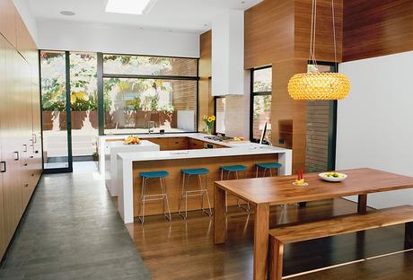
Bernstein specified sequenced walnut veneers in the kitchen and dining area and counters from Caesarstone. The Chrysalis bar stool is by One & Co for Council. A Foscarini pendant hangs above Ligne Roset’s Eaton table and bench.
