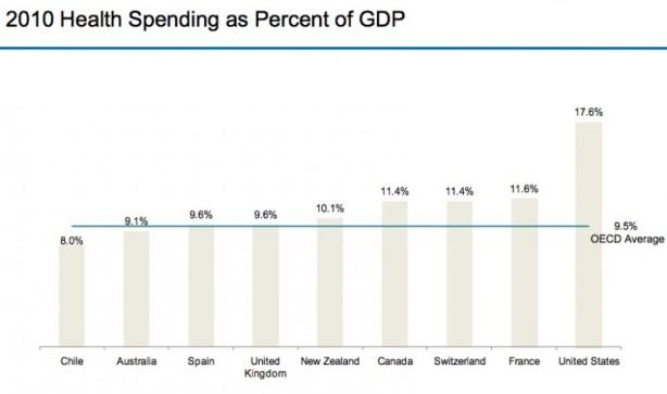
21 graphs that show America’s health-care prices are ludicrous.
The huge downside of the health care reform was not all the mythical pieces people complained about, most of which didn’t even exist. It’s the fact that costs were not addressed as they should have been. This explanation that went along with the graphs can’t be stressed enough:
In other countries, prices are set centrally and most everyone, no matter their region or insurance arrangement, pays pretty close to the same amount. In the United States, each insurer negotiates its own prices, and different insurers end up paying wildly different amounts.
Costs controls are going to have to be a part of the government’s footprint in American health care at some point. It’s an eventuality that we will need and the sooner the better. The system will not be sustained in the long run without it.

