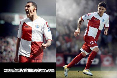
Tentative 4/5 Stars
We all know sponsors can ruin a perfectly good kit, and with this checkered design, any sponsor directly in the middle of the shirt is going to diminish the look at least a touch. I desperately (hopelessly) wish they find some kind of alternate sponsorship placement for this funky, attractive design. QPR does not implement any of their usual home colors into the third kit, opting for a Croatia-esque style for the club's thirds. I think they implemented the checkerboard effectively, and I even like the diagonal shoulder/torso separation cutting off the top two boxes. They pair the shirt with solid red shorts and socks, a quality decision in my estimation.
I'm counting down the minutes until their shirt sponsor casts an unfortunate, irreparable scar on such an appealing design.
