 This is a good news/bad news post, though I’m more on the good news side. Whether you see the news as bad or good also depends on your perspective. The U.S. economy rebounded somewhat from the recession in 2010, thus driving up carbon dioxide emissions as the country started producing more. In fact, “energy-related carbon dioxide emissions in the United States saw their largest absolute and percentage increase (213 million metric tons or 3.9 percent) since 1988 when they grew by 218 (4.6 percent),” according to the Energy Information Administration (EIA). That follows declines in emissions in 3 of the 4 previous years. All told, CO2 emissions are 6 percent (or 358 million metric tons) lower than 2005.
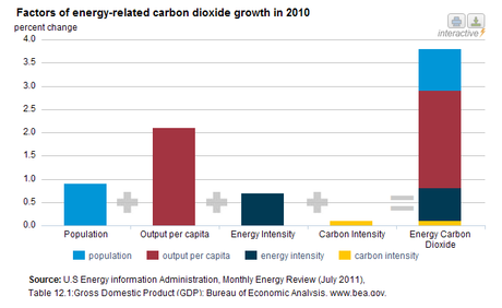
What is even more promising is the make up of four factors that combined to produced the 3.9% rise in emissions. Carbon intensity – the energy consumed per unit of economic activity (Btu/GDP) – made up the smallest amount of increase, at only 0.1%. Population growth (0.9 percent), output per capita (2.1 percent), and energy intensity (0.7 percent) were far larger contributors to the increase. I take this to mean that our energy production methods are becoming more efficient as we get more output per unit of energy produced. The graph below presents this clearly.

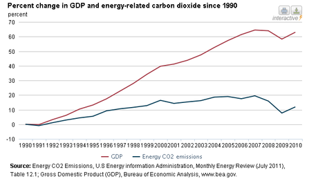
The other graph (in the upper left of this post) shows that we have been able to increase our GDP growth at a faster rate than the related CO2 emissions. “In 2007 emissions reached a peak of about 20 percent greater than 1990, but even after the 2010 increase, carbon dioxide emissions are only about 12 percent greater. GDP has increased by 63 percent over that same time period.”
Solar and wind power have also grown strongly, though still barely make a dent in our overall energy appetite. See the EIA page in the link above for more great interactive graphs and explanations.
[Image]
