Alright alright alright, time for a guest blogger to wow you poster fanatics with his personal picks for top Mondo posters of 2012. This time my good friend and Mondo enthusiast, Luke Physioc, is stepping to wow you with his favorite posters and give you way better reasons about why he picked what he picked. He is also an artist, so his word carries more weight.
If you want to submit your picks, drop me a message on twitter or leave a comment on the article. I welcome everyone’s selections.
Now, on to the list.
Psycho by Daniel Danger

Striking, ominous and slightly disjaunted, just as a Psycho poster should be. The simple colors really set it off, but my favorite part is the stairs. They’re not impossible, but they don’t appear to be right either. They’re slightly imperfect and incorrect. Chaos slipping in.
Battle For The Planet of The Apes by Florian Bertmer

Bertmer has been a favorite artist of mine for a long time. His detail and style are beautiful and every piece he does is memorable. I especially like that this piece is also a very overt nod to Albrecht Dürer’s woodcut Cain Kills Abel.
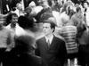
Drive by Ken Taylor

Taylor captured Nicolas Refn’s 80′s stylistic nod in Drive in this piece with the colors beautifully. The knot of highways behind Ryan Gosling’s head and the subtle hammer in his hand are nice touches as well.
20,000 Leagues Under The Sea by Ken Taylor

Another Taylor piece and this one has “classic” written all over it. It captures the essence of the film expertly, the colors are perfect and I absolutely love that it’s a horizontal poster.
The Cabin In The Woods by Phantom City Collective

I have a few PCC prints in my home and they’re all beautiful, quality prints. The Cabin In The Woods is awesome in that it’s a nice aged looking poster, but that if you haven’t seen the film, it tells you nothing, and if you have seen it… well, then you know it’s all laid out plain as day.
Conan The Barbarian by Jason Edmiston

This piece by Edmiston has “classic” written all over it as well. It’s perfect for one of the best action adventure movies ever made and it’s got a very nice comic book style to it as well.
The Dark Knight Rises by Jock

Perfect use of a horizontal movie poster with the skyline of Gotham and the mass of bats forming Batman is awesome. It also ties to the first art we saw for TDKR with the bat logo in the crashing buildings.
Creature From The Black Lagoon by Francesco Francavilla

A classic piece for my favorite Universal monster. Sometimes the traditional look is the best. I love the color palette here and the use of the classic font is excellent.
Back To The Future by Mark Englert

Mondo had a few BTTF posters come out this year, but I think this one was really unique. It’s a perfect use of the horizontal medium and it has really nice details with the time on the sign, the Libyans, Doc Brown’s body and the glow in the dark flames.
Friday The 13th Part 3D by Jay Shaw

I generally don’t care for posters that use photos over drawn or painted artwork, but this one is a stylistic gem. The stark white poster is a nice change for the genre and it’s immediately eye catching.