Every year the fashion and design industry eagerly awaits the announcement of what colors are the trendiest. These trends are both a reflection of the current state of fashion as well as a guidepost for what will make designers and brands successful in the coming months. These reflections and guideposts come from the Pantone Color Institute, which is regarded as the global authority on color and provider of professional color standards for the design industries.
Officially known as the Pantone® Fashion Color Trend Report Spring/Summer 2021 edition for New York Fashion Week, the report includes the top ten standout colors and five core classics that the experts expect to see in upcoming collections.
According to the experts from the Pantone Color Institute, the colors for Spring/Summer 2021 represent a range of hues that transcends seasons and encourages more freedom of choice. This year's color trends are supposed to be flexible enough and inventive enough to adapt to society's newer, more fragmented lifestyle. The experts wanted colors that are based in nature but that could work year-round. As the world is moving at a slightly slower pace, the colors for Spring/Summer 2021 have both a level of relaxation and comfort as well as energetic sparks that uplift your mood.
While this color trend report was specifically released for New York Fashion Week, all types of design sectors take their cues from the report. Interior design trends often follow the color trends from Pantone reports, influencing the 1.57 billion gallons of paint that are sold in the United States every year. The color choices for furniture, decor, and home siding can also seek guidance from these reports, making their significance reach farther than just what's walking down the runway.
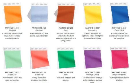
So without further ado, here are the 10 standout shades for the Spring/Summer 2021 New York Fashion Week:

- PANTONE 15-4020 Cerulean: This blue shade evokes the color of the sky on a cloudless day.
- PANTONE 14-1050 Marigold: Based in a comforting golden orange, the marigold is infused with yellow to bring warmth to the palette.
- PANTONE 13-0647 Illuminating: This is a brighter yellow that conveys the optimism and joyfulness of a sunny day.
- PANTONE 18-1248 Rust: A departure from a standard spring palette, this is an earth-inspired brown that is more closely related to autumn leaves.
- PANTONE 13-0117 Green Ash: A soothing green that will make you feel calm and cool.
- PANTONE 18-4140 French Blue: This blue feels like a spring day in Paris that inspires creativity and joy.
- PANTONE 16-5938 Mint: As the name implies, this color brings a minty freshness to the palette to uplift the spirits.
- PANTONE 18-2043 Raspberry Sorbet: Venturing into the reds and pinks, this raspberry sorbet adds a tantalizing tartness.
- PANTONE 17-3628 Amethyst Orchid: This purple shade is reminiscent of spring florals and is unique amongst the rest of the report.
- PANTONE 16-1529 Burnt Coral: Another springtime classic, this pinky shade brings liveliness and conviviality to the palette.
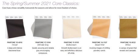
As mentioned before, the report also includes five core classics for Spring/Summer 2021. These shades go beyond the seasons, giving more freedom of choice and flexibility:

- PANTONE 17-5104 Ultimate Gray: A hue necessary for any time of year, this reliable gray encourages composure in the face of uncertainty.
- PANTONE 19-4016 Inkwell: This blackened blue is deep and intense, giving the palette a solid ground to stand upon.
- PANTONE 14-1127 Desert Mist: On the lighter end of the spectrum, this shade is reminiscent of powdery sands.
- PANTONE 11-0110 Buttercream: A classic for any time of year, this off-white hue is easy and effortless.
- PANTONE 16-0632 Willow: Just like the tree, this shade of green provides both protection and performance.
All together, these hues make up a color report that can inspire people as well as give them a sense of assurance and stability. These colors can lend a creative spark to fashion designers or encourage a homeowner to throw out old paint cans, which only last three to five years in proper storage, and find the same comfort in trendy yet familiar shades. This color report will even serve as a color reference throughout the Spring/Summer 2021 season for fashion retailers, reporters, and enthusiasts.
The colors in this report were all chosen from the Pantone Fashion, Home + Interiors Color System, which is the most widely recognized and used system of color standards for textile, fashion, interior, and home design. Whether you're doing a little maintenance on a home built within the last five to 10 years or you're revitalizing the interior of a 20-year old home, the Pantone Color Trend Report is the go-to guide. Now that you know the report, all that's left to do is get in touch with your marigolds and ceruleans so that you stay ahead of the trends.

