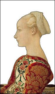
 I still dont feel completely certain whether this renascence artwork 'Portrait of a young woman' is actually attributable to Piero or to his brother Antonio, del Pollaiuolo.
I looked the matter up on Wikipedia and went round in circles on there for a while but in the end do think that it was by Pierro......although I am kind of keeping the door open on this one.
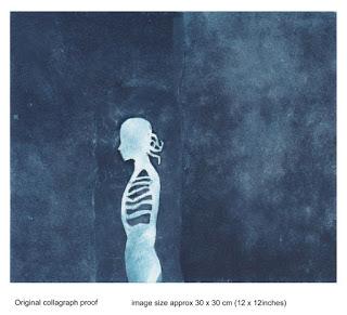
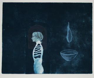
 Anyway I needed a female head in profile to amend my sandpaper collagraph print which I wasn't happy with at all. It had been made using a sandpaper background with a silhouette of what I call an "Eve" figure on it. which is a combination of a skeleton female torso and head-in-profile BUT it just didn't look right.
In this sandpaper plate the lighter figurative plate is cut out from a sheet of "drypoint paper" which I purchased ages ago from Intaglio printmakers suppliers in London, UK. The product is designed for beginners in printmaking. I can also imagine it being used in classes for the general public to give them an experience of making an 'intaglio' print.
Here is a LINK to another print/plate where I first used some drypoint card onto a plate to get a particular 'ghostly' or rather 'soft-edged' effect.
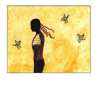
 I have used this 'motif' or whatever its called in other artworks. This yellow one, for example, was made using a technique called photopolymer 'spit bite' whereby, with a brayer, you coat the plate with liquid photopolymer and then cure it.
 Then once that is dry and 'set', using a brush you add some more liquid photopolymer(and dilute to different strengths). This results in the 'forms'..... shapes that you see in the slightly darker tonal areas in the lower central area of the YELLOW proof featured in this post.