As Twitter melted a bit yesterday over a cover reveal, I have decided to bring Judge a Cover forward a day!

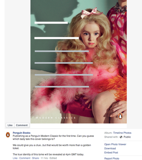
On Wednesday, Penguin Books released an image for a new book in thier Modern Classics range. Grey strips censored the title and author and Penguin invited followers to guess what the book could be.
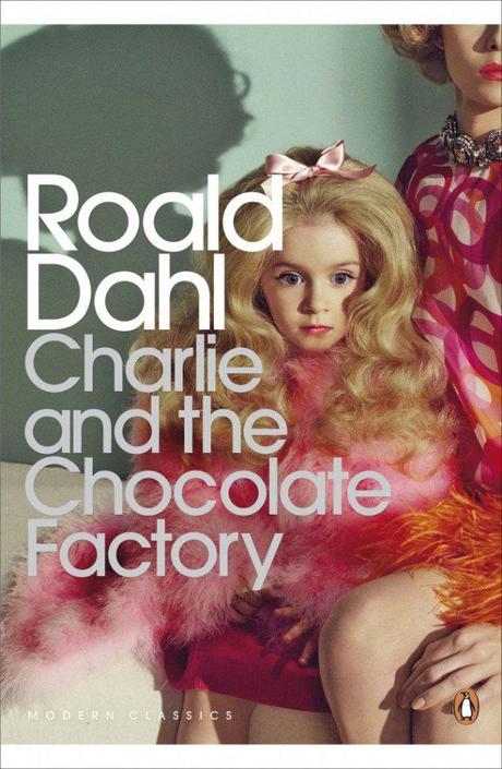
The image showed a shockingly made-up pre-adolescent girl, a mane of gold hair backcombed into a rage. Almost offensively candy shades of orange and pink popped out at you. This hyperbolic image of girliness seemed to be chomping at the bit, teeth gritted against a too glossy mouth. A featureless, but similarly bedecked, mother figure seemed to turn her face away from the girl with detached uninterest.
Penguin sat back and watched as, what I can only assume, were the answers they expected rolled in (well, from those like me that totally missed the “golden ticket” bit); Valley of The Dolls and Lolita being people’s best bets.

When it was revealed that the cover was for Roald Dahl’s classic, Charlie and The Chocolate Factory, I applauded their chutzpah! Here we have a primped and clearly spoilt child, body straining at her Betty Draper-esque mother’s hip, eyes almost shooting out her head towards whatever new acquisition she has her sights on. Her eyes, though tranced, seem to betray the practiced focus of a child used to getting her own way, here are the flickers of self-centredness that will be her undoing.
I thought the cover was brilliant, perfectly pitched for the adult readership of Penguin Modern Classics. It sets the dark, unsettling tone of Dahl’s work that Penguin clearly hope will appeal to adults, a kind of “time to read this another way” incentive.
I told Twitter I thought it was “magnificent”.
It was only then that Lizzi from These Little Words informed me that I was the only one on her timeline who liked it!
I was surprised, my feed had been all for it, if a little taken aback to begin with. So I looked through some more comments and saw that, yes indeed, some people hated it! Some decried it for not depicting the hero of the piece (“Where’s Charlie? Where’s the chocolate?!“), while others seemed to find the Lolita-like qualities a bit inappropriate and a whole lot creepy (I’m not sure if this means they would like the design had it been created for Nabokov’s classic instead).
I can see where these people are coming from, it gives me the cold creeps too to see young girls made up to the nines, but vacousness and its gifting to children by adults, clearly gave Dahl the creeps too. You are meant to find it creepy.
I’ll admit it has been a LONG time since this was read to me at school, but I am assuming we are meant to see this girl as a representation of Veruca Salt, the fur coat wearing monster product of her parents’ grotesque wealth and believed entitlement. This image shows her writ large, as gargoylic and horrible as she is meant to be.
I can see how the image has put people’s teeth on edge, but I find it a fascinating decision, and as someone on Twitter suggested, it would be great to see a serious of adult Dahl covers, all with similar images of parents partly banished to the sidelines, leaving just the horrible (or divine) cartoon rendering of their offspring. This, for me, would be a fantastic start to such a series – a bone chilling picture of what could happen to children of adult readers should they give in too many times…
