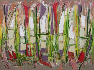
Sometimes a painting looks too good to keep working on, yet I know it needs more. It may be pleasing to the eye, but it could be so much more if I could get past that "pretty." The painting I worked on yestersday fit into this category. I knew it needed more, but I also knew that I'd be destroying the good that was there and heading into unknown territory.
I could end up with an ugly mess instead of a better painting, I thought. But I took the chance. Instead of making minor changes, of keeping the basic design of the piece, I obliterated large chunks of what was there by applying blocks of white, platinum and unbleached titanium with a palette knife.
Next I used a brush to fill in some sections with a bright red, others with a dull plum, and some splash of yellow. I did the same with dark green. In the final steps, I drew lines in medium and dark grays, for both outlining and texturing.
At this point the old pretty painting is long gone. Tomorrow I'll see what I can do with this one.


