This is the weekend edition of TheMarioBlog and will be updated as needed. The next blog post is Monday, September 29
Jon Wile is creative director for the American City Business Journals, a project with which we have been involved for over two years. I like the way Jon keeps track of progress for these weekly business newspapers. He collects the best of the best to reinforce and to promote good design and editing throughout the chain.
We at Garcia Media have worked with Jon and project Pinstripe, rethinking 40 business journals to not just look better, but also embrace a digital first philosophy and reanalyze the role of print.
I contacted Jon for a follow up and progress report about the Pinstripe project:
“Pinstripe is almost three years old in philosophy here at ACBJ and about 18 months in practice. The design rolled out last January at the Silicon Valley Business Journal after restructuring the newsroom, redefining job descriptions and figuring out how print could be reborn in a digital-first news environment. We rolled out the redesign to the remaining 39 papers in about a year, finishing in April 2014. Now we are fine-tuning and tweaking, both on the content and design sides across all platforms. While doing this massive project, we also built a new CMS in-house as well as a new data research platform for our weekly List feature,” Jon told me.
The importance of sustainability for a design concept
How does Jon and his team manage to make sure that the good work of Project Pinstripe continues to evolve and to improve.
“I reach out to every ACBJ editorial designer on Monday and ask them to send me a preview of what they are working on for the week. I generally see about two-thirds of covers before they go to press. We also have an internal site that allows me to see a PDF/Digital Edition of the paper every Friday when they come out. I share the best pages from the previous week in my Monday note,” he said
Here is what Jon tells the team as he looks for good examples:
“As usual, I am hoping to see covers, cover story spreads, special section covers and anything else you might be working on this week. Please send the pages in lo-res format and let me know which parts still need work, what you might have questions about or anything else that could help me give feedback. Early sketches and drafts are ideal, but nearly finished products are fine as well.”
Here is a sampling from this week’s selection:
PORTLAND’S BIG INTERVIEW
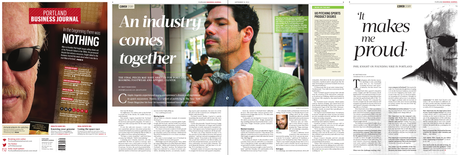

Reporter Matt Kish landed an exclusive interview with Nike CEO Phil Knight as part of a Special Report focused around Footwear and Apparel. PBJ Creative Director Craig Spencer gets credit for the design work. Jon highlighted the simplicity of the inside pages.
CLEVER TYPE-BASED COVERS
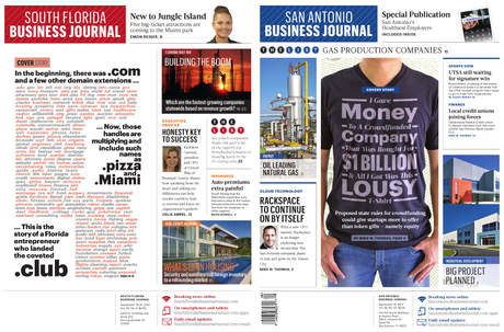

“South Florida Creative Services Director Terry Chapman and San Antonio Business Journal Production Designer Julian Cordero are responsible for these two gems. Terry deftly balanced the type in the centerpiece with white space framing and simple story-telling. Simplifying the typography and color palettes allowed the reader to focus on the story. Nice job balancing the other side of the page, as well. In San Antonio, Julian’s clever idea surely brought a laugh to readers. Really like how Julian stuck to the Acta/Graphik typefaces, but used enough variations to make the illustration work.”
TWO GREAT COVERS IN ONE WEEK
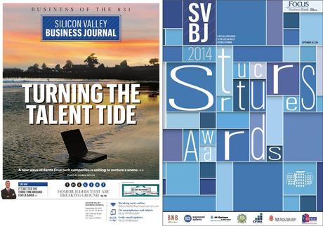

“Ryan Lambert knocked out two great covers last week — one for the ROP section on the “Business of the 831” issue and another on a CRE special section. Small reminder: The Business of treatment should be reserved for LARGE special reports or interview gets only. Please do not use this treatment on a week-to-week basis.”
DATA-RICH MAPS
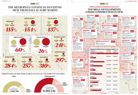

Our last stop this week is in Dallas, where Creative Director Rob Schneider has treated readers to a full-page map/data story each of the last two weeks. The story-telling in these maps gave readers the chance to really dive into an immersive experience. Again, like the simplicity of the typography and color palette to allow the data to be the superstar.
ALBANY: THE CRAFT OF ORGANIZING GRAPHICS

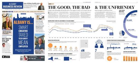
“This set of pages is courtesy of Creative Director Melissa Mangini, who did a wonderful job organizing a bunch of different graphics about the Capital Region on the inside pages. This is story-telling at its finest. Typography on the front is informative, sophisticated and fun. Rest of the front page is balanced very smartly with different panel types and lots of faces. “
TAMPA BAY: HOW TYPE AND IMAGE COME TOGETHER

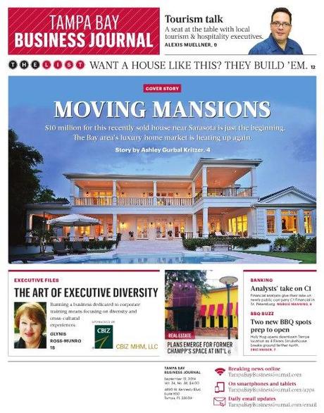
“Our last stop is courtesy of Creative Services Director Eric Johnson, who played up a striking image that stops me dead in my tracks. The List headline above the main image is a perfect compliment to the centerpiece story.”
MORE SPORTS BIZ IN MINNEAPOLIS

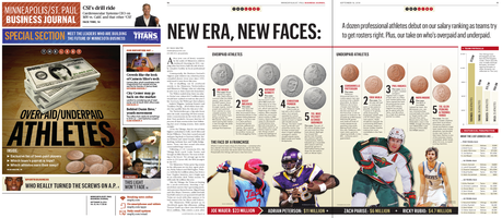
New Lead Designer Ben Ramsden had a bold idea to superimpose Joe Mauer on a stack of bills for an expanded List package, along with creating coins for other play. The Tech and Adrian Peterson refers are handled very well on the front page. Really like the graphics on the inside page, cobbling together a lot of small story-telling pieces to tell one larger story. Nice job balancing the headline across two pages.
SPECIAL ISSUES: WHEN ONE TOPIC DOMINATES
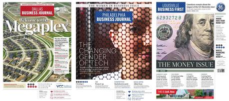

A lot of papers have been riding the special report/issue wave, and here are three good examples. Kudos to Rob Schneider in Dallas for residential real estate, Jon Spencer in Philadelphia for the Women in Business and Brooke Timmons in Louisville for The Money Issue. I really like the dominance given to one main image when the entire section revolves around one topic. Please note: Do this only on the MOST SPECIAL OF CIRCUMSTANCES when you are doing an entire issue like this.
Want a job with ACBJ?
Jon and his team are looking for Lead Designers in three markets? Anyone interested in working in San Antonio, Silicon Valley or Kansas City should reach out to Jon Wile at [email protected].
More about ACBJ
http://www.garciamedia.com/blog/categories/american_city_business_journals

