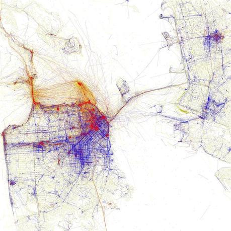
The SPUR exhibition Urban Cartography, which is open until February 6, 2015, documents mapmaking in the past twenty years. Eric Fischer's map, one of the myriad pieces on view, documents where locals and tourists in San Francisco take photographs using geotagged images from Flickr and Picasa. Blue signifies locals, red is tourists, and yellow could be either. "His maps are gorgeous," says Allison Arieff, SPUR's editorial director and the show's curator. "It's not immediately apparent what they are showing but a little explanation goes a long way."
Today, you can find maps that document the smells of a city; you can explore the demographics of the entire nation in a single graphic; a real-time "wind map" depicts atmospheric condisions. These are just a few of the highly nuanced maps that are readily available. Thinking back to the not-so-distant-past, most of the maps that people interacted with were likely the cumbersome paper fold-outs used on longdistance roadtrips (or perhaps napkin sketches given to the lost by kind direction givers) and transit diagrams provided by cities. With the rise of technology, a marked shift has occured in mapmaking and now information about a place is easier to access and organize. SPUR's exhibition on urban cartography—the study and making of maps related to a city—highlights some of these efforts as a way to convey meaningful information about a place.
We sent a few questions to Allison Arieff, SPUR's editorial director and the exhibition's curator, to learn more. "Urban cartography is in a period of rapid innovation," she says, "but as exciting as that is, we have to remember that maps can't just be pretty and provocative but also have to be credible. When you're looking at a map, ask yourself, 'Is there any real value here? Or is this just eye candy?’"
How has the availability and accessibility of information impacted present-day mapmaking?
Massively. Once primarily precise navigational tools, maps increasingly represent diverse and subjective realities. In the past, maps were more authoritative, the closely guarded documents that were the purview of kings, generals, and heads of state. These people had power because they had the map. Today, regular people with modest skills can make maps to represent the city that they live in. New forms of cartography allow people, in effect, to make themselves the center of their universe, creating a map specific to their desired and necessary uses. Even in what is perhaps the most common mapmaking scenario today, where Google owns the data and creates the product, each individual user is interacting with a different map. The level of variance and mutability is unprecedented.Is there a particular program that many present-day mapmakers are using? Is there one tool or technology that really impacted mapmaking today?
The biggest change is in the amount of available data. And accordingly, the hardest thing is probably to figure out what to do with all that data—what to show, what to leave out, what information actually offers value/insight. GIS (geographic information system) and GPS (global positioning system) have been transformative. As for a tool, nothing beats the smartphone—it has completely transformed the way we build and interact with maps.
How have smartphones impacted the way people navigate through cities and how cities present maps for public use?
How often do you use a paper map now? Never, I'm guessing. For increasing numbers of people, the unwieldy paper map is an unknown or foreign object, an artifact akin to the rotary phone and cassette tape. This shift has affected the way we experience our environment and may be impacting our spatial awareness. As we increasingly rely on digital maps, we can find ourselves experiencing the real world through a screen. While it is too soon to determine what it means for us to be experiencing so much of our lives in a digital environment, it is worth considering what might be lost when our paths are so directed. We should be thinking about the implications of only finding what we’re looking for and not discovering what we weren’t.
Slideshow

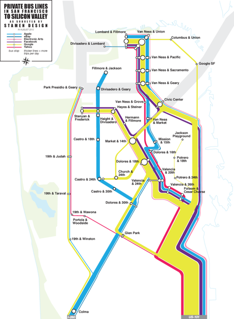
A contentious topic in San Francisco has been the use of private commuter buses used to transport employees between their residences and offices. "The Stamen shuttle map initially set out to map the routes and frequency of buses operated by tech companies like Google and Apple," Arieff says. "Little did the folks at Stamen know that their map would come to function for many as a visual document of Bay Area gentrification—and that real estate agents would use it to market their properties."
Regarding the maps on view at the exhibition, which do you think are the most powerful in showing certain characteristics of the city that most people might not know about?
I have to say there is something surprising and provocative in every map we've shown. The Stamen shuttle map initially set out to map the routes and frequency of buses operated by tech companies like Google and Apple. Little did the folks at Stamen know that their map would come to function for many as a visual document of Bay Area gentrification—and that real estate agents would use it to market their properties. The Google maps are fascinating not least because they are less than 10 years old! It's hard to grasp that such a transformative thing has been around less than a decade. It's striking to see how much those maps have evolved over the years...we don't notice those changes so much over time, only when we look at them side by side.
What are some of the more esoteric maps in the exhibition?
Eric Fischer's maps are gorgeous. It's not immediately apparent what they are showing but a little explanation goes a long way. Andreas Viglakis's maps tackle such a massive problem: transit fragmentation, which basically means there are so many transit systems in the Bay Area—28—that it's extremely difficult for agencies to coordinate and for riders to get from point A to point B. It's very hard to get at that problem in a series of maps. His work is an early foray into a much longer project that we're exploring at SPUR.
Slideshow

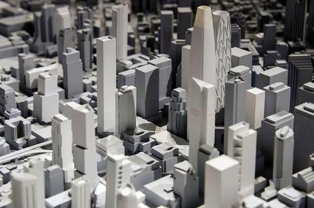
A model by Skidmore, Owings & Merril shows San Francisco in three dimensions. "At the exhibit opening it was fascinating to see how engaged people became while taking a close look at all the buildings in San Francisco," says Arieff. "The three dimensionality provides a level of understanding that is hard to replace."
How can these maps be used to create effective city planning programs?
The Skidmore Owings and Merrill 3-D model, of all the things on display, is probably the most helpful with regards to planning. At the exhibit opening it was fascinating to see how engaged people became while taking a close look at all the buildings in San Francisco. The three dimensionality provides a level of understanding that is hard to replace. One can gripe about a building being too tall—seeing it in a model may provide a better perspective. This model is able to analyze the requirements of San Francisco’s planning codes as well as economic factors like the value of views, daylight, or proximity to amenities and infrastructure.
As I said, there is now so much data at hand...cities need to figure out how best to use what they've got. Hopefully, beautifully made maps like the ones here help inform citizens about their cities and the plans for those cities.
Slideshow

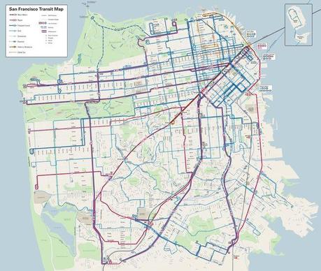
The new map refines how much information is presented and also reflects the frequency of each line to improve usability and trip planning.
The new SFMUNI transit map debuted at the exhibition. What is your opinion of it? Where does it excel compared to the last one?
The new MUNI map is fantastic. My SPUR colleagues had just been looking at little thumbnails of it on the screen. It wasn't until we blew it up on the wall that we realized how transformed it was. Mapmakers talk about the importance of what you leave out—you really see that on the new MUNI map. So much has been taken away and the result is a massive improvement in readability. Route lines show frequency so you're seeing not just that a bus runs but that one line is going to run more often than another, which will really guide your route.
What impression do you hope the exhibition will leave on visitors?
I hope this exhibition will bring more people to SPUR. The issues explored in these maps echoes the work we do at SPUR—affordable housing, transportation and commutes, sea-level rise, and city planning. These things impact everyone who lives here. Maps offer a compelling visual entry into those issues and we're excited to have them on view. We'll have a series of programs related to these maps in early 2015 and SPUR does over 200 programs a year on issues essential to urban dwellers—everything from the musings of Gary Kamiya (author of Cool Grey City of Love) to post-election recaps.
San Francisco readers should keep their eye out for Urban Cartography ads on MUNI buses. If you spot one, take a photo, tweet it to @spur_urbanist, and you'll get a free membership to SPUR!
Urban Cartography is on view at the SPUR Urban Center Gallery until February 6, 2015. Visit spur.org for more information.
