It’s not too often that we have the guts to give someone a much-needed honest feedback. That’ why I was so appreciative of Mitro Patrikainen of Emailab.com doing just that – analyzing my current list building funnel and pointing out what I do well and what has room for improvement.
Granted, I’ve been ignoring my list building while working on my first ever traffic generation course (yes, this is THE first time you are hearing about it!), but there’s not reason I can’t make what works now work better, right?
I’ve already implemented some of Mitro’s suggestions and definitely think you should get his checklist offered at the end of the post to improve your list building funnel as well. After all, your email list is the bread and butter of your business!
There are a lot of parts in TGC’s list building strategy – several opt-in pages and ways to join the Traffic Hacks email newsletter, but I’m going to concentrate on the most important and most visible parts of the list building funnel.
Without further ado, let’s get started.
Home Page Email Opt-In

The home page may not be the first page a visitor sees, but it’s a logical place to start this list building analysis.
Let’s go over some of the elements, one-by-one:
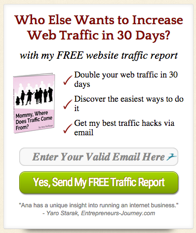
1) ”Who Else Wants [Benefit]” is a common headline formula.
And it’s common for a reason – it’s based on one of the most successful headlines in advertising history, ”Who Else Wants a Screen Star Figure?”
Here is what the well-known business strategist Jay Abraham has to say about this headline:
Who doesn’t? Except men – and this successful and much-fun ad is not addressed to them. “Who else” also has a “get on the bandwagon” connotation: not “Can it be done?” but “Who else wants to have it?”
~ Jay Abraham
What’s also good about this headline is its specifity.
It’s not just promising to get you more traffic; it’s promising to do so in 30 days.
But could the headline be even more specific?
Heck yeah.
”How much traffic” is the key question here. ”Increasing traffic” can refer to 100,000 extra visitors or it can refer to 1 extra visitor…
The last part of the headline ”with my FREE traffic report” is there to let you know what you’re going to get.
It’s always good to set the expectations straight. Your email subscribers can’t look forward to something they don’t know exists.
2) Hand-drawn arrows can help you direct your visitors’ focus – in this case, to the opt-in form!
3) Ok, now there’s a bit more specific headline – instead of “increase traffic”, there’s “double your traffic”.
4) This opt-in form conveys its purpose to the visitor very clearly.
First, she has to enter her email address to the field, and then the report is sent to her. Instead of a generic “submit”, the copy on the button is benefit-driven, giving the visitor a reason to click. The color of the button contrasts against the brown background.
5) The right kind of testimonials can increase email conversions. This testimonial is kind of generic (which can hurt your conversion rate) – it doesn’t say how exactly Ana has helped Yaro Starak. But it comes from an influencer, which gives it weight.
Landing Page Headline

“Oh, I sure would like to increase my website traffic one perfect bite at a time!”
Do your visitors talk that way?
If not, you may want to change your headline.
People respond to messages that speak to their specific problems and desires.
If you want your message to resonate with them, use their language.
One way to figure out what promises, words, and sentences resonate with your audience is to use surveys.
Bullet Points
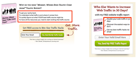
There’s a common problem among these bullet points. We’ll get to that in a moment, but first, let’s take a look at some individual bullets:
- ”Discover the easiest ways to do it”
Yes, people want easy ways to drive traffic, but how easy is it going to be?
To make bullet points like this work, you need to address specific objections, such as ”double your traffic without having to build a single backlink” or ”double your traffic without paying a penny”.
- ”To get your sanity back”
How does this traffic report get me my sanity back?
One way it does that is by showing you proven steps even a monkey could follow to get more traffic.
And why does that matter?
When you know what works, you won’t have to scour through the Internet only to find techniques that might or might not work for you… You’ll be able to sleep your nights peacefully, knowing that you can finally drive converting traffic to your site.
With that said, the bullet point could look something like “A proven guide to generating traffic even a monkey could follow (never lose sleep over the inability to drive traffic ever again!)”
- “To understand what traffic is and where it comes from.”
Why does that matter?
One reason could be that when you know what traffic is, you won’t have to fall for hypey promises or traffic schemes that will probably get your view count up, but nothing else.
You also need to know where traffic comes from so you can tap into the best sources of highly qualified visitors.
With that in mind, here’s a rough variation to the bullet point: “Discover the demystifying truth about the best and worst sources of traffic”.
The point is – when crafting bullet points, generic promises like ”easy traffic” won’t get you anywhere.
Your visitors have heard these promises before, and they say absolutely nothing to them.
When you construct bullet points, keep the FAB formula in mind:
Feature -> Advantage -> Benefit
Feature: When your subscribers join your email list, what will they get? What features does your list building lead magnet have?
Advantage: What will that feature do for them?
Benefit: Why does that matter to them?
Example #1: ”See how I used Slideshare (feature) to go from 0 to 243,000 views in 30 days (advantage)”
Example #2: “Discover my top sources of perpetual traffic (feature) – never worry about your traffic drying up (benefit), even if you don’t actively promote your site”
Take note that a bullet point doesn’t need to have the feature, the advantage, AND the benefit. Just make sure you know all three of them and use them in a way that feels natural.
(Note: I’ve put together a checklist so you can easily implement all the points in this post on your own blog. You can find instructions to get the checklist at the end of this post.)
Landing Page Copy
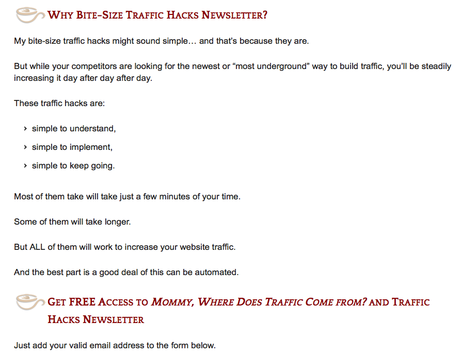
Here are a couple of things I would test on this landing page:
A) No copy.
Often times removing copy elements from your landing page increases your opt-in conversion rate.
Some of the highest converting opt-in pages have just a headline, a call-to-action, and the opt-in form (and maybe an image).
High opt-in conversion rates are not the end goal, however.
Removing copy elements that create anticipation and desire may hurt your response rates and sales conversions.
B) Tease specific traffic hacks.
This copy is blind.
What that means is that it makes promises to the reader, but doesn’t even give a hint on what ”traffic hacks” you’re going to share and what exactly they can do for you.
Instead, I would test making more specific promises – “Here’s what I did. Here’s what it did for me. Here’s what it can do for you.”
Call-To-Actions
There are a couple of things to note about Ana’s call-to-actions:
A) Unvaried CTAs and why that’s a problem
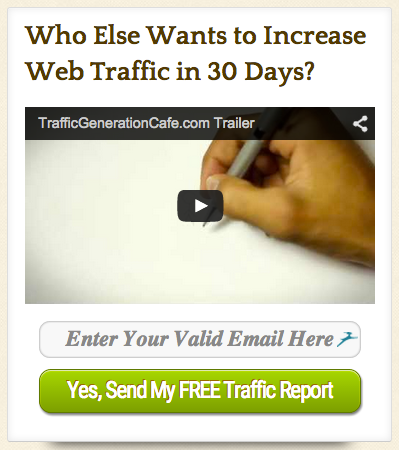
Take a look at these opt-in forms and tell me if you notice something:
Front Page

Sidebar
Sidebar #2
About Page
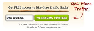
Landing Page

There are basically only a couple of different call-to-actions.
There’s “Who else wants to increase web traffic in 30 days with this free traffic report” and there’s “Get free traffic hacks”.
No matter what kind of visitor is browsing Traffic Generation Café or what she’s doing, she’s seeing the same CTA in every place…
There are only a couple of reasons for her to join Ana’s email list, and if those reasons don’t resonate with her, that’s it.
If you want to get more email subscribers, try appealing to different mentalities.
For example:
- Is the visitor new to your site?
Grab her attention with a thought-provoking headline and explain her the benefits of reading your blog and joining your email list.
- Has the visitor recently discovered your blog and likes reading your posts?
Give her a chance to get even more content from you (by inviting her to your email newsletter).
Here are some examples:
Who Else Wants To Double Web Traffic In 30 Days?
An attention-grabbing headline. Perfect for new visitors.
Where to use it: Front page, landing page.
Get Free Updates
For people who want your latest blog posts sent to their inbox.
Where to use it: Sidebar, after post
Get ”Double Your Traffic In 30 Days”
A shameless bribe for new visitors and for those who are about to leave.
Where to use it: Exit pop-up, sidebar
Join The ”Traffic Hacks” Newsletter
For those who can’t get enough of your content.
Where to use it: After post
Bonus: Download [a bonus gift related to a specific blog post]
For people who are reading one of your blog posts – offer them a gift that is tied to that post. Brian Dean coined a term for these kinds of CTAs: content upgrades.
Where to use it: Mid-post, after post
You can also mix-and-match these CTAs to create hybrids that speak to a couple of different mentalities.
For example:
Join The ”Traffic Hacks” Newsletter
Get weekly traffic hacks straight to your inbox and instant access to the ”Double Your Traffic In 30 Days” report.
B) Test two-step opt-in
Two-step opt-in means that, instead of a regular opt-in form, there’s a CTA button that shows a pop-up, which has the form. It was popularized by LeadPages.

This tactic is consistently increasing opt-in conversions for email marketers.
For example, Pat Flynn at Smart Passive Income reported it increased his conversion rate 25%.
Why does it work so well?
First of all, clicking a button requires a smaller commitment than submitting a form. And when someone has made that commitment, she is more likely to see it through (and subscribe!)
Email Confirmation Page
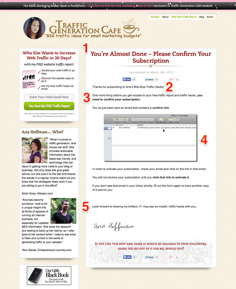
Your email confirmation page has one job and one job only – to get your new almost-subscribers to open your confirmation email and click the link inside it.
With that said, the navigation links, the sidebar, the social sharing buttons and things like that might distract your visitors from that task.
Aside from that, here are some elements that do work:
- A big headline that summarizes what the visitor should do next.
- A ”thank you” to let the visitors know they’ve made the right decision!
- A brief reminder on what they’re going to get when they confirm.
- Visual instructions on how to confirm their subscription.
- A short, personal message with a hand-drawn signature. It makes you more “real”.
Confirmation Email
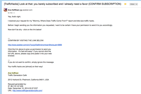
About this email’s subject line… When you want people to take action, clever lines are usually not the best route to take.
If they confuse people, even if just a little, they may not end up taking the action you want.
I would try something punchier and more explicit, like ”Confirm subscription to get your traffic report”.
Download Page
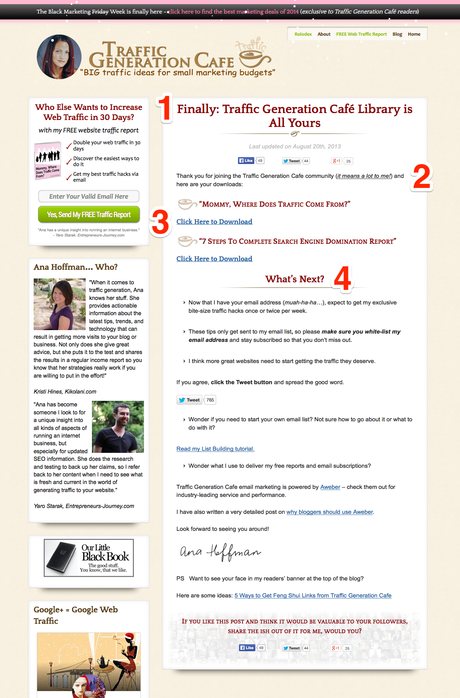
Yes, you’ve got a new confirmed subscriber!
But the ”job” isn’t over yet…
It’s time to impress her… so when you start sending her emails, she’ll know they are worth opening and reading.
The download page plays a big part in that.
Here are some of the good elements on this page:
- The headline is implying you’ve got access to a whole library of traffic generating goodness.
- Again, there’s a ”thank you” to enforce the right decision.
- A download link to the promised gift… and a surprise goodie!
- Instructions on what you should do next and what you should expect. Never let your subscribers hanging.
There’s quite a lot going on on this page…
Sure, it can be a good idea to include social sharing buttons, affiliate links, and community-building elements on a thank you page…
But it can also be distracting and overwhelming.
Could some of these elements be drip-fed to your subscribers via email follow-ups or by any other means perhaps?
Layout
You probably noticed how pretty much all of the pages in Ana’s list building funnel (except the front page and the landing page) have the same layout.
They all have the header, the sidebar, the social sharing buttons and so on.
When the visitor goes through the funnel, the branding stays consistent… She won’t get confused by sudden layout changes or anything like that.
On the other hand, some of the elements on those pages can be distracting.
For example, what if a visitor who just submitted her email address through one of the opt-in forms, and is now on the confirmation page, clicks one of the links in the sidebar, and starts reading a blog post instead of confirming her email?
Thank You Email
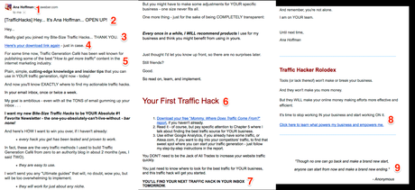
The thank you email is there to remind the new subscriber about the benefits of subscribing, and to get her used to receiving and opening emails from you.
Let’s take a look at what Ana has in her thank you email:
1. Ana uses her real name as the sender name instead of, for example, “Traffic Generation Cafe”. This gives the emails a bit more personal touch.
2. This subject line presupposes the new subscriber knows who Ana Hoffman is… Which, in this case, is probably true because that subscriber came from TrafficGenerationCafe.com, where you can’t miss the fact that it’s Ana Hoffman’s blog.
But what if someone subscribed to Ana’s list without first getting to know her? Would that be something that would never happen? And how much sense this subject line would make to that subscriber?
Generally, it’s better to keep your subject lines focused on the topic at hand… It’s the only thing that’s common between ALL of your subscribers and yourself.
For example, when Joanna Wiebe wrote the subject line for the welcome email of one of Neil Patel’s email campaigns, it said “BOOM! This is how you get traffic… and convert it”… And it got a 104% open rate.
Another thing to note about this subject line is the prefix, “[TrafficHacks]”. It can help you brand your emails, so your subscribers know what to expect when they see them in their inboxes.
3. Can you say “thank you” too much? Maybe… But you can never be too grateful. And this probably isn’t too much.
4. A download link to remind them about the lead magnet – just in case.
5. & 7. Here Ana shares her ambitions and tells you what you should expect from this newsletter – how often you’ll get emails from Ana, what will they contain and how they are monetized. This is a good way to prevent disappointments and confusion, but leaves you room for doing pleasant surprises. Also, Ana’s passion is quite contagious.
6. It’s one thing to say you want to provide a lot of value to your subscribers… And another thing to prove that. That’s why it’s a good idea to start providing value right from the start. In this case, Ana refers to the lead magnet and gives the new subscriber yet another reason to read her ebook. The focus stays on the lead magnet and the subscriber’s attention isn’t divided.
8. Speaking of dividing attention… Is it really a good idea to put two different call-to-actions in a single email… in the first email!? If you want to monetize your emails right from the start, maybe it’s better to just monetize the lead magnet, and leave resource links for later?
9. Sometimes someone else’s words can communicate your values better than your own words. Quotes are one and a good way to do that.
10. Note how the email is formatted. It uses bolding, bullet points and sub-headlines to make the email easier to read. It also doesn’t use fancy graphics that would look awful for those who have images disabled in emails.
Lead Magnet
The lead magnet is a great chance to build up the relationship between you and a new subscriber.
You make a promise to your visitors on your landing page and in your CTAs and you deliver on that promise through a medium that has perhaps more perceived value than a blog post.
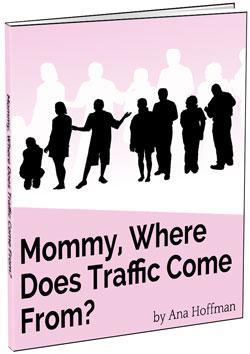 Ana’s lead magnet is the “Mommy, Where Does Traffic Come From?” PDF report.
If you’re a TGC subscriber, you should have it somewhere so dig it up and let’s take a look at it:
- It builds up Ana’s character through the use a cartoon charicature and humor.
- It’s easy to read and skim (lots of lists, images etc.), which also makes it evidently valuable.
- It’s long, which increases its perceived value but can also make it too overwhelming to read for some new subscribers (who may or may not know Ana that well).
- It has lots of links to TGC blog posts, which establishes TGC as a valuable resource.
- It mentions some affiliate products in a non-pushy way. The report is monetized without appearing like a blatant sales pitch.
- “Doubling your traffic” isn’t mentioned anywhere in the report… Is this really THE report Ana promised to send me? The point is – make your CTA message match with whatever you’re giving away (and you avoid confusing your subscribers).
List Building Marketing Takeaway
If you want to build a list, it’s not enough to create some ebook and install a list building plugin on your blog.
If you want your list building offer to convert, you need to appeal to the specific problems and desires of your audience.
If you want your subscribers to open and read your emails, and follow your recommendations, you need to manage your visitors’ attention and create interest and desire towards your lead magnet, your emails, and your offers.
Need Help In Implementing This? Here Are A Couple Of Bonuses
I hope this post has helped you understand how you can increase your conversion rates and attract more interested subscribers with your blog.
The most important step, however, is to take action on the points and suggestions discussed in this post.
That’s why I’ve made a 19-point checklist that you can follow to implement the suggestions on your own blog. Just check, check, check each point off as you go, and you’ll have a more effective list building system in no time.
You’ll also get a complimentary membership to the EmaiLab Newsletter, where you’ll get insightful email marketing tips and useful recommendations straight to your inbox – once a day.
Go to the bonus page here, tell me where I can send the goods and you’ll get instant access to the checklist and to the newsletter!

